Park / Ayres
-
 07-July 13
- Views 15,962
- Downloads 1,109
- Fans 2
- Comments 43
-
-
 80.38%(required: 65%)
 Design

5dave 90% zburns999 90% Jonny93 85% Pacificoaster 85% Austin55 80% Dimi 80% In:Cities 80% Liampie 80% Loopy 80% nin 80% turbin3 80% tyandor 80% Maverix 75% Louis! 70% Airtime 65% 80.38% -
2 fans
 Fans of this park
-
 Full-Size Map
-
 Download Park
1,109
-
 Objects
1
-
 Tags
Tags
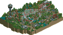
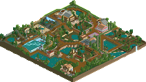
![park_4086 [H2H8 R1] Tahendo Zoo](https://www.nedesigns.com/uploads/parks/4086/aerialt3817.png)
agreed
*and a sweet logo! Good work nin
nin's logo deserves an accolade by itself.
my sentiments exactly
upon first look i wondered how did this only get an 80%
I think this is the coolest flyer I've ever seen, and the first one I've seen without 4th dimension track on the pretzel. Also the screamin' swing area is sexy AF.
Holy shit.
It's fantastic. I hope your PT entry will be at least as good. Love your work!
Also thanks for the logo comments guys. This won't be the last of them.
Probably because they didn't like the theme.
But one thing I thought was funny was Airtime voted 85% for a LL creation that was just so bare and boring(but technique was good and the coaster was nicely planned out, but still no 85%, thats 15% from perfect) and yet here's a master piece with a nice well themed area and a nice realistic coaster and yet gives it the bare minimum.
(just put it this way, pierrot, who I(and some otheres) consider a LL god, probably one of the most talented minds and creationist when it comes to LL, voted 25% on SSSammy's design)
The only thing I can think of is some of the panel may feel that they have personal obligations towards certain members.
Very interesting, SSSammy & Airtime & Louis!
Maker: SSSammy
Classi Bullet: http://www.nedesigns...st/#entry624204
Louis & Airtime voted the highest
Maker Louis & Airtime
Bolt: http://www.nedesigns...park/2056/bolt/
SSSammy voted the highest
Maker Airtime & Louis
Inferno: http://www.nedesigns...k/2153/inferno/
SSSammy voted the highest
Maker Louis
Great Escape Colorado: http://www.nedesigns...scape-colorado/
Airtime voted the highest
Maker Louis
Viper: http://www.nedesigns...ark/1590/viper/
SSSammy voted the highest
Funny one
Maker: Pierrot
Adelaar: http://www.nedesigns...k/2157/adelaar/
Lowest votes: Louis & Airtime
just thought it was kind of cute
Not saying you guys are cheating, just saying because of your guy's relationship, maybe you hold each other down at a lower standard and maybe give each other the 10% extra buddy vote
Cool logo, but I can't help thinking I've seen it before.
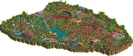
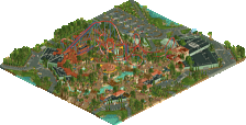
Great job on the park. I like the coaster a lot, and the more natural/organic architecture was pretty cool as well.
fuck this post is phenomenal. fuck theres some big differences in those votes but your right the brits are always at the top
good shit shotguns
For Airtime&Louis I think it's even easier to explain why they tend to vote high on each others works and on (apparently) the same releases. They live together. They influence each others tastes directly. I'm sure they talk about RCT every once in a while. Louis even said that they sometimes give each other live commentary while building. Their tastes have gotten so samey because they adjusted (kind of) to each other.
I think this post sums it up perfectly.
I am really fond of certain members around here, Sammy being one of them, but that does not influence my vote. I am really fond of Sammy's LL, but not his RCT2. And with regards to Airtime & I, we do live together, we look at RCT creations together, we build our own RCT alongside each other, so yeah, we are pretty in tune with each other over RCT. There are certain things that Airtime likes that I don't and vice versa, but there is also things that we both like.
Anyway, with regards to BG's design. I personally felt that seeing as he was going for a more 'perfect' and realistic style that there was a lot missing or 'wrong' with it. This justified my lower vote. 70% still shows that I think this deserves a solid design score, I just don't think it's outright incredible. I also find that when giving feedback to BG, he rarely takes it on board, this isn't why I voted lower, but had he taken those suggestions on board, the design would look better in my eyes and therefore I would've voted higher. This is up to him whether he wants to take feedback or not, but generally I find that the more feedback you listen to, the better your score.
congrats on the design, bg. its a shame that people had to start shit in a topic that's meant to be about your lovely design.
I will admit I did get a little bit of a "I feel like I have seen this before" feel from this design. You did use some great track details on the rides, but only once on a building for the roof on Kalambo Falls, which was quite awesome. I am really becoming a bitch about staff these days and this park had about 3 strikes. No frozen staff makes me sad. I think it's a bit of a step backwards when people don't use it. More forgivable staff offenses were the unnamed handymen and lack of one bearing my name... which is why I will be kicking you off the staff at Parkmakers soon...
I think an 85% score is what I would have went with here. Great work