Park / Swoon

24 Comments

  • Comment System%s's Photo
  • Louis!%s's Photo
    This is one of my favourite RCT creations ever made. Congratulations.
  • robbie92%s's Photo
    This was just so... cool. I find it hard to really critique, but it's so amazing.
  • JJ%s's Photo
    wow looks like a lot of fun :D
  • BigB%s's Photo
    o.O

    Watching the overview I totally lost the overview...

    Good job !
  • Steve%s's Photo
    Wow, FK, awesome work and great inspiration. The thing I think that held this back for me was the way you did the paths - everything is so curvy and flowing and organic-looking and then there's these square, static paths. Definitely cool in their own right, though. Is there something like them in the album art that I'm missing or did you do them off pure imagination? Regardless, great work dude. I think you need to do "Room On Fire" or "First Impressions Of Earth" next!
  • ][ntamin22%s's Photo
    postmodern RCT
  • zburns999%s's Photo
    I honestly didn't really like it a whole lot when I first opened it. After taking a look at the read-me, I still didn't like it, but I had a tremendous respect for what you were doing. It was nice to see something really daring that at least had inspiration beyond "I'm trying to be daring." Also, the layout was quite good, which is usually not the case with creations such as this.

    Overall, I was torn on how to vote, and although it wasn't my cup of tea at all, I actually really respected this and thought it should be a design. I just get confused sometimes with stuff like this, because it totally transcends the game to such an extent that the roller coaster is actually superfluous. It's only real purpose is to be a source of motion on the map. So we're really not judging a roller coaster anymore, but rather an idea, which is basically against everything the Design accolade is meant to be. Whatever. Thought this was worth the design. Congrats.
  • inthemanual%s's Photo
    zburns: Isn't it both an idea AND the execution of that idea? He used RCT to execute this idea very well, and managed to tie in a pretty good coaster into the artwork of it all.

    I agree with Steve about the paths. They had too many different colors and textures going on, which worked for everything else, but it didn't seem right no the paths. I really liked the different exit paths and the waterslide, and the bridges, and the coaster, and well, everything but the paths. Really solid fantasy work. It really makes me want to reach into fantasy more, but I hardly know where to begin.
  • AvanineCommuter%s's Photo
    You are on to something magical here FK... even though it was evident in Colorflood, here it comes together on a transcendant level.

    I am hugely inspired by this idea of RCT as a medium for art rather than the conventional modeling program it was destined to become. I think it will be fun to try something in the same style... :nod:
  • AK Koaster%s's Photo
    Whatisthisidonteven?!?!?

    Beautiful, yet crazy at the same time.
  • Twiggy%s's Photo

    The thing I think that held this back for me was the way you did the paths - everything is so curvy and flowing and organic-looking and then there's these square, static paths.

    I feel that the square, linear paths work. They're almost like a graph, a foundation, and the idea is formulated, let loose, and grown over it. It gives a contrast between straight and curvy. I dig it.
  • Fisch%s's Photo

    You are on to something magical here FK... even though it was evident in Colorflood, here it comes together on a transcendant level.

    I am hugely inspired by this idea of RCT as a medium for art rather than the conventional modeling program it was destined to become. I think it will be fun to try something in the same style... :nod:/>


    I think more the "elite" players nowadays should actually see the modelling part of the game as an art in itself instead of just using it as a simulation that is capable of recreating six flags/cedar fair parks without too much imagination/creativity.


    I appreciate every release that is imaginative/creative, and this is great because you didn't give a %"ยง$&"/ about the current rct norms. Great job fk! :)
  • RCT2day%s's Photo
    This is exactly what Chris Sawyer had in mind when he invented RCT. So old school and refreshing. I kid. I kid. Crazy awesome stuff.
  • Cocoa%s's Photo
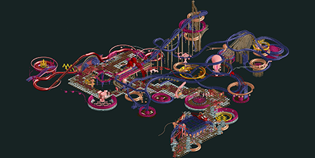
    i love it, very trippy. I wouldn't have built it so close to the ground though, it sort of kills the illusion of 'floating' in space. Did you just have a random layout laying around and you felt liked doing colorflood 2.0? Because it seems like a strong realistic layout rather than an over-the-top ghost cell crisis sort of layout. anyway, great work

    (ps, is this the first db entry with a black background? :) )
  • GigaG%s's Photo
    Wow. That's all I have to say. This is just amazingly crazy.
  • MCI%s's Photo

    Watching the overview I totally lost the overview...

    lol :D

    I love it. If any art was like this, maybe it would be more interesting to me.
  • csw%s's Photo
    Hopefully this won't get overshadowed by PT4, because it's great. It feels like it's a group of jellyfish in the abyss or bacteria/amoebas in a Petri dish or something. lol
  • Midnight Aurora%s's Photo
    The initial thought in my head was that I liked this more in small screens, but that's not right. Completely opposite to your last entry, I think your micro details are fucking excellent, but the big picture could have been stylized a bit better. And certainly in this, above all else, you could have taken liberties with the coasters layout--it's too traditional for this format.
  • FK+Coastermind%s's Photo
    Thanks so much for all the comments everybody!

    I'm holding most of my thoughts till tomorrow night, where i'm hoping to review in stream with Pac. I'll post some responses again after that!

    FK