Park / De Vliegende Hollander/Python
-
 07-June 13
-
 De Vliegende Hollander/Python
- Views 20,024
- Downloads 1,439
- Fans 10
- Comments 25
-

-
 83.85%(required: 65%)
 Design

Maverix 90% Pacificoaster 90% 5dave 85% Arjan v l 85% Goliath123 85% Jonny93 85% nin 85% pierrot 85% robbie92 85% Sulakke 85% tyandor 85% Airtime 80% Louis! 80% posix 75% Wanted 75% 83.85% -
10 fans
 Fans of this park
-
 Full-Size Map
-
 Download Park
1,439
-
 Objects
1
-
 Tags
Tags

![park_4178 [H2H8 Grand Finals] Heaven's End](https://www.nedesigns.com/uploads/parks/4178/aerialt3929.png)
Oh wait...
This is so cool... very cool... it touched my heart.
And i'm visiting the Efteling within 2 weeks.
Just loved it Liam, you can tell by the score, it's the first 85 that i gave away.
Congrats.
Edit: Btw., be careful in your airship towards your new adventure.
I had the pleasure to visit efteling two day´s early in may and it´s my favorite park I´ve been to so far. The Vliegender Hollander is one of the most awesome rides I´ve ever had the pleasure to get my ass on and to see him so well translated to rct is just awesome. While it´s not a recreation it gets the whole feeling. The only thing missing: You could have put the soundtrack in it to make it even more epic.
I´m not that much of a Phyton fan, but it´s really good translated into rct, too. The whole area is just a blow to me, so sorry about not being critic. Just reminded me of the best two days inside a park I´ve had so far.
No, he couldn't, because then the average score would have been over 100%
Congratulations on the double design.
First of all I missed out on voting for this, but I'd have given it 85 I think. Like everyone else lol.
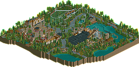
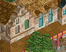
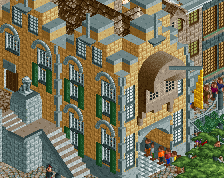
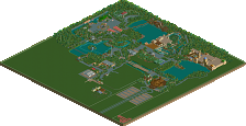
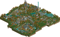
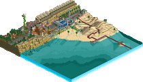
The Archy is really fantastic throughout. The main facade rows we're my favorite, beautiful and not detailed "to much", it came of as very realistic and clean. The arcade area just had a really charming atmosphere about it. That whole Piazza area was huge, I mean it fills up the whole screen on full zoom, and there is just path everywhere. It seems like it should be bad, but it just isn't. It's just got a very warm feel to it, and its scaled all vey well. I think that has a lot to do with the fact you've crammed 1,300 or so guests into this little park. They contribute to the atmosphere really well. I really liked the station of the car ride to. The train station was nice, interesting trick you pulled with the train itself! Props on getting that to work.
Python was great! It's a simple ride but you pulled it off very nicely. I really liked that you used the largest possible turn at the top, just scaled nicely. Simple ride but you pulled it off nicely. I did think the station was lackluster, and those diagonal wooden fence objects look terrible.
De Vliegende Hollander was a neat little ride to. I with you had made a version without rooves so we could see into the dark section. Not a bad layout at all. Huge improvement from your past layouts. The architecture around the station wasn't quite as good I thought, maybe a few to many windows, but certainly not bad. I really liked the multi-tiered feeling, and the queue line looked winding around. Again the boardwalk type feel was really nice here.
I also really enjoyed the "extra" surrounding areas. Context I guess. I love me some context. I saw the little message to Gert to, Nice. And ofcourse the little baloon with the message, really neat touch! I'm super excited to see where that ballon takes us...
Oh the one thing that held it back?
Why wasn't I in the staff?