Park / Azuron: The Ice Dragon
-
 02-June 13
- Views 2,376
- Downloads 640
- Fans 0
- Comments 4
-
 59.62%(required: 65%)
 Design Submission

In:Cities 80% CedarPoint6 75% Austin55 65% Goliath123 65% Liampie 65% Maverix 65% Pacificoaster 65% 5dave 60% Louis! 60% Arjan v l 55% Loopy 55% Sulakke 55% BelgianGuy 45% Fizzix 45% Jonny93 45% 59.62% -
 No fans of this park
-
 Download Park
640
-
 Objects
1
-
 Tags
Tags
![park_2813 [PT4 R1] Alton Towers Entrance](https://www.nedesigns.com/uploads/parks/2813/aerialt2477.png)
![park_3805 [NEDC4 9/15] Caelipotens](https://www.nedesigns.com/uploads/parks/3805/aerialt3439.png)
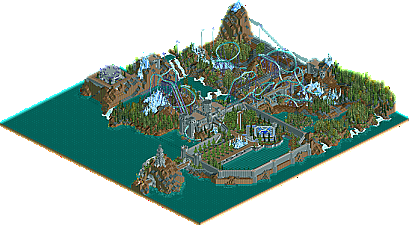
You clearly have a lot of skill in building and imagination, but the lack of focus and detail really push this design way farther back than it should have been.
Then there are the surroundings - they are on a whole different level than the layout. I was really impressed. If I had to sum them up with a word, it would be "grand".
Overall I really liked it. Over 100 hours of work deserves more comments!
The 'fake' mcbr, was a no no for me and the pacing was off in some places.
I know it wouldn't have made it through the loop (decently), if the train was slowed down at the mcbr, but than the layout has to be remodeled i.m.o.
The architecture was great, i loved the castle.
Peeps where definitely missing and there wasn't any atmosphere.
Too bad there wasn't a queue for the ride either.
But then i saw that flat ride and i thought: Wow, that's really nice.
Very mixed feelings about this.
There are several flaws in this design, i hope you work on those and then the next design could be a winner.
Overall good job!