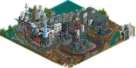
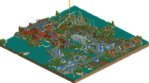
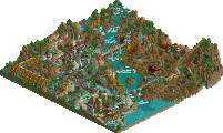
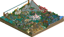
Well... Um... That architecture kills my entry... Damn...
I'll be stealing some details from the buildings, but nothing major really. That architecture was cool and the canals made the harbor area really stunning. Actually everything was there except a coaster, and though I can't imagine a stock "realistic" coaster going in there. An adventure ride or maybe some rapids or something wouldn've hurt though...
Oh well. What's there is amazing and because I can feel it I couldn't stop looking even though all there was to see was buildings...
There's something to it, if only one of us could figure it out....
Well, I'm still scratching my head about this one. I have so much to say, I don't know where to start.
My opinions on the park can essentially be broken down into three categories. The parts I enjoyed, parts I loved and other parts I just said "wtf".
"Enjoyed"
I enjoyed the enveloping size of the buildings and diversity of each structure. All the special touches, such as the custom flags, fire escapes, broken down railroad, etc, really helped keep the park interesting. Some of the buildings by themselves were actually quite boring, but you seemed to add just enough detail to keep me looking. Great use of resources and landscaping too.
"Loved"
There were some details that I just loved, like the glass building the trolley went thru, the enourmous white building and the smaller outcropping of buildings just outside the city. Wonderful touches of brilliance. An overall amazing atmosphere as well.
"WTF"
First and foremost, the coaster. I sat there and tried to figure out what its purpose was. It circled that purple/black building for some reason and the building had that fenced junkyard-like area out front. Was it some type of centrifuge for a nuclear plant? Was it supposed to represent some type of experiment that went wrong? Was it related to the city being abadoned and broken down? Not very pretty, but definitely intriguing. Then there were other head scratchers. Like why were certain pieces of the columns missing on the large white building? They were obviously not put there for a purpose. Why were single station pieces used to represent buildings and not stalls? I could go on and on.
Overall, I'd still say its one of the better RCT creations I've seen in awhile and definitely the best PT park yet. Cork definitely nailed it by saying its this year's Epica. Albeit not the most attractive or themeparkish creation ever, but it just has so much mystery you have to like it.
Great stuff DJ. Too bad on the placement. This probably would have pushed in the top 7 if I were a judge, but hard to say without knowing what it was up against. I defintely feel it was missing something though.
I'm not going to go as far as saying it was this year's "Epica" because then I'd have to feel it was the best entry. It didn't have the backstory nor the intrigue IMO that Epica had. It had a lot of mystery which definitely kept it interesting, but not to the same degree Epica did.
Now I will say that it definitely should have placed higher...probably in the 6-7 range....maybe even a tad higher. There are a couple entries we've yet to see (three spring to mind) that I definitely didn't like quite as much as DJ's. No offense to any of the parks though, they were all pretty damn good in their own right.
Could someone please PM me and show me? I'm confused.
Not sure what the upside-down stuff under the name means, but I assume "En Midvinternattsdrom" means "A Midwinter Night's Dream." Which is a reference to Shakespeare's comedy "A Midsummer Night's Dream." I'm guessing the main reason he changed summer to winter might be because of when he was working on the park. However, I suppose the name could also have some deeper meaning related specifically to the park.
EDIT: Oh, and like ride6, I'm almost embarrased to have my park come after this, considering the amazing archy in this park, and the slight lack of it in mine.
I'm almost embarrased to have my park come after this, considering the amazing archy in this park, and the slight lack of it in mine.
Blah blah... shut up. I've seen your park. Stop putting yourself down.
And THAT'S what the "A MidWinter Night's Dream" was referring to. I didn't process that until just now.
Anyway, Iris, who knows; there might be a backstory (not necessarily as neat and profound as Epica's, but still) that no one's picked up on. The name itself, coupled with the magnificent desolation (I like that phrase) DJ's portrayed here suggests that it might have a nuclear feel to it. Winter as in nuclear winter, profiling a city in the aftermath of some sort of nuclear test gone wrong. The abstract numbers could play along, since one might imagine a highly technologically advanced society engaging in such experiments and resulting to pure scientific nomenclature for its subjects.
At least that's one guess. Maybe it was nothing at all, but until DJ replies in this thread, we can only guess (it's a nice scheme of getting more replies though, since he's already built up some nice intrigue.
I didn't expect someone else to not use English in their park.
Oh, and I made the logo before I figured out the translation, obviously. So ignore the upside down text under the logo. I just put it there to "fill in" the graphic a little bit. Just... read each word mirrored and it'll be obvious that what it's saying (in English) is not very special at all.
I really think a read me would have helped. I too didn't catch the name. I guess the park is what it is whether you understand the parkmaker's meaning or not. I have to say I've looked at this park a few more times and I'm starting to feel a little guilty about my placing. I'm not sure where I should have placed it, but I am sure it should've been higher than 10th on my list. Oh the joys of judging...there will always be a park that somehow slips through the cracks. I hope DJ isn't too upset by the placing and knows he's done something special here.
Emergo and Xcoaster are correct about the name, although I should point out it's "En Midvinternattsdröm," not "drom." The dots matter.
As for the Epica comparisons - I can see the similarities, but there are a number of significant differences. The most important one is that there is no "true meaning" of this piece of art; instead, the viewer is allowed - encouraged - to take part in the piece and draw their own conclusions, as some of you have been doing (thank you very much, it makes me happy reading your theories and hopefully adds to your own enjoyment). That is why I don't want a readme. It would totally ruin the piece, and I would have nothing to say that hasn't already been expressed in the piece - it would just be me basking in the glory of my own cleverness.
I don't want to pretend it turned out exactly as I wanted it to, that every detail is perfect, but most things are carefully done and thought-out and so I believe the piece would hold up to closer analysis, even down to things like color choices and placement (including 900429, which was actually the very first thing I built). If you decide to take the time to seriously theorise about the piece, please do share, as each person has an unique perspective on it, and I have learnt things about my own piece just from reading this topic.
How could I be unhappy with the placement - the hosting is free, it has it's own page with nice screens, comments and a cool logo. Only it's a bit lower down a short list than some of the other entries, big deal.
I really enjoyed looking around this park! It was extremely inspiring, seriously i have had a ton of ideas just looking around at it. I have never seen any work from you before and now i can see what all the fuss is about, you master architecture so easily, and you really know how to use good colours and textures. I didn't get the story behind the park, (or why there was tons of tram lines there lol), but it was very interesting to look at.
Congrats, if all the other entries are better than this one... wow.
It's ok Panic...it happens. When I'm judging a contest like this and am looking at park after park in a short period of time I tend to develop a set of criteria of what separates the great parks from the not so great. Sometimes when there is an entry so different as this one that doesn't really meet any of the criteria I've internalized thru the judging process it just doesn't seem to measure up at the time. However when you look at it later with a clean mind, you realize that it has a greatness about it that goes above what you were originally basing your judging on. It's one of the pitfalls of the judging process and I think every contest has had one or two instances like this.
76 Comments
Phatage Offline
Ge-Ride Offline
If HandyAndyG judged
DarkJanus
Kumba
Old Red
Six Frags
Steve Offline
postit Offline
Ride6 Offline
I'll be stealing some details from the buildings, but nothing major really. That architecture was cool and the canals made the harbor area really stunning. Actually everything was there except a coaster, and though I can't imagine a stock "realistic" coaster going in there. An adventure ride or maybe some rapids or something wouldn've hurt though...
Oh well. What's there is amazing and because I can feel it I couldn't stop looking even though all there was to see was buildings...
There's something to it, if only one of us could figure it out....
ride6
JKay Offline
My opinions on the park can essentially be broken down into three categories. The parts I enjoyed, parts I loved and other parts I just said "wtf".
"Enjoyed"
I enjoyed the enveloping size of the buildings and diversity of each structure. All the special touches, such as the custom flags, fire escapes, broken down railroad, etc, really helped keep the park interesting. Some of the buildings by themselves were actually quite boring, but you seemed to add just enough detail to keep me looking. Great use of resources and landscaping too.
"Loved"
There were some details that I just loved, like the glass building the trolley went thru, the enourmous white building and the smaller outcropping of buildings just outside the city. Wonderful touches of brilliance. An overall amazing atmosphere as well.
"WTF"
First and foremost, the coaster. I sat there and tried to figure out what its purpose was. It circled that purple/black building for some reason and the building had that fenced junkyard-like area out front. Was it some type of centrifuge for a nuclear plant? Was it supposed to represent some type of experiment that went wrong? Was it related to the city being abadoned and broken down? Not very pretty, but definitely intriguing. Then there were other head scratchers. Like why were certain pieces of the columns missing on the large white building? They were obviously not put there for a purpose. Why were single station pieces used to represent buildings and not stalls? I could go on and on.
Overall, I'd still say its one of the better RCT creations I've seen in awhile and definitely the best PT park yet. Cork definitely nailed it by saying its this year's Epica. Albeit not the most attractive or themeparkish creation ever, but it just has so much mystery you have to like it.
Great stuff DJ. Too bad on the placement. This probably would have pushed in the top 7 if I were a judge, but hard to say without knowing what it was up against. I defintely feel it was missing something though.
iris Offline
Now I will say that it definitely should have placed higher...probably in the 6-7 range....maybe even a tad higher. There are a couple entries we've yet to see (three spring to mind) that I definitely didn't like quite as much as DJ's. No offense to any of the parks though, they were all pretty damn good in their own right.
Ge-Ride Offline
CoasterForce Offline
Emergo Offline
Ever heard of Shakespeare?
If you have, or search for it, then you will certainly be able to place this name, even if you don't speak any other language than English.
(Have not checked out this park, but - first one of this PT- I'll absolutely do !)
Edited by Emergo, 22 February 2006 - 07:14 PM.
Ge-Ride Offline
Xcoaster Offline
EDIT: Oh, and like ride6, I'm almost embarrased to have my park come after this, considering the amazing archy in this park, and the slight lack of it in mine.
Edited by Xcoaster, 22 February 2006 - 07:47 PM.
Ge-Ride Offline
Corkscrewed Offline
Blah blah... shut up. I've seen your park. Stop putting yourself down.
And THAT'S what the "A MidWinter Night's Dream" was referring to. I didn't process that until just now.
Anyway, Iris, who knows; there might be a backstory (not necessarily as neat and profound as Epica's, but still) that no one's picked up on. The name itself, coupled with the magnificent desolation (I like that phrase) DJ's portrayed here suggests that it might have a nuclear feel to it. Winter as in nuclear winter, profiling a city in the aftermath of some sort of nuclear test gone wrong. The abstract numbers could play along, since one might imagine a highly technologically advanced society engaging in such experiments and resulting to pure scientific nomenclature for its subjects.
At least that's one guess. Maybe it was nothing at all, but until DJ replies in this thread, we can only guess (it's a nice scheme of getting more replies though, since he's already built up some nice intrigue.
I didn't expect someone else to not use English in their park.
Oh, and I made the logo before I figured out the translation, obviously. So ignore the upside down text under the logo. I just put it there to "fill in" the graphic a little bit. Just... read each word mirrored and it'll be obvious that what it's saying (in English) is not very special at all.
Toon Offline
Janus Offline
Emergo and Xcoaster are correct about the name, although I should point out it's "En Midvinternattsdröm," not "drom." The dots matter.
As for the Epica comparisons - I can see the similarities, but there are a number of significant differences. The most important one is that there is no "true meaning" of this piece of art; instead, the viewer is allowed - encouraged - to take part in the piece and draw their own conclusions, as some of you have been doing (thank you very much, it makes me happy reading your theories and hopefully adds to your own enjoyment). That is why I don't want a readme. It would totally ruin the piece, and I would have nothing to say that hasn't already been expressed in the piece - it would just be me basking in the glory of my own cleverness.
I don't want to pretend it turned out exactly as I wanted it to, that every detail is perfect, but most things are carefully done and thought-out and so I believe the piece would hold up to closer analysis, even down to things like color choices and placement (including 900429, which was actually the very first thing I built). If you decide to take the time to seriously theorise about the piece, please do share, as each person has an unique perspective on it, and I have learnt things about my own piece just from reading this topic.
How could I be unhappy with the placement - the hosting is free, it has it's own page with nice screens, comments and a cool logo. Only it's a bit lower down a short list than some of the other entries, big deal.
Thank you, again.
X250 Offline
Congrats, if all the other entries are better than this one... wow.
-X-
Panic Offline
Toon Offline
@DarkJanus...
Classy response!
Corkscrewed Offline
J/K Great park, DJ. Glad to see the good spirits.