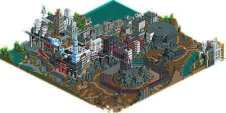
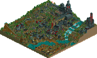
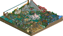
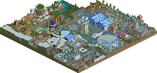
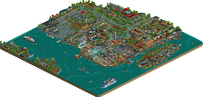
One of the biggest surprises of the entire contest is the fact that long-time upcoming star parkmaker DarkJanus actually got an entry in. After small teasers in the QFTB-X and screens of insane futuristic parks on Mars, we're finally treated to the closest thing to a finish product of Janus. What we got leaves us Janus's actual talent even more unknown then when we started. An entry with obvious skill and originality, but a definite sense of something missing. It almost feels like the vastness of the park, something it seems Janus was trying to accomplish actually held it back and stopped it from really defining the theme. What I saw in the entry was great, larger then life, enveloping architecture that really impressed me, unique theming and good atmosphere, and a very confusing coaster. A sense of confusion kind of remained constant throughout the whole entry...from the foreign language, to the coasters named in numeric sequences, to themes that seem like they'd work better if they were properly spelled out. It looks as if the theme was pulled off....I'm just left wondering what the theme actually was. Still, it's obvious Janus has what it takes and if it were strictly up to me, he'd have definitely placed in the top 10. It shows just how quality the contest is, and I thank Janus for taking the time and surprising us all with an entry this go around, and hopefully it's just the beginning of a beautiful start for Janus here at New Element.
In retrospect, I should have definitely switched my placing of this and Old Red's. Darkfire's 2050 AD has long been the benchmark for the futuristic city theme for me, and it wasn't until long after I sent my judgings in that I realized that here was theming that actually topped that - indeed, perhaps the best futuristic city theme I have ever seen. Iris has talked about the sort of confusing nature of the thing...but now that I look back on it, the lack of operating rides and movement and the mysterious languages and codes which things were named in lent the entry a sort of cool, abandoned eeriness. It is definitely an entry that has grown on me.
That said, there are countless opportunities for blending a coaster into the city theming subtlely and even using it to enhance the theming. What might have been cool is if you built a blazing fast coaster but only allowed it to peek out of the buildings every so often and unexpectedly, rather like a spirit dashing among the city, almost too fast to be seen. But I understand how a conventional B&M layout or something could have kind of killed the deserted city atmosphere.
edit: I think that the coaster that was there could have been much revised; to begin with, I would have put launches along a lot of the straight sections to keep the coaster moving at a fast clip throughout. At the end it really just kind of limped back to the station, which bugged me a lot.
I know you started late on this, so I won't knock you for not having much of a "park" put together.
First and foremost, this is a stunning display of abstract urban architecture. I think the big white building on the map edge is my favorite. The bleak landscape is engrossing, and I've only begun to look at it. Great use of height and combining 1/4 tile work with more traditional building elements. The coaster is... well, forgettable. I understand the place this entry was given because it's rather one-dimensional, but that doesn't stop it from being inspirational.
First of all, this was a big surprise to me. First, because I really didn't expect the park to be up so early. I thought I'd still have to wait about 10 hours before it'd be up. Second, I didn't really think that DarkJanus was entering. And third, I didn't think he'd be so low down if he had entered.
Anyways, I must say that I'm really impressed. True, it isn't much of a theme park, as I only noticed 3 or 4 functioning rides, unless if you consider the true attraction of the park to be the city itself, but I doubt that's what you were going for, otherwise it probably would've had some kind of tour ride, a more typical entrance, etc. But for a futuristic city, wow, I love it. Fantastic, grand architecture, I can imagine purposes for the buildings, but it's not without an air of mystery. First of all, I don't understand any of the ride names or banners (A Midwinter Night's Dream?), but this, along with the fact that we have to wonder why the city seems so deserted (or is that just because there aren't any peeps in it?), and what the purposes of some of the buildings are really adds to the weirdness of it's desertion. For example, I was really curious about the checker pattern thing, the stadium thing called "the World," and the thing with the sign that says "Pop!" on it. Also, it maintains some realism by how all the buildings fit in the futuristic urban theme, but some of them seem like they could be from different periods than others, such as the white building cBass mentioned, which seems like it probably would've come near the end of the city's life (assuming it's supposed to be dead). Conversely, there were several older looking brick buildings that looked like they could've come from earlier in it's history. And of course, you have the run down railway outside the city. How you made some of the buildings appear to be from different ages brought up the question if something to do with one of these later buildings could've caused the city to die (again, assuming it's dead). For example, I couldn't help thinking that the rather strangely named "World" building might've had something to do with the disappearance of the people (again... assuming they're supposed to be gone). Or the checker thing, or any number of other buildings (or even the coaster, especially with it's unusual name and layout, makes me wonder at its purpose). Anyways, this is an entry I'll definitely be looking at more later, and it's possible I'll comment some more. Some details about the story of the park would be nice, BTW.
In short, the architecture and details were spot on, but there was a severe lack of "theme parkiness" to it, but that didn't stop it from still being an awesome entry. Great job.
I don't know what the fuck it was supposed to represent or anything, but I absolutely loved it.
I particularly liked the tower block buildings. Some of the forms and ideas you incorporated into them were amazing. And I also love that white building that cBass is talking about, absolutely immense. I think people will be using some of the scenery ideas from your architecture in this park for time to come, there were some really awesome combinations.
The coaster was weird, not quite sure what it was trying to represent, but hey, twas cool.
I loved the way you used the checkboard flat roof piece for your path on the "boardwalk" area. Really gave it a kinda dark deserted feel. Lovely.
What I don't understand is how you broke so many "rules" so to speak but easily got away with them and they just enhanced everything. Like random landblocks climbing up buildings, piece of ice and checkerboard tiles dotted here and there just noticable from certain angles, and jungle trees growing out of rooves!
I really liked the viaduct structure with the broken train line along it, i think that was pulled off very well.
What was with those hovercraft things?
I think the fact that half of it was in a foreign language just enhanced the mystery of it. But let's be honest, the stuff in English didn't exactly tell us much at all!
Overall, a very mysterious entry, but I absolutely loved it in every way. Obviously I haven't seen the other entries, but I'm surprised this has placed this low, it was wonderful. Looking forward even more to the rest of the entries now.
That's really all I could say.. I wasn't expecting this in a mile, and I think this is the best I've seen from you DJ! It reminded me a bit of your Tallinn Road Rally entry over at RCT2.com you made a while ago.. But this was far more amazing.. Particularly in terms of architecture which was phenomenal and some of the best I've seen in rct2.. It was so dense yet achieved the city-like atmosphere I think the theme was about.. I loved all the little touches spread in the city when you rotate the view 2 times.. The hover ride was also pretty cool, riding through the canals of the city.. I couldn't care about the coaster, but it obviously was more meant as a gimmick than be an actual rollercoaster in a theme park.. The color choice was refreshing too, although it could've used some more of those in places..
All in all an amazing entry and the others must be phenomenal to top this.. Although (no offence), but I almost can't imagine...
Wow, definitely a wacky park to say the least. The harbor area I thought was very good, and some of the architecture, although blocky in some parts, was amazing. It was very unique as well, and the whole park was a very creative way to build a city.
However, it just seemed so confusing, I couldn't really get the concept of most of the park. For example, the coaster that wrapped around the building was named with numbers. Also, the foreign language was a sort of an odd factor to the park as well. And, there were very few fully operational rides too, so that also brought it down for me as well.
So, overall, it was very good. The theming was there, and it took obvious skill to build the city, but it was just sort of confusing and hard to figure out. It was definitely a unique park, though.
that's what first came to my mind, but close behind there was "sincere condolences". i'm sure there will be some parks i would place lower than this. the only negative point was that there were no real coasters and only few rides. you could have integrated them so well into the city. the use of 1/4 tile blocks was really great. i'm really looking forward to see another project from you (with those object [hope you know which i mean]).
Now my expectations for the top10 are very high. maybe too high, but seeing the names that are still in the race there should be some great parks.
Definitely one of the harder parks in the competition to judge. The atmosphere here was fantastic and as I worked out my rankings, it jumped anywhere from about 7th to 10th where it ended up for me. Unfortunately for DarkJanus it ended up on the bottom end of my rankings, but if my mood had been different on my last day of judging, it could easily have finished much higher. That's how close this contest was. I will stick by my placing tho, I think the lack of a defining ride really hurt the entry as a whole, because in terms of atmosphere this would easily have been a top five park for me.
Completely amazing. I never knew big white buildings could be so interesting, and a joy to look at. It's not only the buildings, but the small little details that make add up to something real special--like the tunnel to the coaster was especially great.
Janus is now my idol at 1/4 blocks, and such. Cool park.
But it was a really cool entry, definitely impressed me. The architecture was outstanding and the atmosphere was really good too. However, I didn't really get 'it', it was a bit too unclear and all, plus that it lacked a real coaster...it remains an excellent entry. Looking forward to the top 10, Jazz made it
holy shit, this looks awesome. the atmosphere looks fucking immense, i can't wait to look at it.
now that i have seen it:
amazing. I loved everything there was here, even the emptiness. you pulled it off so classily (is that a word?) that it added to the atmosphere in my opinion. This definitely had one of the best atmospheres i have seen. the dark, forboding, mysteriousness of it worked perfectly. despite not having a stand-out ride, it's still one of the best parks in a while.
i think you guys are missing the point. it doesn't really seem like there is supposed to be a coaster here, in the traditional sense. The one there, though, was nice despite it just being a big spiral. But no where in this park did i see a place for a roller coaster. this would suit more of a trackless adventure coaster, like sandstorm rally. except not racing, kind of. well that would have been cool, too. but i digress, a coaster like what everyone is saying would have completely ruined it for me, and i'm glad he didn't put one in.
congrats on the park, janus, it's definitely the best so far. it'll probably be one of my favorites throughout the entire contest, i really think you got short end of the stick here. hopefully we'll see more from you in the future, as you're one of my favorite rct2ers at the moment.
Edited by tracidEdge, 22 February 2006 - 02:56 PM.
When Iris first showed me screens, I remarked that there was a sense of "almost." That this was one step below absolute greatness.
Having looked at it in game, I have another remark: I think we found this year's Epica. The architecture is absolutely wonderful. Kumba, if you're reading, THIS is what I mean by crafting space. This park would absolutely pummel ass if it was viewed in 3D. The buildings were superb and filled the urban fabric richly. The detailing of the facades was impeccable. The nice little touches, such as the hover canal boats and the rail transportation lines, were very, very cool. From a pure urban aesthetic view, I'm not sure I've seen a park that's done better, not even the great Wisconsin.
The "almost" feeling still pervades, though much more subtly. Somehow, your work made the map seem smaller than it really was, resulting in a feeling that there was too little work. Obviously, the absense of a real ride hurt as well. And really, a third of the map was undeveloped. Although I can't really think of any way it could have been.
Overall, I'd say this park placed too low, but it's not top 5 material either. Having looked at it, I probably feel much better about it than Irs (or Panic), but it still seems to miss "it" just by a bit.
Otherwise, this is truly a fantastic entry and one well worth saving.
This is the first park of the contest that I have actually been pulled into. It actually made me want to look around and look deeper into the architecture and see all the little details and elevation changes around the park. I think, I might have an idea of what you were trying to represent, thinking artistically...but I'm not sure if I'm even close. For me I can find many different ways to interpret it, but I'm not going to get too serious with it....
Even though the theming aspect of it was great, I was left dissapointed after not seeing an outstansding, unforgettable, or at least decent coaster or two to top it off. That one coaster was weird, but after knowing how it was going to go through the layout and finish after the first time though its turn, it bored me.
Overall an incredible entry and it was definately and inspiring piece of work and it really makes me want to finish a certain park and start a completely different project. If this is what I can expect for the rest of the entries, then I'm definately looking foward to the rest of the results.
Really awsome and great job having it be a total suprise.
I really liked the city look, but is it 100% your own? Looks like something out of a vedio game. I liked that coaster that looked like a race track, then the old Metrorail track over the parking lot was a great. Remined me of tDATl for some reason...
Great job proving your alive. Iris give him his Parkmaker spot back!
If I judged:
11. DJ
12. SF
13. Old Red
14. kRuCmTbCa
And fuck guessing heres how the top 10 will be...
1. Corkscrewed
2. Phatage
3. Steve
4. cBass
5. JKay
6. X250
7. Xcoaster
8. ride6
9. Magnus
10. Jazz
76 Comments
iris Offline
En Midvinternattsdrom by DarkJanus
One of the biggest surprises of the entire contest is the fact that long-time upcoming star parkmaker DarkJanus actually got an entry in. After small teasers in the QFTB-X and screens of insane futuristic parks on Mars, we're finally treated to the closest thing to a finish product of Janus. What we got leaves us Janus's actual talent even more unknown then when we started. An entry with obvious skill and originality, but a definite sense of something missing. It almost feels like the vastness of the park, something it seems Janus was trying to accomplish actually held it back and stopped it from really defining the theme. What I saw in the entry was great, larger then life, enveloping architecture that really impressed me, unique theming and good atmosphere, and a very confusing coaster. A sense of confusion kind of remained constant throughout the whole entry...from the foreign language, to the coasters named in numeric sequences, to themes that seem like they'd work better if they were properly spelled out. It looks as if the theme was pulled off....I'm just left wondering what the theme actually was. Still, it's obvious Janus has what it takes and if it were strictly up to me, he'd have definitely placed in the top 10. It shows just how quality the contest is, and I thank Janus for taking the time and surprising us all with an entry this go around, and hopefully it's just the beginning of a beautiful start for Janus here at New Element.
Panic Offline
That said, there are countless opportunities for blending a coaster into the city theming subtlely and even using it to enhance the theming. What might have been cool is if you built a blazing fast coaster but only allowed it to peek out of the buildings every so often and unexpectedly, rather like a spirit dashing among the city, almost too fast to be seen. But I understand how a conventional B&M layout or something could have kind of killed the deserted city atmosphere.
edit: I think that the coaster that was there could have been much revised; to begin with, I would have put launches along a lot of the straight sections to keep the coaster moving at a fast clip throughout. At the end it really just kind of limped back to the station, which bugged me a lot.
Edited by Panic, 22 February 2006 - 01:26 AM.
Corkscrewed Offline
I fixed it up for you, but for once, I get to call you a bonehead.
cBass Offline
I know you started late on this, so I won't knock you for not having much of a "park" put together.
First and foremost, this is a stunning display of abstract urban architecture. I think the big white building on the map edge is my favorite. The bleak landscape is engrossing, and I've only begun to look at it. Great use of height and combining 1/4 tile work with more traditional building elements. The coaster is... well, forgettable. I understand the place this entry was given because it's rather one-dimensional, but that doesn't stop it from being inspirational.
Xcoaster Offline
First of all, this was a big surprise to me. First, because I really didn't expect the park to be up so early. I thought I'd still have to wait about 10 hours before it'd be up. Second, I didn't really think that DarkJanus was entering. And third, I didn't think he'd be so low down if he had entered.
Anyways, I must say that I'm really impressed. True, it isn't much of a theme park, as I only noticed 3 or 4 functioning rides, unless if you consider the true attraction of the park to be the city itself, but I doubt that's what you were going for, otherwise it probably would've had some kind of tour ride, a more typical entrance, etc. But for a futuristic city, wow, I love it. Fantastic, grand architecture, I can imagine purposes for the buildings, but it's not without an air of mystery. First of all, I don't understand any of the ride names or banners (A Midwinter Night's Dream?), but this, along with the fact that we have to wonder why the city seems so deserted (or is that just because there aren't any peeps in it?), and what the purposes of some of the buildings are really adds to the weirdness of it's desertion. For example, I was really curious about the checker pattern thing, the stadium thing called "the World," and the thing with the sign that says "Pop!" on it. Also, it maintains some realism by how all the buildings fit in the futuristic urban theme, but some of them seem like they could be from different periods than others, such as the white building cBass mentioned, which seems like it probably would've come near the end of the city's life (assuming it's supposed to be dead). Conversely, there were several older looking brick buildings that looked like they could've come from earlier in it's history. And of course, you have the run down railway outside the city. How you made some of the buildings appear to be from different ages brought up the question if something to do with one of these later buildings could've caused the city to die (again, assuming it's dead). For example, I couldn't help thinking that the rather strangely named "World" building might've had something to do with the disappearance of the people (again... assuming they're supposed to be gone). Or the checker thing, or any number of other buildings (or even the coaster, especially with it's unusual name and layout, makes me wonder at its purpose). Anyways, this is an entry I'll definitely be looking at more later, and it's possible I'll comment some more. Some details about the story of the park would be nice, BTW.
In short, the architecture and details were spot on, but there was a severe lack of "theme parkiness" to it, but that didn't stop it from still being an awesome entry. Great job.
Metropole Offline
I particularly liked the tower block buildings. Some of the forms and ideas you incorporated into them were amazing. And I also love that white building that cBass is talking about, absolutely immense. I think people will be using some of the scenery ideas from your architecture in this park for time to come, there were some really awesome combinations.
The coaster was weird, not quite sure what it was trying to represent, but hey, twas cool.
I loved the way you used the checkboard flat roof piece for your path on the "boardwalk" area. Really gave it a kinda dark deserted feel. Lovely.
What I don't understand is how you broke so many "rules" so to speak but easily got away with them and they just enhanced everything. Like random landblocks climbing up buildings, piece of ice and checkerboard tiles dotted here and there just noticable from certain angles, and jungle trees growing out of rooves!
I really liked the viaduct structure with the broken train line along it, i think that was pulled off very well.
What was with those hovercraft things?
I think the fact that half of it was in a foreign language just enhanced the mystery of it. But let's be honest, the stuff in English didn't exactly tell us much at all!
Overall, a very mysterious entry, but I absolutely loved it in every way. Obviously I haven't seen the other entries, but I'm surprised this has placed this low, it was wonderful. Looking forward even more to the rest of the entries now.
Metro
Six Frags Offline
That's really all I could say.. I wasn't expecting this in a mile, and I think this is the best I've seen from you DJ! It reminded me a bit of your Tallinn Road Rally entry over at RCT2.com you made a while ago.. But this was far more amazing.. Particularly in terms of architecture which was phenomenal and some of the best I've seen in rct2.. It was so dense yet achieved the city-like atmosphere I think the theme was about.. I loved all the little touches spread in the city when you rotate the view 2 times.. The hover ride was also pretty cool, riding through the canals of the city.. I couldn't care about the coaster, but it obviously was more meant as a gimmick than be an actual rollercoaster in a theme park.. The color choice was refreshing too, although it could've used some more of those in places..
All in all an amazing entry and the others must be phenomenal to top this.. Although (no offence), but I almost can't imagine...
SF
Jazz Offline
However, it just seemed so confusing, I couldn't really get the concept of most of the park. For example, the coaster that wrapped around the building was named with numbers. Also, the foreign language was a sort of an odd factor to the park as well. And, there were very few fully operational rides too, so that also brought it down for me as well.
So, overall, it was very good. The theming was there, and it took obvious skill to build the city, but it was just sort of confusing and hard to figure out. It was definitely a unique park, though.
~Jazz~
Magnus Offline
that's what first came to my mind, but close behind there was "sincere condolences". i'm sure there will be some parks i would place lower than this. the only negative point was that there were no real coasters and only few rides. you could have integrated them so well into the city. the use of 1/4 tile blocks was really great. i'm really looking forward to see another project from you (with those object [hope you know which i mean]).
Now my expectations for the top10 are very high. maybe too high, but seeing the names that are still in the race there should be some great parks.
Toon Offline
Geoff Offline
Janus is now my idol at 1/4 blocks, and such. Cool park.
Edited by Geoff, 22 February 2006 - 09:18 AM.
ACEfanatic02 Offline
I love urban architecture in RCT2... not many people can pull it off this well. Spectacular, as is the barren landscaping.
However, the rides leave a lot to be desired. That coaster is... uh... wierd, to say the least. Seems pretty boring as well.
I have to say I agree with the placement of this park. The amazing architecture and landscaping can't counteract the lack of any real rides.
Still, great stuff.
I think PT2 is turning out a lot better than the first so far.
-ACE
Titan Offline
cBass Offline
Splash-0 Offline
But it was a really cool entry, definitely impressed me. The architecture was outstanding and the atmosphere was really good too. However, I didn't really get 'it', it was a bit too unclear and all, plus that it lacked a real coaster...it remains an excellent entry. Looking forward to the top 10, Jazz made it
bernts matte Offline
tracidEdge Offline
now that i have seen it:
amazing. I loved everything there was here, even the emptiness. you pulled it off so classily (is that a word?) that it added to the atmosphere in my opinion. This definitely had one of the best atmospheres i have seen. the dark, forboding, mysteriousness of it worked perfectly. despite not having a stand-out ride, it's still one of the best parks in a while.
i think you guys are missing the point. it doesn't really seem like there is supposed to be a coaster here, in the traditional sense. The one there, though, was nice despite it just being a big spiral. But no where in this park did i see a place for a roller coaster. this would suit more of a trackless adventure coaster, like sandstorm rally. except not racing, kind of. well that would have been cool, too. but i digress, a coaster like what everyone is saying would have completely ruined it for me, and i'm glad he didn't put one in.
congrats on the park, janus, it's definitely the best so far. it'll probably be one of my favorites throughout the entire contest, i really think you got short end of the stick here. hopefully we'll see more from you in the future, as you're one of my favorite rct2ers at the moment.
Edited by tracidEdge, 22 February 2006 - 02:56 PM.
Corkscrewed Offline
Having looked at it in game, I have another remark: I think we found this year's Epica. The architecture is absolutely wonderful. Kumba, if you're reading, THIS is what I mean by crafting space. This park would absolutely pummel ass if it was viewed in 3D. The buildings were superb and filled the urban fabric richly. The detailing of the facades was impeccable. The nice little touches, such as the hover canal boats and the rail transportation lines, were very, very cool. From a pure urban aesthetic view, I'm not sure I've seen a park that's done better, not even the great Wisconsin.
The "almost" feeling still pervades, though much more subtly. Somehow, your work made the map seem smaller than it really was, resulting in a feeling that there was too little work. Obviously, the absense of a real ride hurt as well. And really, a third of the map was undeveloped. Although I can't really think of any way it could have been.
Overall, I'd say this park placed too low, but it's not top 5 material either. Having looked at it, I probably feel much better about it than Irs (or Panic), but it still seems to miss "it" just by a bit.
Otherwise, this is truly a fantastic entry and one well worth saving.
Kevin Offline
This is the first park of the contest that I have actually been pulled into. It actually made me want to look around and look deeper into the architecture and see all the little details and elevation changes around the park. I think, I might have an idea of what you were trying to represent, thinking artistically...but I'm not sure if I'm even close. For me I can find many different ways to interpret it, but I'm not going to get too serious with it....
Even though the theming aspect of it was great, I was left dissapointed after not seeing an outstansding, unforgettable, or at least decent coaster or two to top it off. That one coaster was weird, but after knowing how it was going to go through the layout and finish after the first time though its turn, it bored me.
Overall an incredible entry and it was definately and inspiring piece of work and it really makes me want to finish a certain park and start a completely different project. If this is what I can expect for the rest of the entries, then I'm definately looking foward to the rest of the results.
Kumba Offline
I really liked the city look, but is it 100% your own? Looks like something out of a vedio game. I liked that coaster that looked like a race track, then the old Metrorail track over the parking lot was a great. Remined me of tDATl for some reason...
Great job proving your alive. Iris give him his Parkmaker spot back!
If I judged:
11. DJ
12. SF
13. Old Red
14. kRuCmTbCa
And fuck guessing heres how the top 10 will be...
1. Corkscrewed
2. Phatage
3. Steve
4. cBass
5. JKay
6. X250
7. Xcoaster
8. ride6
9. Magnus
10. Jazz