Park / Hudson Crossings
-
 30-May 13
- Views 13,393
- Downloads 1,348
- Fans 6
- Comments 25
-
-
 75.00%(required: 70%)
 Gold
Gold

turbin3 90% Austin55 85% Kumba 80% Pacificoaster 80% Wanted 80% Arjan v l 75% Jonny93 75% Liampie 75% Loopy 75% tyandor 75% zburns999 75% Airtime 70% Coupon 65% Goliath123 65% wheres_walto 65% 75.00% -
6 fans
 Fans of this park
-
 Full-Size Map
-
 Download Park
1,348
-
 Objects
389
-
 Tags
Tags
![park_4102 [H2H8 R3] Castles-n-Coasters](https://www.nedesigns.com/uploads/parks/4102/aerialt3848.png)
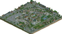
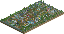
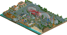
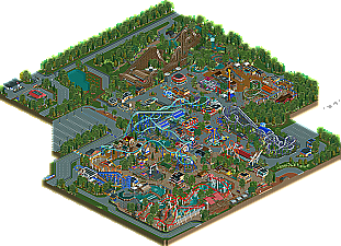
Anyway, I really enjoyed this park. Thanks to the peeps and the more adventurous color choices for the games, rides, and some of the architecture, Hudson Creek feels much more "alive" than most realistic parks. The coaster layouts throughout were also very good. Thunderhawk, in particular, was extremely well paced and had some really picturesque spots... The way the dive from the station fly-through wrapped around was probably my favorite. I also love that it was GCI with a double down... maybe it would actually have some real airtime!
Maverick's layout was a bit weaker than the rest of the park's coasters in that it used many of the same elements pretty much in the same ways (corkscrews, sudden camel-backs), just re-ordered. I feel like CP's Maverick kinda has two distinct halves in terms of it's behavior somewhat. In spite of this it's still a solid ride.
The two B&Ms both seemed a bit slow to me... Levi, which I assume to be a hyper, rather than a B&M "Mega-Lite", tops out at 65 and the first camelback suffers. Otherwise a great layout though, and I love the turn-around. Afterburn, the B:TR clone, just seemed a bit slower than B:TR. The layout and look was spot on, but it seemed to flow more than "fly", and Batman is usually more aggressive.
Regardless, this is a perfect choice for a gold park. The scale and ambition doesn't suggest a spotlight, but the atmosphere is pleasant and lively, the coasters universally solid to excellent, and the colors refreshing. Excellent work overall, and I hope we'll see you in the Pro Tour.
Ride6
The interaction, the use of colors and nice layouts.
I actually did like Thunder Canyon, although it could've been more exciting if it was 'dressed' a little more.
Overall a very nice atmospheric park, i can imagine myself being there.
Foliage/landscaping: finally no more mould patches styled foliage from you! First time I see you doing a proper forest landscape, something denser. Sadly I think it was TOO dense in most places. Around open space the density becomes very weird looking, this was most noticable around the rapids; it didn't look good there at all. Around the Boomerang you pulled it off perfectly though. I suggest you vary the density where necessary.
Architecture: an improvement! It'll never be your strongest point, but there was definitely good stuff in here among the 'Maverick stations'. The second entrance and the peach building over there look great for example.
Overall parkmaking: again, an improvement! The park was filled with rides and peeps. The park layout was pretty good, although it could do with less path. There's so much path it's almost a grid... Anyway, the park was definitely your most fun and atmospheric piece to date.
Congratulations on gold, a well deserved accolade! I see some break through improvements and room for more improvement. I hope to see you develop further.
I especially loved the pathing; Great way of spacing everything out.