Park / Sailfish
-
 19-May 13
- Views 10,231
- Downloads 1,030
- Fans 1
- Comments 32
-

-
 68.85%(required: 65%)
 Design

Kumba 90% AvanineCommuter 85% Austin55 75% disneylandian192 70% Jonny93 70% Liampie 70% Maverix 70% Pacificoaster 70% robbie92 70% Louis! 65% turbin3 65% tyandor 65% Phatage 60% wheres_walto 60% 5dave 55% 68.85% -
1 fan
 Fans of this park
-
 Full-Size Map
-
 Download Park
1,030
-
 Objects
372
-
 Tags
Tags
![park_2420 [H2H6] R4 - Reservoir Dogs - Atlantis Resort](https://www.nedesigns.com/uploads/parks/2420/aerialt2160.png)
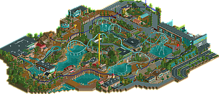
I sorta thought I was going to have the high vote as I tried to overlook the unfinishedness, especially around the bottom, and the fact that the ride either wouldn't work or crashed on me a bit. "Unrefined" would be a good way to put how I felt about some of the park. I also found the naming scheme really obnoxious but eh.
The animal statues placed around the park where amazing, and pushed my vote way up. Seriously one of the coolest things I've seen in game in a while. I think some were missing though? They layout was pretty good, I'm always up for a good intamin launcher, and the supports were awesome. Archy was good throughout, and the aquarium section felt really great.
I hope you still have some RCT in ya Sam and you to airtime.
good stuff guys.
RMM Offline
This bothered me though:
It's not funny, either.
I'm going to leave now as these jokes are starting to flounder.
Like Austin said, the statues were one of my favorite things. The sea turtle especially. I like the exhibit design and integration with the monorail as well.
The coaster had a nice flow, though I couldn't get a complete circuit because it kept breaking down. What is the point of that small piece of chain lift in the middle? I know it's slow in the roll, but it still makes it at least. I also don't think you need that midcourse on such a short coaster. I'm not sure loading could happen fast enough to make that a viable option. Lastly I'm really confused as to why the park would spend a ton of money blocking that river just to have the coaster dip down a little further. From a practicality standpoint that's strange.
The details on this map were really great to uncover so, so I hope you'll both do another design soon.
I really like the natural feeling this park has; with all those little lakes and green land combined with sand and mud it looks very realistic. I can really imagine walking there, so great job!
kudos to In:Cities for nice logo, I love it.
Sam, this is one of my favorite pieces of RCT. So proud of you young man!
amazing work though. the statues were awesome, great layout (shitty station though) and some awesome stuff around the park. lovely realism work that I would definitely expect from you, sssammy. the architecture was a little inconsistent and i couldn't really figure out what theme/style you were going for, but overall a very solid design.
also, you better hope it never rains hard or you're gonna get a flooded track