Park / Age of Empires
-
 07-December 03
- Views 18,556
- Downloads 3,133
- Fans 1
- Comments 56
-
-
 81.11%(required: 70%)
 Gold
Gold

Cocoa 90% yes Dr_Dude 90% yes Jaguar 85% yes Liampie 85% no Ling 85% no RWE 85% no csw 75% no G Force 75% no Poke 75% no Scoop 75% no posix 65% no 81.11% 27.27% -
1 fan
 Fans of this park
-
 Download Park
3,133
-
 Tags
Tags
NE Invitational
Finally, we have an update here at New Element, the NE Invitationals.
We have parks from three of the best parkmakers at New Element...mantis, Evil WME, and Micool.
Dragon Realm by Micool
Our first entry is definitely the smallest when it comes to size, but it's probably also the most unique of the three entries. No surprise there, since it's from the craziest mind to hit NE since Mala and Blitz-sama, the recent raising star at NE: Micool. His stock continues to rise, with the Pro Tour entries he's been releasing lately, "The Happy Place", two wins in Head2Head, and not to forget his placing in the Blockbuster Challenge back when that happened. He's also been added to the Radar list lately, so you know there's always something new to see from Micool. In this park, he brings together all the elements of his style and comes out with his best work yet in my opinion. Really reminding me of Buster actually with certain portions of his new park, Micool is really starting to leave a mark here at NE.
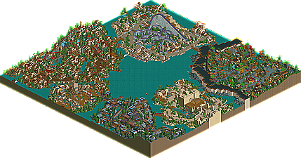
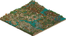
Age of Empires by mantis
How does someone win Parkmaker of the Year when they haven't ever released a park at New Element? Good question, and one that should be directed towards mantis...up until now. With "WOMB" still in the making, his Atomkraftwerk park wowing people enough to steal a victory from Fatha' in H2H2, and areas in collabo's on the way, mantis decided to settle the score once and for all and unleash "Age of Empires" on everybody, his first full-scale park at NE. Featuring five diverse themed areas, an excellent variety of unique coasters, perfect theming, and tremendous architecture. Finally people are starting to see why mantis has been getting all this praise lately, and lots of people will be eating their words by the end of it.
Candlelight Times by Evil WME
The third and final entry in The NE Invitational comes from one of the more fantasy oriented parkmakers, coming straight off his best park yet..Glyphindel Oasis Dunes and producing an even better park, Candlelight Times...Evil WME. A park filled with never before seen ideas, WME's best coasters to date, great theming, and unique hacks, Candlelight Times puts the pressure on the other parks in terms of creativity and exeuction. Evil WME has always had his own distinct style and with every park it seems to get more and more refined. There are still some raw areas of 'the Times', but i think it's quite obvious that WME has really reached that next level, the elite status at New Element.
Then I moved to mantis. Wow. The guy has the most anticipated park ever in WOMB, and releases this full mapper, as well as magnificent H2H parks in Erwindale and AtomKraftWerk, and the entropy area in the wannabe collabo? The mideival area was amazing, I agree with iris about the layout. The one that got me was the alien area. I just zoomed out one level, and viewed the theming and landscaping masterpeice that was the lush enviornment inside the steel walls. Also in the park, a hella tight SLC...amazing landscaping and landscape interaction, and a bobsled coaster. Oh, and the egyptian area
Evil's...also surprised. The Inverts were outstanding, I loved the loops at the end, and the use of waterfalls for the first drop. That alt cobra roll element was amazing, but that area lacked overall ummph in my opinion. The steel coaster was really weird...I liked it. It was amazing that the 3 trains kept perfectly in synch.
Anyways, I voted for Mantis, but was surprised at all 3. I mean, I daresay that we expect this kind of thing from Mantis haha, but micools was probably the most surprising.
Go mantis.
Turtleman
Fatha' Offline
All were nice, nonetheless.
But PoC would have blown them all out of the water...
Micool and WME, your parks were great too. Lots of new ideas and colorful, original theming. You're overshadowed by mantis' greatness at the moment, but I wouldn't feel too bad about that. We all are.
I found it to have a casual ease to it, that I enjoyed looking over. The park showes that WME has spent lots of time playing the game, and he really knows what he is doing. I didn't overly care for the the section with all the dirt for walls, but I loved everything else.
I have found myself as a handyman/mechanic/ect in three different parks total: LER, GoD, and now This. High point of all three. lol
It was a close call between this at Mantis Age of Empires.
The park was equally increadble. I think the mongolian section was the weakpoint, but even there it was quite nice. I was most amazed at the areas that most probably would consider the most boring. That would be, the greek, and midieval sections.
I was slightly confused by the name of the park, I was half expecting it to go right along with the actual game: Age of empires. I guess not.
Micools park was much better than I had expected. I thought that it showed much for skill than the Happy place did. It appears to me like Micool is now more indepth to the game, instead of just the ideas and bright colors. It had a professional feal to it, great job.
You have earned my respect micool, congradulations (haha, as if you could honestly give two shits).
Big thanks to all of you for helping to bring terrain elevation back to RCT. I get so tired of seeing flat parks and all three of you put a lot of terrain into your themed areas. I'm also appreciating the resurgence of some forgotten coaster types. Suspendeds are popping up everywhere which is the best new trend at NE as far as I'm concerned. Keep 'em coming everybody! And I've been waiting to see another good bobsled since Butterfinger's Euroscape. All of the parks featured some of the new theming ideas of the last year too with healthy amounts of custom coaster scenery and golf stations used as buildings. Oh and 2 of the 3 are on my team for H2H3 which makes this twice as exciting. If only we could somehow get our hands on mantis too...
Cheers.
Only too true, even if he won't admit it. Our initial conversation about the parks was when mantis and I were having that debate in the Pro Tour thread. mantis found the initial pages on somewhat of an accident. Anyway he told me his park paled in comparison to WME's, as WME's was smooth, atmospheric, and creative, while his was boring and cliche. Like a fool I believed him - this was after I had seen WME's park but before I looked at mantis' - since he had told me months ago that he was going to try traditional themes and styles.
When I opened the park I was in for quite a surprise. Where was the cliche? I asked. Where was this boring-ness he spoke of? Yes! I found it. Nestled in the wonderful Egyptian section was an incredibly boring piece of architecture.
I guess that was the cliche part, too.
WME's park impressed me incredibly as well. The duelers are mind-boggling - better than Moonlight Magic's IMO - and the rest of the coasters are top-notch as well. I was amused by his use of dirt walls, as I wasn't sure if the sections were complete or not, but once I realized they were I began to realize the natural beauty of the park as a whole.
And of course I voted for myself, being a pompous pig and wanting to rig the ballot box. But ignore one of those votes for me. It's mantis who should win, and it's WME who should come in a close second. Maybe if I had made the park bigger it would have had half a shot, but I didn't, that's my fault, but overall I don't regret it. I think the park works better when the viewer can only see the very tips of the four island, which in dragon realm come together on the other side of the world as well.
gym - Thanks, but good choice.
Maybe one
No actually I am very happy with your comment, and gracias. Of course I was going to have fun with the park, but another reason I built it, and a reason I made it a nominal sized park, is that I considered it an exhibition where I could show my skill (that I'm not completely incompetent), in six different ways, and in six different themes. (Yeah, it's hard to tell but that is six themes. Village of the sand people is actually egyptian/dragon midevil, and Vicaria is actually viking/"alpine," though the alpine area turned out much more midevil.)
So comes and passes the event of NE that I anticipated most. I hope you all take a good look at all the parks. Both mantis' and WME's parks rank on my top 20 without question. (If only I knew exactly what that was...)
LOL Ed. I could try to trade you...
Now, I don't want to be accused of being a Micool whore, but I just love his work. The innovation, the funness - I can just feel it seeping through the walls on his park. The coasters were great as always, and I loved the theming. Although, I must say, I liked you using the color palete that you did on THP more, but I ain't complainin. I know you'll gain Parkmaker status sooner or later if you keep it up.
Good job to the rest of you. mantis, I thought your park was great, but what turned me off was that alien section. Yes, I know some people would love it, but it didn't appeal to me. I dunno why, it just didn't.
And Evil WME, well, I'm sorry, but I just didn't really feel for your park the way the others did. I knew you had great ideas and hacks, but there wasn't much else for me. Good job, though.
2.MANTIS
3.MICOOL
I voted for mantis. I could praise every little detailed I liked and every other thing(s) I didn't like in the park now but I'm not, sorry.
I'm going to put it like that: Mantis, NE bräuchte mehr Mitglieder wie dich. Congratulations.
The park has some really strong points but is full of flaws at the same time so I liked but didn't love it. Out of these three it was the best in my opinion.
I have two words that describe Age of Empires in a nutshell - Fucking Fantastic!
Everyone has been highly anticipating WOMB but this park has gone un-noticed (mainly due to the rules of the contest) and appeared out of nowhere, it has taken me and probably everyone else by surprise. I don't see how WOMB can be any better then this. As of now I don't think there is any park better than this. Definitely my new No.1.
Yes there are faults but there is no park and will be no park without faults. I can just find so much to love in Age of Empires. I'm not going to write a full on review because I will be writing forever and aimlessly trying to think of other words to substitute in for 'fantastic, 'outstanding' and 'amazing'.
Old Coventry has such a nice atmosphere and theming and just everything. The B&M is out of this world and the architecture is simple yet complex at the same time and oozes with your style, as does all the buildings in the park. Your knack for putting colours together is incredible and it really shows in the Alien Factory. You can get so many colours to work well together like no other parkmaker and it makes all of your parks so much more solid and defined then anyone else’s and this area is the epitome of this. The Mongolian area words can't describe. At first glance it didn't look much but when viewed closely and carefully you can see the amount of detail, planning and effort that must have gone into this area is immense. Every inversion on the SLC is so intricately themed and has its own 'place', if you will. The lift going up the side of the hill is so out of the way and un-intrusive it just adds to the beauty of the area. It's just fantastic.
Congratulations Mantis, I have no bout you'll win this and you by far deserve it. I just wish PoC had been entered because if it is as good as the hype (and it would need to be) we would have an amazing battle on our hands.
Oh, and that's Ensemble Studios you are thanking for the logo in the read me
Micool: Small, but really good. I love the "Village of the Sandpeople".
Coaster's were good. Original and great.
Micool for parkmaker!
EvilWME: Brilliant hacks and ideas. Overall nice theming. The entrance to the medieval area really impressed me. Neat custom flat rides, great coasters.
Mantis: Whoa. Genius. Wonderful colours, great detail, extraordinary rides. Great use of elevation.
Great job mantis, very detailed and it looks like even if you havent, a lot of planning went into the area. (Looking at the rapids).
WME - it's unreal.
Micool - it's beautiful.
Mantis-Yours blew me away too the way you progress through the ages of civilazation , the great ideas , the colours , the buildings and my fav the COASTERS!!
Micool- Very small if only if it was bigger it would have been my favourite.
I really like the entrance area best part of the park imo.
I say you should be the next parkmaker.
Well done you 3!
~NC~
Mantis you now take my number one spot....
Micool, i dont like your coasters, the buildings are fine but the coasters are strange lol
Wme, at first you were my number one cos of the egyptian area but now manis and old coventry have topped it....
good job guys