Park / Ruishi
-
 25-April 13
- Views 14,589
- Downloads 1,204
- Fans 8
- Comments 46
-

-
 84.23%(required: 65%)
 Design

In:Cities 100% nin 95% Steve 95% wheres_walto 95% Airtime 85% Jonny93 85% Liampie 85% robbie92 85% prodigy 80% turbin3 80% Wanted 80% zburns999 80% BelgianGuy 75% Kumba 75% Louis! 75% 84.23% -
8 fans
 Fans of this park
-
 Full-Size Map
-
 Download Park
1,204
-
 Objects
305
-
 Tags
Tags
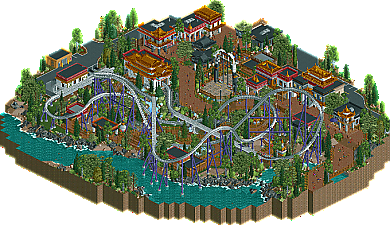

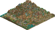
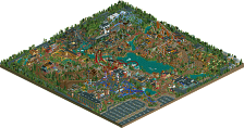
corrrrr I think I say this every time an accolade is released
Airtime Offline
You know this amazing and that I love it. The architecture is perfect as well as the ride design. The colours used are brilliant giving a really vibrant feel whilst fitting the theme (I think) perfectly. Nice to see a S&S launcher design.
The only thing that really stopped me from giving you a good 10% higher was that the rides constantly broke down. There's ways around that by hacking differently etc. I think I had to reload the design several times to get the coaster to make it all the way down the launch without breaking down.
One thing I noticed, though. I really felt like the area of the larger park represented on this map could have used one signature building. I think of Busch Gardens Williamsburg. The Globe Theatre, the Festhaus, the Piazza...each park section has a signature piece of architecture. I felt that one prominent building would have been a nice staple for the area, and would have made the map itself a bit more memorable, as the coaster really stole the show more than it needed to.
Not a big gripe. Just a suggestion. Awesome design!
This is still probably my favorite work from you, even when playing with you in H2H, because it shows both your panelist-tested metagame while being some of the more adventurous work you've done in terms of color, ride design, and theme. It's very atmosphere conscious and you've used what would have been typical, banal simple structured buildings. and formed them in interesting way. The only thing that keeps this away from 100% material is that there's not enough context clues to tell me every structure's given purpose in its enviroment.