Park / Ruishi
-
 25-April 13
- Views 14,591
- Downloads 1,204
- Fans 8
- Comments 46
-

-
 84.23%(required: 65%)
 Design

In:Cities 100% nin 95% Steve 95% wheres_walto 95% Airtime 85% Jonny93 85% Liampie 85% robbie92 85% prodigy 80% turbin3 80% Wanted 80% zburns999 80% BelgianGuy 75% Kumba 75% Louis! 75% 84.23% -
8 fans
 Fans of this park
-
 Full-Size Map
-
 Download Park
1,204
-
 Objects
305
-
 Tags
Tags
Nice work on the park Robb -- uh, I mean, Justin.
Tis good quality shit man
I don't think it's so similar to Robs BGA, they are some different styles for sure.
My only critique of this would be that i knew it already so well. I think that was a bonus and a negative, i enjoyed watching you make it, but the result was in the end i wasn't surprised by anything, nor was there that much for me to explore. I guess i would say that i want you to continue to build on streams, but maybe having a side project or 2 that you don't stream would help. I want to see something from you and explore it for awhile, rather than knowing it so well i only look at it for 10mins. Maybe that's alot to ask, but i think that would be a good step if you could swing it.
Otherwise, loved the streams, loved the design, great work!
FK
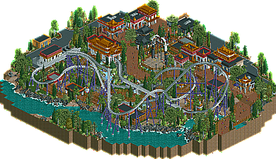
Jokes aside, this design was good. Like really, really good. Best one in a very long time, and hopefully it'll set the tone a bit for upcoming designs in the future. Everything was just great about it, yet it never lost it's main goal, that being to showcase the headline coaster, which in itself was fantastic.
Congrats dude, everyone knew you'd get it. The streams have been great fun and I can't wait to see what you have planned for us next.
Also, great logo. I love how all of the letters ended up being the same size, who could've thought of that?
Well done pac, executed really nicely. I cant find anything wrong with it. It felt weird seeing it on my own screen after watching you stream for so long. lol
good work though. feel like I've seen it all before though
I would've loved to see one sort of 'iconic' building though. the buildings were more of a facade for an extended gift shop than individual buildings with personality. something like the yak and yeti restaurant or something different would have been awesome.
but I'm just nitpicking, because it was clearly an awesome design and you know it
Don't complain about choices you've made.
Didn't realize Winter is Coming was a design, always thought it was a park, hahah. Still up there though.