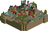
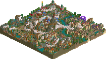
Park / Mandarin

Park_2763 Mandarin

34 Comments

  • Steve%s's Photo
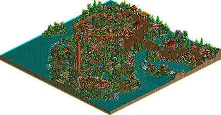
    well. here it is. have fun.

    Mandarin Download
  • tyandor%s's Photo
    Refused as NE design? Just too bad :'(
    I really like this one. The atmosphere is perfect.
  • yyo%s's Photo
    Well, Steve, this one of the few Rct2 works I've really been anticipating, ever since I downloaded the rough version from the RCT death match. Anyways, I pretty much loved it, the coaster was pretty good, except for
    the last half of the ride where it really seemed to get slow paced. The colors, however, were perfect, I wouldn't have changed a thing. The foliaging was neat, but there was an overuse of the spiky bushes, add more trees next time. What really stole the show though, was the architecture. It was awesome, I loved every little building, especially the Lotus Blossum cafe. Really, really nice.

    It may look alot like slob's work at times, but hey man, if that's what you feel like building, then build it. I usually love slob's work and I love this too.

    It's unfortunate none of our coasters got excepted, but here they might still have a chance to shine.
  • Geoff%s's Photo
    what the hell? Rejected as a design...

    Thhat sucks :(
  • Highball%s's Photo
    What the hell? I thought you quit solo work?
  • disneylandian192%s's Photo
    Obviously not. I Really like it. Atmosphere is Nice. Beautiful!
  • Metropole%s's Photo
    Very nice Steve. Design worthy IMO. The coaster layout was good, the foliaging was amazing and the architecture was excellent. Great work.
  • muuuh%s's Photo
    woa steve looks nice!

    this is a design IMO!
    your park is better then the Vemillion Design!

    i love this atmosphare and your archy!
    planting is cool.

    but the last houses aren`t so good as the first houses :(
    rest is cool.

    muuuh
  • Anolis%s's Photo
    I think it can't win the Design Spot cos it was already released.
    But it is good enough for a NE Design.
    I love the Buildings and the foliage in some places.
    More trees would be better imo. And like the others said, the Coaster ist too slow at the end.
  • posix%s's Photo
    do you get like a notification when your submission was rejected?
    steve, you know what i think of it.
  • Steve%s's Photo

    [font="tahoma"]do you get like a notification when your submission was rejected?[/font]

    nah, i just bugged the living hell out of Corkscrewed. :p

    thanks for the comments, guys. :wub:
  • X250%s's Photo
    Fantastic coaster, atmosphere and foilage was almost too perfect. :)

    -X-
  • Kevin%s's Photo
    That was awesome...

    and this was definately design worthy.
  • chapelz%s's Photo
    I'm beggining to wonder about Corkies judgement.
  • JKay%s's Photo
    Well, steve. I must say absolutely loved every bit of this. Imo, the only thing holding it back from a design was the length of the coaster. If the track had been a tad bit longer, it seems like the balance between theming and track would've been strong enough to be considered a design. The coaster did have some slow points, but nothing that really interfered with the pacing. But still, when I look at Vermillion compared to this, I really don't see any reason why this couldnt be catagorized in the same tier. The theming, architecture and atmosphere really don't get much better than this, but then again, maybe thats' why it wasnt made a design. I dunno. Either way, its good to see you finish something steve. I've been waiting to see finished work from you for a long time and this was just marvelous.
  • Kumba%s's Photo
    I think it alreddy being released mite have hurt it. Also its got slow spots and I know Corky does not like them, and I can't say the layout is perfect coz imo that turn-around is odd looking. Is it as good or better then Vermillon? Yes, but that was not released on the froums befor... and I dubt Loopy was bugging Corky ;)

    Keep at it Steve.
  • Corkscrewed%s's Photo
    Not rejected as a design... rather I couldn't make up my mind cuz it was released before... even if it was partway.

    Definitely would have deserved it if it wasn't previously released though. It's extremely nice.
  • Turtle%s's Photo
    I am seriously humbled when looking at this. I want to know why I can't build something this beautiful...
  • Steve%s's Photo
    Thanks a bunch, guys. I'm really glad you liked it. It's such a great feeling to build something and to see that people really enjoyed it.

    Thanks again. :]
  • Six Frags%s's Photo
    Steve, this is awesome.

    Your landscaping is perfect.
    Your architecture is brilliant.
    The atmosphere is classic.

    Steve for Parkmaker.

    SF