Park / Elements
-
 15-June 04
- Views 4,208
- Downloads 598
- Fans 0
- Comments 26

-
 No fans of this park
-
 Download Park
598
-
 Tags
Tags
 15-June 04

 No fans of this park
 Download Park
598
 Tags
Tags
 Similar Parks
 Members Reading
Elements by gir
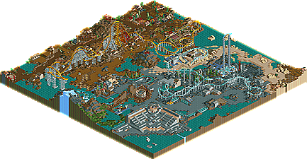
Gir was one of the more mysterious parkmakers coming into the final Pro Tour. He had a solid preliminary entry, but seemed to sneak into a weak round where it was a one-on-one dark ride contest between him and Steve, where he took the win. While his prelim was nice, this was the true test of his work, to see how he could perform on a bigger map, and just what I expected happened. Flashes of great ideas here and there, like on the freefall towers or the stadium, but for the most part he seemed to struggle filling the map with quality work. The jagged rocks seemed to be used as filler instead of landscaping, a big no-no nowadays. The coasters weren't particularly great, although not too bad...just not enough to really elevate the park. The architecture needs work in my opinion, too much 2x2 type, but I am happy to see the originality in the themes and the variances of color used throughout the map. Raven seemed to have a soft spot for this park as he placed it in his top ten in the entire contest, while most other judges had it sunk at the very bottom. I think gir has lots more to show us, and this is just the beginning of his tenure here at New Element, he's still refining his skills, and come next Pro Tour, perhaps he'll place higher.
Great job, though, Gir. Looking forward to more in the future!
Elements are best executed with landscaping, but it will create empty spots...
You've executed it pretty good though, but the theme was maybe too hard for a contest like this...
SF
The coaster design was pretty good, but where is all the landscaping? I want some green
I loved the idea for the park, the music and the colors/textures added to the feeling of the areas.
Overall not a bad job, I quite liked it. Your future seems bright!
What killed the park I think was the total lack of architecture. Or maybe not the lack of it so much, but the lack of quality in it. The buildings were so tiny, insignifigant, and undetailed... not to mention many looked totally unfinished.
The coasters were fairly strong. Especially the invert.
This park has a similar appeal to Earth by natelox. Unfortunatly, it's not the type of park that usually does very well in a contest where detail and complexity are likely to reign supreme. I like it for what it was though.
And iris, why, oh WHY did you let Pryo judge again? You deserve an evil eye:
raven was only 14 off.
What was there was pretty good, but it could have been so much more. I think it was a good idea you left out a lot of buildings, because they seemed to be your weak point... The landscaping could have been a bit better, I liked the coasters save the water one (don't really like those much anyways), and overall it seemed to flow very well.
I think if you had put a bit more thought into the landscaping, shaped up your buildings more, and put some creativeness into it (like actually make a show for the lovely stadium, make the volcano explode, things like that) it would have come out much better like raven wanted it to.
Corkscrewed Offline
I'm glad Ann got kidnapped!!!
p.s. - there's a second pro tour?
On my list so far the parks would be in the same order... 23 - rwadams, 22 - gir
on the right angle, that hyper has such an amazing helix. and that tunnel is lovely. and the station and its surroundings is very very nice.
the stadium.. guys, LOOK at that stadium. It's stunning.
a lot of buildings did look good, really, the ability is there.
the lack of foliage make the foliage that is there, thus the more beautiful...
although gir probably had the potential to improve the park bits, by simple manouvres, and there were slight "mistakes" in the landscaping, i have a feeling i'm going to agree with raven on this one.
I enjoyed it quite a bit... I thought the landscaping was quite nice, and of course, the invert and the shot towers were great as well. Plus, it was fairly original, but it just wasn't pulled off as smoothly as it could have.
The main things that detracted from the park were those horrible invert ratings (didn't see how they were what they are, but you could have tinkered with it), and the sections weren't divided as much as I figured they'd be. The atmosphere was excellent-- but there just weren't the little things to set the park off. I suppose more architecture would have been nice... I don't know. It probably would have been better with a full map.
I can't really speak though, seeing as I'm not even in the contest. Overall, good job... I'm looking to more work from you in the future!
Metro