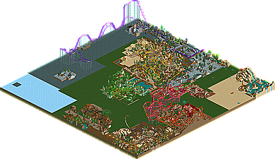
Park / Project Warlock
-
 19-October 03
- Views 1,384
- Downloads 310
- Fans 0
- Comments 5

-
 No fans of this park
-
 Download Park
310
-
 Tags
Tags
 19-October 03

 No fans of this park
 Download Park
310
 Tags
Tags
 Similar Parks
 Members Reading
Warlock II will be a single map mega with areas seperated by a tight system of rivers. Many of the themes will be carried over, each one better than the original. Also, don't ask to see it, cause I'll only be giving it to those who will be doing guest appearances.
Enjoy.
I liked the mix of fantasy and part-realistic themes. The entrance was quaint, while the Yellow Dragon area was freaky.
Aeroglobe's coaster was cool (I still don't understand how to do that hack...) but RATINGS! Same for eruption, i'm afraid. The little scenery hacks and ride hacks were good, but not consistent enough to really be an enhancing feature IMO.
I'm sure the next project will be better, because after all, practise makes perfect! I'd still recommend trying to make the themes a little more subtle - having the green and yellow themes next to each other like that kind of made me think of some of the dreadful parks I had to judge for the first Pinnacle Park round (there were good parks, but there were equally awful parks...)
Ooh, and I like m'house, too
Like I said before, a lot of the themes will be more traditional and some (like the green one) will be dropped. However, I'm still aiming for two or three pure fantasy areas. roomraider had kindly obliged to build a tilt coaster and there will be another expert fantasy ride designer helping, so the coasters in anyone's mind will be a huge improvement over these. I'm also thinking of redoing the Angry Flying Lawnmower for a NE design...
Your theming could use lots of work, but hey, you're gonna make an even better version, right? I like how your archy is very cluttered, it reminds me of early Butta' work but somehow better and more organized.
Anyways, carry over the good themes and continute this please. Please.