Park / Poplar Grove

Park_275 Poplar Grove

27 Comments

  • Butterfinger%s's Photo
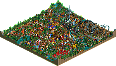
    I liked it. It had atmosphere going for it... very peaceful and serene. The architecture was also pretty, ect. Not much more to say that hasn't all ready been said.
    Whilst the other theme didn't exactly help the park, it didn't totally destroy it for me. The little military vehicles were amazing, and the planes were pretty cool as well. Coaster I didn't care for, though. I didn't care for any of the coasters actually, looking back on it. That would be what I would pick as the major flaw, rather than the 'lack of identity'.
  • Ride6%s's Photo
    The Racer can race. You just have to let it run for a while and explore the rest of the park. There are details that I haven't heard mentioned yet that may be worthy of your attention (like the heart over the tunnel of loves' enterence).

    I was hoping for 20th, oh well. Raven and Toon certaily killed that.

    And I didn't expect to hear myself say this but, THANK YOU PYRO. :D Although I know full well that is park could not possably be that good.

    And Butterfinger- could you please give me a better idea of what I did with the coasters? I just built small ones because they could fit into the "classic" theme without interfearing too much. Although they are genaric as hell.

    ride6
  • Butterfinger%s's Photo
    I just didn't care for the layouts, if that's what you mean. They didn't flow, or look very appealing in a zoned out view... to me. I don't know how to really suggest how you would make them better, coaster design is just an aquired skill I suppose. But then again, maybe no one else had a problem with them.........
  • PymGuy%s's Photo
    Well I liked this park, though like many others have said, you should have just stuck with one theme instead of showing off both.
    It would have helped alot in the consistancy and feeling of the park.
    I did like the layout of the merged coaster though, and the merging was done very smoothly.
    The rest of the park was very good, and it gave off the traditional family park atmosphere you'd expect.
    I also liked the things you did with the 1/4 blocks, some nice game stalls and such.
    This park was nothing outstanding or ground breaking, but good job ride6.
  • shameless%s's Photo
    i read the first few respones before i actually downloaded the park and looked around. the responses werent too good in general, but looking at the screenshots i was saying to myself "what the hell are these people complaining about?" from far away this park seems relativly well planned, but once i got to looking around, i found that the lay out really wasnt that good. i dont know exactly what it was, but something about it wasnt working. also as others mentioned i think, you should have worked on a more solid theme.

    now i know with a response like this its hard to think that i actually like the park, but i do, those were just my complaints. it was a nice park, good architecture for the most part, interesting colors here and there, and incredible use of 1/4 tile scenery.
  • Ride6%s's Photo
    I didn't plan the park layout well enough. The arcade next to racer and the enterence are the best archetecture in the whole place IMO and those where built first. 8@

    I'll try to do better next time.

    ride6
  • AustinPowers%s's Photo
    I think you limited yourself in some of the areas in this park. Limiting yourself is never a good thing in a contest that looking for an all-out effort. The 1/4 tile stuff was cool, and the splitter was pretty good. I didn't really like the architecture though. My biggest problem with the architecture was the roofing. The roofs just didn't look right. Too many flat pieces on the tops I think. Pretty good park overall though, you just gotta work on matching themes and making sure that you aren't limiting yourself with your theme choice, especially in a contest.
  • sloB%s's Photo
    I must say ride6, I was pleasantly surprised by the park. While as a whole, the park obviously suffered from a strange theme line-up, the splitter itself and some of the other small ideas were great.

    That's not to say this park was greatly flawed. The architecture, at most times, was very messy, as most of your architecture is these days, and the other rides in the park were uninspired, to say the least. That's the trouble with this park. While it was solid, and overall pretty aesthetically pleasing, I had trouble really getting into because of the lack of real substance.

    Anyway, it's definitley an improvement over your previous work, which basically sucked, and congratulations on not getting last place.