Park / Poplar Grove

Park_275 Poplar Grove

27 Comments

  • iris%s's Photo
    Posted ImagePosted Image

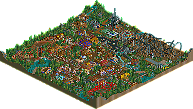
    Poplar Grove by ride6

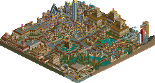
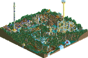
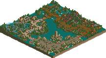
    As of late, one of the most controversial parkmakers has been ride6. With his statements that seem to iritate everyone, most people are looking for a way to drag him down. While I find him to be a solid, talented, upcoming parkmaker, I realize that sometimes his words get in the way, and he'd be a lot farther in his career if he'd let the parks speak for themselves. He's made a name for himself recently with a string of good RCT2 releases, capped off by the Runner-Up "Waters of Civilization", easily his best work. He's also proven to be a dual-game threat, making a terrific area in the RCTX collabo "Urban Midnight". This time he went back to his stronger suit in RCT2, and delievered a park that as Toon brilliantly stated, seemingly has an identity crisis. I understand the theme, but I think if you're going to build a traditional park, build it. The army stuff was the best quality work in the map no doubt, and I'd rather have had him done that the entire way, or at least just picked one of the themes and followed through, instead of two 'half themes' that left a lot to be desired. The split-coaster wasn't as interesting as I'd hoped, but the helicopters and planes built out of 1/4 tile scenery was cool, as was the custom tree. A very solid entry, and a good park to add to his already impressive resume.
  • deanosrs%s's Photo
    Congrats ride6 - you finished above what most people thought you would looking at the predictions thread. As for the park... I read your explanation and readme before hand, but here you lost some points for presentation I would imagine. You say read it first, but to make sense, you'd have to have already seen the park to know which coaster you're talking about. Also, you say that the coaster is "incredably themaed" or something, but the themeing is basically non-existant for the alien coaster - basically you just chucked some tt torches in and that was it, unimpressive if you ask me. The landscaping wasn't great for that coaster either... unfortunately, gutterflower released some absolute top quality splitters in his project, and those overshadow this big time, so the hack didn't really earn any points for innovation, most of the judges have been around for ages and have seen it before (Kumba and myself have already done it in rct2 as well). I agree with the identity crisis as well... the park basically seemed unplanned, like you had two ideas for different parks, but ended up building them as one. Some of your flat ride themeing was a little monotonous and often buildings stood out too much because they were "lonely" and too high.

    That covers all the negatives I can think of. It's definitely better than WoC, ignoring the army stuff the traditional park theme is pulled off well in places as well, specifically the arcade near the woodies. Coaster design was ok, not brilliant, but on the right side of average, and the main epicentre of the park had a very nice atmosphere. I thought where you'd built a quarter tile train engine into the path looked particularly nice, and your custom tree was also an impressive, if not original touch.

    Basically, I think you'd improve with just some more planning. Had this park known what it wanted to be, it may have been much higher. I'd still very much agree with the pt rankings so far of the 3 parks released, though.
  • Metropole%s's Photo
    The best park of the PT released so far (i know that doesn't say much) I liked the amusement park aspect of it. But that UFO coaster, despite the readme didn't fit in, and it seemed like you put i there as an excuse to show off that you can hack. It really didn't do anything for me, and kinda ruined the park for me. Some of the 1/4 tile stuff you built was nifty, and your architecture was good. But that coaster killed it for me. Sorry

    Metro B)
  • BigFoot%s's Photo
    Looks pretty good ride6. My rct2 is still not working, so I can't download, but the screens look pleasant. Though as you are aware, I'm more fond of your LL work. After G.A.L., and whenever I release the mini's, like iris said, you'll be a powerhouse in both games......surprisingly a rarity these days.

    In anycase, nice job, hopefully I can dl it soon.
  • Janus%s's Photo
    The storyline is absolutely ridiculous. It went on just fine until the UFO turned into a ... ride-able, self repairing rollercoaster...? :rolleyes:
    Also the army stuff seemed a bit overdone, sure you can be somewhat creative with 1/4 blocks, but most of it felt a bit akward. Most of it, the tank and the helicopter in particular, was a bit flat, and didn't make sense... Why do they have relatively large buildings made of steel and glass and stuff (plus an whole airfield, and a bunker...), and small temporary tents and such, just next to each other?

    Oh well, the traditional part of the park, I liked a bit more. Though all the one or two-story buildings annoyed me (some higher buildings or towers or facades would have been good), the atmosphere was ok, and I liked the train station and the large tree. The multi-coloured flowers didn't really work IMO, it looked more undecisive than pretty (much like the whole of the park, actually).
    Still a solid park with some nice coasters and themings, but it just felt strange... I like your LL work better.

    Also, I dislike the name... It's like the park, it could be good but it just misses, for me.
  • Geoff%s's Photo
    You should've stuck to either the alien theme, or the traditional amusment park theme. You would have placed higher =\

    I really enjoyed it, but the alien place was a bit radical and plain for me. The coaster was really cool....I thought.
  • mantis%s's Photo

    As for the park... I read your explanation and readme before hand, but here you lost some points for presentation I would imagine. You say read it first, but to make sense, you'd have to have already seen the park to know which coaster you're talking about. Also, you say that the coaster is "incredably themaed" or something, but the themeing is basically non-existant for the alien coaster - basically you just chucked some tt torches in and that was it, unimpressive if you ask me.

    The readme's called "Explanation - Open Park First", so i'm guessing he wanted you to look at the park, then read the readme in tandem?
    And incredibly "thrilling" looks just right for that coaster - it's a splitting multilooper, after all.

    Anyway, if this is #21 then this contest will definitely turn out to be amazing, because the buildings here all had their own character, the creativity was there and, overall, it seemed a good exercise in rct2. And I think playing about with 1/4 blocks like that should only be encouraged.

    Good work, ride6.
  • deanosrs%s's Photo
    ^ my bad :devil:
  • Ride6%s's Photo
    Glad to hear it was enjoyed. I should've stuck to one theme but I decided it was worth taking a gamble. Now I'm wishing that I hadn't, but what is done is done.

    I should've used so more conventional creativity that would fit in better. Something like the train in front of the station. And yes, you should open the park THEN the read me.

    Glad to here people are happy with my work in both games, I have alot going in RCT2 right now but there is still some LL work for rctx that hasn't been released. I wish I could've done alittle better but I'm still happy with this place and look at the difference in the score from #23 to this!

    ride6
  • Panic%s's Photo

    unfortunately, gutterflower released some absolute top quality splitters in his project, and those overshadow this big time, so the hack didn't really earn any points for innovation, most of the judges have been around for ages and have seen it before (Kumba and myself have already done it in rct2 as well).

    Just one note, IMO ride6 actually one-upped Roomie in one aspect of the split coaster. On all of the coasters in Roomie's Insania, the train came back together on flat and straight track using the 5' bend or whatever it's called, and on all but the second coaster in Insania it was after a brake run. Ride6 had the trains come back together rather unexpectedly, while twisting up a hill at full speed. Not only that, but the element was perfectly executed, in that there was no gap or anything, no sign that the train had ever been split. Ironically, in Insania, on the 2nd coaster, the sole coaster that didn't have a brake run before the reformation of the train, the reformation was done rather sloppily and gaps were evident. Maybe Ride6's was not as impressive in the overall magnitude of the innovation as Roomie's, but the way in which certain parts of the ride like the reformation of the train were carried out was even better than Insania IMO.
  • Ride6%s's Photo

    Not only that, but the element was perfectly executed, in that there was no gap or anything, no sign that the train had ever been split.

    Accully the two halfs will start to move into eachother after about 4 runs. But I did my best to get it balanced. I probably should've went with a traditional out and back wooden coaster or something, sure that area was more creative but it doesn't match.

    ride6
  • Evil WME%s's Photo
    nah. didn't like this one much. the woodie wasn't duelling when i turned it on testing, and the only thing good was the splitting coaster. The archy wasn't to my liking, the theming wasn't.

    anyways, introducting...

    If... WME would have judged

    1-20. ?
    21. Elements- Gir
    22. Country Squire Amusement Park- rwadams
    23. Poplar Grove- Ride6

    (i'll update this with each one, but leave out my own entry.)

    (yes, as of now, i agree with raven)
  • gymkid dude%s's Photo
    ya...panic i was impressed by the rejoin of the splitter as well...

    and no, im gonna go ahead and disagree with everyone, but i woulda been bored to tears had u done all traditional. That WAS nice and i do give credit those were nice buildings, even the restroom housing buildings were nice, but i liked the creative army stuff better. It coulda been awesome if you woulda done something like an army base and a war zone or something like that. I dunno.
  • penguinBOB%s's Photo
    I think it would have been cool if it were like a traditional park next to an army base, but the coaster just skewed things a bit, too out of place. Very nice otherwise... Coasters were nice, the splitter especially (but it was definately lacking in theming :|'''' ), buildings and such were good too. Just try and keep it more composed next time.
  • Tech Artist%s's Photo
    I actully liked this park. I liked it's traditonal feel, the architecture could use some work but overall it wasn't bad. I liked that UFO area, the split coaster is the first time I have seen one in action and it was awsome, I liked all the little Military vehicals as well but the UFO could use some work.
    I also liked the custom games, those were nice.

    My rating would be 6/10, mainly the atomosphere and litte details and little fun things here and there is what makes me like this park. Work on your Architecture though, that is what I
    think kills your rating. I do understand the theme and I think it is pretty neat what you did, Imo it doesn't look like 2 themes if you think about it. Nice work Ride6! :D

    I see a lot of people are saying it is 2 themes, to me it looks like a small town near a small Military base with a UFO crash site. I think that is pretty cool. :yup:
  • cBass%s's Photo
    The split coaster was nice -- not too outrageous and timed very well. Other than that nothing else in the park really had an impact on me.
  • Toon%s's Photo
    I didn't so much find it to be 2 themes as 2 separate styles of parkmaking that didn't merge together well. I much preferred the split coaster and little military sculptures to the traditional style of park. I found the main park to be rather uninspired, I was disappointed with the 'cookie cutter' style of coasters even tho they fit the theme. To me they just weren't enough to warrant high marks within the framework of this competition. As WME said, I too was disappointed that the mobius woodie did not actually duel itself. There had to have been a way to make that work. Just too many problems along those lines that left me with a rather lack-lustre feeling about this work. Nothing in the competition was 'bad' but this was definitely among the weakest entries for me.
  • Elephant6%s's Photo
    The coaster was inspiring to say the least... but nothing else really stood out. I agree with Toon on almost everything else.
  • Tech Artist%s's Photo
    Will there be one entry released tommarow since there was 2 released in one day?
  • Six Frags%s's Photo
    I like the realisticness in some places, and those custom made 1/4 tile military stuff...
    I get what you want to achieve with the two themes, but it didn't flow to well imo... maybe also because of some empty spots/overtreeing in some places...
    Still a nice park and you seem to improve with every park you make, so keep that up,

    SF