Park / Capybara Downs

Park_2740 Capybara Downs

16 Comments

  • BigFoot%s's Photo
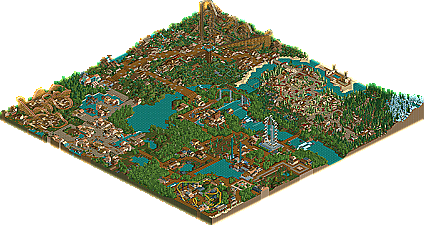
    Yet another great rctX group project that I get the pleasure to release. A totally different style than what rctX normally brings, yet a pleasing one at that!

    Capybara Downs is a park based on a mix between rides and animals, and is the brainchild of project leader Corkscrew. Featuring ares from Corkscrew himself, the korean master guljam, work from Valp, another wonderful LL section from ride6, and an entrance area by BigFoot.

    Please go here: Capybara Downs For more information and the download of the park.

    Posted Image

    rctX and its members would like to hear your comments, good and bad on our third release.

    Thanks,
    BigFoot
  • Kraken%s's Photo
    I like this park, but it had a really big flaw in my opinion-a lack of detail. When I zoom out and look at the park, it seems like I'm looking at a very good safari-ish theme park, except with "See-through scenery" turned on. For instance, in the area around Lost Beauty, the buildings look genuinely half finished. Many of the nature-ish, tree filled areas seem to suffer from this problem as well. It makes the park look very plain. The only area I really didn't notice this in was in (guljam's?) Cras Adventure section.


    I know it probably sounds like I think your park is horrendous, but I really do like it. I just tend to point out the negative as clearly as I can.
    Now, the positive...

    You guys conveyed the desired theme very well, even if in the process the park winded up looking somewhat plain. It feels very much like a Busch Gardens Tampa type park, which I think is what you were going for. The rides were well done, though I would have liked more "powerhouse" rides...it seems like you had too many "support" coasters. Good job with Caimen Falls though, I thought it was nicely done. El Jaguar and Extreme Case were also great.

    Good job overall, folks-but try not not make it so plain next time. :yup:
  • BigFoot%s's Photo
    Thank you Kraken for replying, and for your opinions. 90% of any thing wrong with the park, was my fault more or less. I took on the project simply to finish it off, and well, got a much larger section than i thought I would.

    All the themeing around "Lost Beauty", or lack there of, was my doing, as well as lack of themeing elsewhere in the opening section...In anycase, perhaps I just plum ran out of motivation for the park...

    Yet I like to think that my architecture was much improved in this park.

    Thanks for the comment Kraken.

    BigFoot/MM
  • Kraken%s's Photo
    Welcome.

    I actually don't think your archy is bad-but there would be a really nice section, and then a a big section where it looked like you got kinda bored. I'd probably rate your skills as a builder higher than what you actually built. :)
  • gymkid dude%s's Photo
    I liked the theme with the junior coaster the best, that was pretty good looking. I liked ride6's dueling woodies the best coaster-wise.

    Good to see another club still doin some LL.
  • tracidEdge%s's Photo
    I didn't really like the park. There wasn't enough in it for my tastes. I did like the coaster Extreme Case because it was hidden back in the trees. It was just way too empty for me.
  • mantis%s's Photo
    I thought some of it was very hit-or-miss. That one wooden coaster looked pretty dreadful sitting there all on its own. However, the entrance area next to it was very nice - especially the kiri style rapids bits flowing around the place.
  • Themeparkmaster%s's Photo
    Strangely I liked the bright yellow stand up coaster the most. I found it extremely realistic. Architecture wise guljams area was probably the better. The dueling woodies were also quite impressive. There was to much filler between areas though and generaly not enough to keep me that interested. Still a nice release and props on getting another group park out.
  • Ride6%s's Photo
    To tell the trueth only two or three building survived from Valp. All he did was name the Lost Safari that and build a tini bit that gave me some inspiration. All I can say about this whole thing for me was that is was very, very different. And pretty diffecult since the last thing I had built before this was Global Defence Labs in Urban Midnight. Trying to go from a hyper-complicated theme like that to something so increadably simplistic turned out to be challanging; mainly because I wanted people to be able to tell it was mine without slapping in a huge military complex. ;)

    I appolize about the amount of filler in my (and Valps) area. It was really due to the fact that I felt a need to put in two safari-adventure type rides (a tame one and a thrilling one). The Duelers aren't my best because I had problems with pacing (trying to put diagonal lifts in like that never lets you go too high).

    I hope you can enjoy this park for what it is. Thank for the replys from TPM, Kracken, Mantis and Phantom Rider.

    ride6

    ps- Posix, where art thow? You'd love at least one area of this. ;)
  • Scorchio%s's Photo
    I think it looks... um... "pleasant" - I can see myself enjoying it if it were real.
  • BchillerR%s's Photo
    Replying by the screen, I think your fencing is what takes away... I don't know what it is, whether or not you used to many, or sometimes the wrong fence for the building, or just to large of a variety.
  • Corkscrew%s's Photo

    Replying by the screen, I think your fencing is what takes away... I don't know what it is, whether or not you used to many, or sometimes the wrong fence for the building, or just to large of a variety.

    That's the screen of my area, the Amazone one, and I completely agree with you, BchillerR. That part of the park was the first one and dated back from in October (who knows even September) when I had a major fencing prob... and not to forgot a flower one too :)

    Anyway, thx to all the people who shared their opinion about the clubpark ;)
  • posix%s's Photo
    Managed to retrieve this one today thanks to RCTCA.

    ps- Posix, where art thow? You'd love at least one area of this. ;)


    Indeed Ride6 :)

    The colours in the top left area (rotation as set when opening the park) were wonderful. Interesting use of the pink flowers.
  • pierrot%s's Photo
    oh wow, it's interesting to see older works from guljam. I've never heard about this from him.
  • gir%s's Photo
    The good old days.

    I have guljam's Cosmic Kingdom of Legends and Corkscrew's Minnesota's Great Adventure if you're interested, posix. Probably some other stuff too.
  • Liampie%s's Photo
    Submit anything if it's not in the database already.
  • posix%s's Photo
    I love you gir.

Similar Parks

Members Reading