Seriously, if you tried to do something like this, it would probably be like half this and half army themed or something stupid like that...
Haha! Good one
Posix - I actually liked this more than any part of Allure Lake, probably because the buildings really appealed to me. But my favourite part is the foliage and fence-work. You are the king of mid-path theming, especially with the little fence details and formal shrubs. Great stuff. I loved the way 'Berserk' was only set to 'intense' mode
And we love you too Looking forward to Zeal, dude.
edit - oh, and even though I try and rip off your cool rock outcrops, I still fail they...uh...rock!
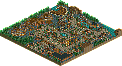
Well, I for one liked this park....it's not a contest winner, but I think it is better than the others released so far. I just really felt that the theming was all appropriate for the atmosphere and the buildings were great. I liked the station buildings the most. The picnic pavillions were great. As Mantis said also, the foliage and fencing was great. The woodie was well built (cool station too). My complaints address the barenness. I understand the look and feel you were going for with the minimalist style, but I think it was overly bare in places. It looked unfinished....not minimalistic like the majority of the park (which I liked)...but unfinished in some areas. I also would have liked to have seen one other coaster. Those are my two main complaints though. But I liked the park, and I'm glad that there are still some people who build what they want to and enjoy.
I'm another person who liked the park.
I'm not sure why I like the park but I think as mantis pointed out the architecture is really cool.
Treetop Cyclone is an awesome coaster that i'm positive I could never pull off.
If the park wasn't as bare, at the moment I think i'd prefer it but if you were to place more trees I think the park may loose the feel that it currently has, which i'm liking.
There are a couple of things that if changed could have made the park even better.
I feel that if the park wasn't as flat and there was some height variations on the paths and in the general area it would look much better, could be wrong though...
I also didn't like how you had the mounds of dirt raised above the ground for whatever reason then just had a staright drop back down to the flat land below. I think it would have been much better if the mounds levelled of from these mounds to the floor rather than cutting of to a drop.
Well Done though, I appreciate what you've gone for and I like it.
At the moment, Posix is one of my favorite parkmakers, and this only boosts his standing in my eyes. I've loved everything he has made, aside from Audrix Towers. I liked it a lot, but parts of it didn't seem like him. This is a great return to what Posix is best at. I know he's capable of pulling of brighter themes when he wants to as well, but if this is what he chooses to do, so be it. It's quality stuff, and he seems to be really molding a style that is his own, not Joe Holland's or SAC's. He has now created his own style, and is probably one of the best realistic parkmakers to touch the game.
Great job Posix, it's a shame it didn't place higher.
Thanks to everyone who understood why I did leave certain things empty. It makes me very happy when people like something I made solely for myself. I do of course understand those who didn't like the park. It's only natural that there exist different tastes, but I think you should at least be able to see that there is some certain quality in this, even if it doesn't appeal to you.
Yeah, I think Pos is probably my fave parkmaker now.
After recently just getting around to downloading 'Nagas' I noticed that Posix has a wonderful style. I love the simplicty of his work.
The park: I loved it. The woodie's layout is fantastic (loved the turnarounds), and its color scheme (although nothing original) was fitting. I also like the landscaping-or lack of landscaping I thought the huge rocks jutting out of the land was a really nice touch.
Don't even get me started on the layout.
Fuck #20. You shoulda placed higher.
Excellent work. Keep on going, man.
I fucking love this park. It really has a wonderful atmosphere. I really can feel that I am in the park. It gives me a warm welcoming feeling. Not like a park with cramped architecture. It truely reminds me when I first got rct and played with it. Anything that can remind me of the old scenerios I used to play is truely one of the best. I love those old memories of playing the game without a care. I could honestly look at this for hours. Minimalism is really actually complex. The same how Mala builds. It look messy but once you look at it again in depth it looks awesome.
I just wish peeps could go in this park. It would make it really amazing. I love peeps. You are definetly one of the best parkmakers out there Posix. Keep building like this. I love it.
[font="tahoma"]Thanks to everyone who understood why I did leave certain things empty. It makes me very happy when people like something I made solely for myself. I do of course understand those who didn't like the park. It's only natural that there exist different tastes, but I think you should at least be able to see that there is some certain quality in this, even if it doesn't appeal to you.[/font]
Yes, i can see quality to an extent. I can see the thought that went into it, and infact, it was quite atmospheric. But i still feel that it doesnt show quality parkmaking. But underneath it, you can see that a great parkmaker is behind it (for example, the woodie shows this)
You know its fine to love this park, but I take exception to people claiming it should've been higher without having seen any of the higher placed work. I'm sure you will still think so later, but at least wait to see the other parks in this competition before making such a broad statement.
I, for one, loved the train shuttle system layout/stations etc...
That got my attention the most, but the park had many other subtle scenery/buildings that were really well executed too.
Anyone notice how the music was placed precisely to allow for the sound to go back and forth in the speakers. It actually took me a while to find what rides had music on.
Not bad Posix.
I thought it was beautifully done. Except for the excessive bare lands on the side at times, it was very very nice. I like your landscaping alot, it really makes for good flow and gives a more direct feeling of the atmosphere. Your architecture is also a strong point, very simplistic but crafted really well. Your theming WAS bare, but it helped contribute to the theme. Oh, and I love the coaster. You always make good woodies.
It's a biiiig shame that you weren't placed higher, but you win some and you lose some, ya know? Oh well. Such is life.
I think this park/topic has shed light on a problem I'm seeing in the "parkmaking world".
What happened to the good old days where the ultimate goal was atmosphere? Sure, new and exciting is always great and welcomed, but we're so concerned about wether or not it's something "original" and "new and exciting", or complaining about the fact that a building isn't so detailed that it's got you wondering about the sprite limit that we seem to be missing the great philosophy of atmosphere.
Hell, all you have to do is hit the right combination and see how many pieces of "detail" you can fit on one single square. It's cramped as fuck, but now that's the "atmopshere" that everyone is seeming to strive for.
I would like to point out however that there are people who can go into a ton of detail yet still hold this amazing atmosphere (See anything that Toon has touched).
While I've yet to download this park (I believe it's LL, which I haven't dusted off in a while and don't plan on it), the pictures are amaizing. Kudos, and there's nothing wrong with placing at the bottom (Hell, I got 17th out of what, 21 for Hi-Rollers).
"Consistency is the last refuge of the unimaginative." - Oscar Wilde
That's a keeper. "Consistency" is now a bad word in my vocabulary.
As for this park, I wasn't a fan. Posix, I'm really glad that you enjoy building your parks. I think it's some sort of enlightenment when you can say you build parks for you. But if you're going to submit parks for contests and spotlights, you should accept any critisims. As for what I thought of the park: It was very bare and unbareably flat. A few players have done the minimalist thing very well, but I think you've taken it too far. The landscaping, where it exsists is just ugly. The "mini-mountains" don't fit the park and the cliff feel they have to them isn't helping. Tree placement/selection was sub par as was the architecture. In all honesty, I find it very hard to find where you spent the "13 years" building this park. The bright spot was the coaster. The layout was very classical and the short trains showed some attention to detail. My only suggestion was that for it's hieght it was too long. I would've gone with a double out and back instead of a triplett. But you can throw all that down the drain if you enjoy building your parks for you.
RCT Flame, I don't mean to make an example out of you, but the first thing you said sounds like what I've been reading in the RCT forum and I'm responding to that as well as this. There was no such thing as the good old days, nor has there ever been such a thing. That's a perception that you've created in your head. I don't blame you, we all do that, I just wanted to point that out. Atmosphere means something different to different people so if you really want to be clear about what you mean, you should define that. And you're right that people seem concerned about making up new rides and hacks and there are some people who seem to believe that more detail automatically makes something better. But I think a lot of what people are pointing out as changes in the RCT community are just the effects of having a site like this where parks get a lot of exposure. Even in the heyday of Danimation, there was never as much activity there as there is here now. The constant contests and lists and whatnot just weren't there. You could release a park once a year and no one would think it odd how conspicuously absent you were. There's something appealing to that, and it's tempting to call those the good old days, but I wouldn't go back to the way it was. Everything looks better in retrospect.
You can build parks for yourself and still be interested in what other people think about them. You can work on parks as often or as infrequently as you want to. If there's some kind of percieved peer pressure that you have to keep making parks and posting screenshots, well, tough. Being a parkmaker is not going to change anything. If you think it will, you'll probably end up quitting like Ozone did. There are a lot of people who make what they want to make and are interested in what other people think about them. I'm not going to name names cause then some people will be disappointed that I didn't mention them when I probably should. You know who you are. You take out of NE what you want to take out of it. If you make it a job than it will be. If you feel like you need recognition from others to feel good about yourself, then you're like 95% of the population. It's a very common belief. And my telling you that you don't probably won't change that.
I always have so much more to say than I actually say. It seems I'm just hijacking random topics for rants today. Sorry Posix. I haven't looked at the park yet but I will. I just think that there's a lot of squirming about that goes on when people disagree with each other and it doesn't need to be that way. The sky is never falling and nothing is ever worth insulting people over. Etc, etc. Why do I feel so defeated after writing that. Maybe because it never seems to matter what I say, things pretty much go on as they have been anyway.
Posix, I would have really gotten into this park but for the gray-rock surfacing on the flat ground. I can see where people are coming from when they talk about the atmosphere, however only from my personal standpoint of what could have been. I see the ideas and how you tried to bring out the atmosphere, but IMO the gray rock killed it. It may not seem that significant, but the degree to which it made the park look lifeless and barren pushed this over the fine line between charming and desolate. More than anything the park seemed cold to me. I really hate to say it but it looked abandoned but for the operating coasters. The fact that the coasters were running made it seem kind of like a swing still going back and forth after the kid jumps off in mid-air.
That said, I think Posix is underestimated on his skills with building wooden coasters. You seem to be able to handle speed very well and make your wooden coasters look realistic, smooth, and most of all as if someone could ride it right then. I enjoyed vastly the swooping drops and wide turns of Treetop Cyclone. Well done on this and your other wooden coasters.
"Consistency is the last refuge of the unimaginative." - Oscar Wilde
Ah yes, but "A foolish consistency is the hobgoblin of little minds, adored by little statesmen and philosophers and divines."--Ralph Waldo Emerson, "Self Reliance"
Which brings us to one point... Perhaps too much of a good thing isn't really good at all, like the baren flat rock land, what was with that? Or perhaps the whole minimalistic style, but nah, keep with that, just maybe add more flares, catchy stuff, or even *gasp* more detail where it is needed, like the ghost train theming, the landscape next to the pavilions, etc. Then yet another point, which Toon has brought up, maybe the adoration by the "statesmen, phliosophers, & divines" is not really a good thing. Maybe we should take it as-is.
But anyways... enough brain work for today. Loved the atmosphere, woodie, architecture, and over-all feel you've brought with this park. Not much else though.
This park has an elegant simplicity to it that pleases me. Each vista is well balanced and harmonious. As an exception I can only cite the wooden mouse supports which, while a staple to your idiom, have always looked a bit awkward to me.
Really, the woodie was so incredibly good, it almost made me like the entire park. I guess it was good for what it was, but even WME has certain RCT rules (!) and using those fences like that is a no-no in those. But i liked the transport ride, "spin-off" was tastefully done, and the coaster was possibly the best ever. The layout was very nice too, very tastefully done. This might even rise a few spots on my little list, depending on some of the other entries..
If... WME would have judged
1-19. ? 20. Elements- Gir 21. Darkwood Amusements- Posix 22. Country Squire Amusement Park- rwadams 23. Poplar Grove- Ride6
46 Comments
mantis Offline
Posix - I actually liked this more than any part of Allure Lake, probably because the buildings really appealed to me. But my favourite part is the foliage and fence-work. You are the king of mid-path theming, especially with the little fence details and formal shrubs. Great stuff. I loved the way 'Berserk' was only set to 'intense' mode
And we love you too Looking forward to Zeal, dude.
edit - oh, and even though I try and rip off your cool rock outcrops, I still fail they...uh...rock!
AustinPowers Offline
Twisted Offline
I'm not sure why I like the park but I think as mantis pointed out the architecture is really cool.
Treetop Cyclone is an awesome coaster that i'm positive I could never pull off.
If the park wasn't as bare, at the moment I think i'd prefer it but if you were to place more trees I think the park may loose the feel that it currently has, which i'm liking.
There are a couple of things that if changed could have made the park even better.
I feel that if the park wasn't as flat and there was some height variations on the paths and in the general area it would look much better, could be wrong though...
I also didn't like how you had the mounds of dirt raised above the ground for whatever reason then just had a staright drop back down to the flat land below. I think it would have been much better if the mounds levelled of from these mounds to the floor rather than cutting of to a drop.
Well Done though, I appreciate what you've gone for and I like it.
rctfreak2000 Offline
Great job Posix, it's a shame it didn't place higher.
Tech Artist Offline
posix Offline
I do of course understand those who didn't like the park. It's only natural that there exist different tastes, but I think you should at least be able to see that there is some certain quality in this, even if it doesn't appeal to you.
Steve Offline
After recently just getting around to downloading 'Nagas' I noticed that Posix has a wonderful style. I love the simplicty of his work.
The park: I loved it. The woodie's layout is fantastic (loved the turnarounds), and its color scheme (although nothing original) was fitting. I also like the landscaping-or lack of landscaping I thought the huge rocks jutting out of the land was a really nice touch.
Don't even get me started on the layout.
Fuck #20. You shoulda placed higher.
Excellent work. Keep on going, man.
Geoff Offline
You have showed everyone you can do a fantasy, realistic, and minimalistic park and still keep them beautiful.
Turtleman Offline
I fucking love this park. It really has a wonderful atmosphere. I really can feel that I am in the park. It gives me a warm welcoming feeling. Not like a park with cramped architecture. It truely reminds me when I first got rct and played with it. Anything that can remind me of the old scenerios I used to play is truely one of the best. I love those old memories of playing the game without a care. I could honestly look at this for hours. Minimalism is really actually complex. The same how Mala builds. It look messy but once you look at it again in depth it looks awesome.
I just wish peeps could go in this park. It would make it really amazing. I love peeps. You are definetly one of the best parkmakers out there Posix. Keep building like this. I love it.
Metropole Offline
Metro
Toon Offline
KingArv Offline
That got my attention the most, but the park had many other subtle scenery/buildings that were really well executed too.
Anyone notice how the music was placed precisely to allow for the sound to go back and forth in the speakers. It actually took me a while to find what rides had music on.
Not bad Posix.
KingArv KingARV KINGARV KingArv KingARV KINGARV KingArv KingARV KINGARV KingArv KingARV KINGARV KingArv KingARV KINGARV KingArv KingARV KINGARV KingArv KingARV KINGARV KingArv KingARV KINGARV KingArv KingARV KINGARV
thorpedo Offline
It's a biiiig shame that you weren't placed higher, but you win some and you lose some, ya know? Oh well. Such is life.
Rct Flame Offline
What happened to the good old days where the ultimate goal was atmosphere? Sure, new and exciting is always great and welcomed, but we're so concerned about wether or not it's something "original" and "new and exciting", or complaining about the fact that a building isn't so detailed that it's got you wondering about the sprite limit that we seem to be missing the great philosophy of atmosphere.
Hell, all you have to do is hit the right combination and see how many pieces of "detail" you can fit on one single square. It's cramped as fuck, but now that's the "atmopshere" that everyone is seeming to strive for.
I would like to point out however that there are people who can go into a ton of detail yet still hold this amazing atmosphere (See anything that Toon has touched).
While I've yet to download this park (I believe it's LL, which I haven't dusted off in a while and don't plan on it), the pictures are amaizing. Kudos, and there's nothing wrong with placing at the bottom (Hell, I got 17th out of what, 21 for Hi-Rollers).
natelox Offline
As for this park, I wasn't a fan. Posix, I'm really glad that you enjoy building your parks. I think it's some sort of enlightenment when you can say you build parks for you. But if you're going to submit parks for contests and spotlights, you should accept any critisims. As for what I thought of the park: It was very bare and unbareably flat. A few players have done the minimalist thing very well, but I think you've taken it too far. The landscaping, where it exsists is just ugly. The "mini-mountains" don't fit the park and the cliff feel they have to them isn't helping. Tree placement/selection was sub par as was the architecture. In all honesty, I find it very hard to find where you spent the "13 years" building this park. The bright spot was the coaster. The layout was very classical and the short trains showed some attention to detail. My only suggestion was that for it's hieght it was too long. I would've gone with a double out and back instead of a triplett. But you can throw all that down the drain if you enjoy building your parks for you.
Coaster Ed Offline
You can build parks for yourself and still be interested in what other people think about them. You can work on parks as often or as infrequently as you want to. If there's some kind of percieved peer pressure that you have to keep making parks and posting screenshots, well, tough. Being a parkmaker is not going to change anything. If you think it will, you'll probably end up quitting like Ozone did. There are a lot of people who make what they want to make and are interested in what other people think about them. I'm not going to name names cause then some people will be disappointed that I didn't mention them when I probably should. You know who you are. You take out of NE what you want to take out of it. If you make it a job than it will be. If you feel like you need recognition from others to feel good about yourself, then you're like 95% of the population. It's a very common belief. And my telling you that you don't probably won't change that.
I always have so much more to say than I actually say. It seems I'm just hijacking random topics for rants today. Sorry Posix. I haven't looked at the park yet but I will. I just think that there's a lot of squirming about that goes on when people disagree with each other and it doesn't need to be that way. The sky is never falling and nothing is ever worth insulting people over. Etc, etc. Why do I feel so defeated after writing that. Maybe because it never seems to matter what I say, things pretty much go on as they have been anyway.
Panic Offline
That said, I think Posix is underestimated on his skills with building wooden coasters. You seem to be able to handle speed very well and make your wooden coasters look realistic, smooth, and most of all as if someone could ride it right then. I enjoyed vastly the swooping drops and wide turns of Treetop Cyclone. Well done on this and your other wooden coasters.
penguinBOB Offline
Which brings us to one point... Perhaps too much of a good thing isn't really good at all, like the baren flat rock land, what was with that? Or perhaps the whole minimalistic style, but nah, keep with that, just maybe add more flares, catchy stuff, or even *gasp* more detail where it is needed, like the ghost train theming, the landscape next to the pavilions, etc. Then yet another point, which Toon has brought up, maybe the adoration by the "statesmen, phliosophers, & divines" is not really a good thing. Maybe we should take it as-is.
But anyways... enough brain work for today. Loved the atmosphere, woodie, architecture, and over-all feel you've brought with this park. Not much else though.
cBass Offline
Evil WME Offline
If... WME would have judged
1-19. ?
20. Elements- Gir
21. Darkwood Amusements- Posix
22. Country Squire Amusement Park- rwadams
23. Poplar Grove- Ride6