Park / Seven Stars Entertainment Parks Germany

Park_2733 Seven Stars Entertainment Parks Germany

743 Comments

  • Tom_Dj%s's Photo
    It's simple but it looks still nice
  • inVersed%s's Photo
    Beagle, your getting much better man.
    I like that screen a lot, pretty realistic and nicely detailed.
    Great job!
  • Phatage%s's Photo
    That castle is perfect for the theme. Only things I would suggest are to make the roof coaster track so its easy to delete to see inside and instead of having all the mario characters all the way to the right there, see if you can make the queue line not zigzag and have it go around an outside mario land with the characters dispensed along the queue. Also, why are the paths set up in grid fashion?
  • Roberto Roboparks%s's Photo
    Very realistic. Great job.

    There is one thing that seems to bother me, the blue wall where the Mario figures are; I do not like the blue there, it's too bright IMO. Try using a more pale color.
  • Beagle%s's Photo
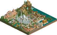
    Seven Stars is planning a new park. In 10 - 15 years Seven Stars will opening this second Park. The Park will located near by the Seven Stars Entertainment Park. So the visitors can select in which Park they want to go.

    Posted Image

    See you at Seven Stars

    Beagle
  • inVersed%s's Photo
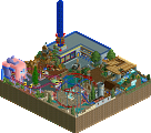
    I like it. It is blocky, but all movie studios are. It has a very nice studio feel to it do to the detail you have put into it. I think you should throw another color in there to break up the brown and gold. I am not to sure about the rocks at the side or the foliage here. It could use some shrubs and flowers. Good work overall though
  • GuestGRIDE%s's Photo
    It looks nice, but most movie studios are white or gray.
  • Highball%s's Photo
    Reminds me of Studio 1 at WDS. Great work.
  • Phatage%s's Photo
    I really like those rocks. No, I really really like them. Why don't you use them on the front of the building as well? Anyway, screen is great, you have theme parkized a studio with your choice of colors and that tent queue area, and the right choice of benches and lamps will complete the screen.
  • SenZ%s's Photo

    It looks nice, but most movie studios are white or gray.

    Not in themeparks...


    Looks nice! Really liking the supports, haven't seen that much :)
  • Beagle%s's Photo
    News

    Not only inside, also outside the park Seven Stars is building new attractions in this winter break.
    So that the guests of the "Camp Liberty" can do something in the evening, Seven Stars is building the "Burg Restaurant" between the park and the camp.

    This restaurant is the beginning of the "Seven Stars Entertainment Boulevard". This Boulevard will be developed in the next years.

    Inside the park, a new area "Super Mario Land" develops for the birthday season 1985. A roller coaster, a darkride, a restaurant and a small roundabout will be included in this area.

    The Mainstreet was extended by a further house at the entrance.

    In the middle of "Big Bear" develops the "Trapper Camp".

    Also, Seven Stars is building a new water ride in the area of 'Canada'


    Burg Restaurant (under construction)
    Posted Image

    see you at Seven Stars
  • Xenon%s's Photo
    This park has a great Disney feel to it, and I'm glad to see that all the roofs aren't just plain and flat. (I've seen that a lot and it really annoys me.)

    On a more specific note. The Burg Restaurant needs something more in the main entrance. And arch would be nice. Might I also suggest a stone base around the base of the building. I think it would look a lot better not to mention look more realistic.
  • Rhynos%s's Photo
    That's a lot of custom scenery.....

    but looks good. I should re-read this topic.
  • Metropole%s's Photo
    I agree with Xenon on this. There needs to be some kind of arch where the entrance is and have it look more like the path goes into the building rather than just stopping where the building starts. Nice work.
  • JBruckner%s's Photo
    hey everyone! welcome to custom scenery world!


    sorry, but there is just too much custom stuff there for me to enjoy it. this same thing could of been pulled off with the ORIGINAL stuff, let alone some of the more mundane toon stuff.
  • Scorchio%s's Photo
    I like all the custom scenery used - if it's available, and you have a perfect use for it in your park to try and get a certain theme right, then why not use it?


    Nice screens Beagle.
  • Beagle%s's Photo
    News

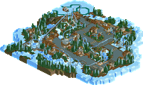
    Here it is, the first picture of the waterride in the area of Canada "Timber Creek".


    Timber Creek (under construction)
    Posted Image

    See you at Seven Stars
  • Rhynos%s's Photo
    For some reason, to me, those rocks dont actually too bad. Nice job so far.
  • JKay%s's Photo
    If you only used some landscaping.....this would be great....
  • egg_head%s's Photo
    The big roof seriously needs a chimney.
    Like it though! :)