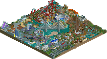
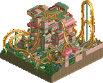
Park / Seven Stars Entertainment Parks Germany

Park_2733 Seven Stars Entertainment Parks Germany

743 Comments

  • cg?%s's Photo
    I agree with you, but still, it seems certain people need convincing, which is a shame. But, anyways, just to be nice to iBrent, here's a little screenshot. This is from a few experiments I'm doing in preperation for my next park, and is definetly NOT a finished screen of any park, and is NOT intended to advertise it. Or maybe it is? :w00t:

    Oh yeah, as it seems to be such a wonderful way of getting extra praise, there's no custom scenery! Yay! What good does it do anyone anyways?

    Attached Images

    • Attached Image: Array
  • Aeroglobe%s's Photo
    I think CG did a park in H2H2 with WME, I forget what it's called, it had a cool vertical drop inverted coaster, and had a futuristic style... am I right on this one?


    ...

    Anyways, this park is really cool, IMO... I like the realistic style of it all. Can't wait for it to be done!

    Aérôglòbe Posted Image

    *edit* -- @cg's last screen; i wish i thought of a grassy theme like that so bad.
  • cg?%s's Photo

    I think CG did a park in H2H2 with WME, I forget what it's called, it had a cool vertical drop inverted coaster, and had a futuristic style... am I right on this one?


    No...
  • Beagle%s's Photo
    @ Cg? I know that you don't like my park. This is your oppinion and that's okay, but don't tell it everytime I show a picture. Your comments are boring... with your words crap 8@

    Build your own park and make it better like me or shut your mouth :fuck you:


    So, now I will build the next (crap ;)X ) season...

    see you at Seven Stars

    Beagle
  • Evil WME%s's Photo

    No...

    yes, he is...

    but i was the only blue meanie that touched that park.
  • cg?%s's Photo
    That's what I meant, WME... stupid computer!
  • rK_%s's Photo
    Im not sure about the time spent on some of these rides but you advertise well.
    where are your feature attractions?, i dont see much steel at all.

    and cg, give the kid some credit, hes new here but hes obviously got some skill to expand.
  • tyandor%s's Photo

    Im not sure about the time spent on some of these rides but you advertise well.
    where are your feature attractions?, i dont see much steel at all.

    You seem to forget he builds this park on a time scale. Concerning he's in the year 1982 you shouldn't expect great modern steelies. However I have to say that I think a shoot-the-shute is bit odd with that picture in mind because I thought most of those rides are quite recent... ah well.

    Anyway I like most stuff, but I've always been trouble by those rocks. I think they are really ugly and take a lot away...
  • supertrooper%s's Photo

    However I have to say that I think a shoot-the-shute is bit odd with that picture in mind because I thought most of those rides are quite recent... ah well.

    Hmm...I think this may be it. you may have to copy and paste.

    http://patimg2.uspto...ey=5C6E5727E1AA

    st
  • cg?%s's Photo
    Chute-the-chutes have been around, in one form or another, since the late 1800s. They've been around in their modern incarnation since the late '70s, so, it's actually about right for 1982.
  • Beagle%s's Photo
    1983

    We could increase our number of visitors again. We had 2.3 millions visitorsin the last season. That is a rise of 200.000 visitors.

    La Onda was accepted very well by our visitors. Particularly in the summer months La Onda was very well visited. Due to the high capacity of La Onda the waiting periods were bearable.

    For 1983 Seven Stars decided, for the first time in park history, not to build a new attraction.

    For the next season Seven Stars build a bungalow camp with 480 beds


    Park price list

    Adults_______: 17,- Marks
    Children_____: 12,- Marks
    Familyticket__: 46,- Marks (2 adults & 2 Children)


    Camp Liberty price list

    Overnight accomodation___: 15,- Marks per person
    Breakfast_______________: 20,- Marks per person
    Half-board______________: 30,- Marks per person


    New 1983

    Camp Liberty


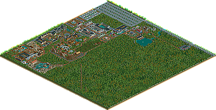
    Parkmap 1983
    (Click the map to take a closer look)
    Posted Image

    Posted Image

    Posted Image


    See you at Seven Stars Entertainment Parks (SSEP & SSES)
  • Scorchio%s's Photo
    I really love the custom supports you've got for that river-ride... they're extra-nice :D
  • Roberto Roboparks%s's Photo
    I like Liberty Camp, simple but nice.

    But wouldn't it be a good idea to connect the Camp to the area near the Chute-the-Chutes, instead of walking all the way back to the entrance?
  • Beagle%s's Photo
    News

    Posted Image

    See you at Seven Stars
  • spiderman%s's Photo
    The new screens are average. It is a good start, has some potential to be good, but its missing something.

    However Chauncey, I do love that screen. For some reason I always like your work (although very little of it is released, I guess).
  • cg?%s's Photo

    The new screens are average.  It is a good start, has some potential to be good, but its missing something.

    However Chauncey, I do love that screen.  For some reason I always like your work (although very little of it is released, I guess).

    :wub:
  • inVersed%s's Photo
    Though I dont like the park itself really. I like the concept a lot, yet however I dont feel that it is executed right. It seems plain and spaced out, the archy isnt to spectacular. The biggest theme that caught my eye negatively from the overview was the huge walk path between the hotel and the park entrance. It appears that the guess would be half tired by time they get to the entrance. The good think that caught my eye was the well done parking lots and the realism of the cabins. Also maybe put trees closer up to the cabins to enhance the forest like feel.
  • Madhollander%s's Photo

    Though I dont like the park itself really. I like the concept a lot, yet however I dont feel that it is executed right. It seems plain and spaced out, the archy isnt to spectacular. The biggest theme that caught my eye negatively from the overview was the huge walk path between the hotel and the park entrance. It appears that the guess would be half tired by time they get to the entrance. The good think that caught my eye was the well done parking lots and the realism of the cabins. Also maybe put trees closer up to the cabins to enhance the forest like feel.

    totally agree, the path from the cabins to the park is WAAAAAAAAAAAY to long and it runs trough the middle of nowhere, imagine standing at the start of the path at the cabins looking down that long paht to the round area at the end, i would'nt want to walk that, i'd get back in the cabin... plus the area could seriously use some trees, it's so blank around the cabins, and a parkinglot especially for the peeps in the cabins would be nice to.

    looks nice for the rest, i'd like to see this develop. :yup:
  • Beagle%s's Photo
    News

    Exclusively, the first look (Artwork) at Big Bear. :D

    Posted Image

    See you at Seven Stars
  • Evil WME%s's Photo
    I think there's something wrong with your computer.