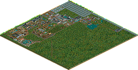
Park / Seven Stars Entertainment Parks Germany
-
 31-December 08
- Views 70,679
- Downloads 796
- Fans 4
- Comments 743
-
4 fans
 Fans of this park
-
 Download Park
796
-
 Objects
427
-
 Tags
Tags
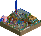
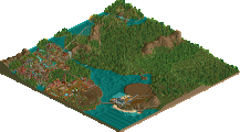
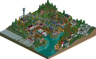
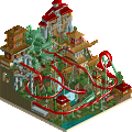
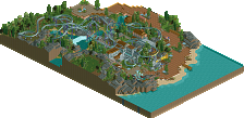
Now you can take a look at Seven Stars...
Happy New Year!!!
Here it is... the Seven Stars Download (Season 1992 Preview)!
Attention: It's only a preview! A few things are different to other
version you have seen at this thread!
Download Seven Stars 1992 (Preview)
But I think, it's enough for the first look...
Seven Stars wish you a happy new year!
Beagle (SSEP & SSMS)
Each area is pulled off amazingly. The peep's view must be astonishing.
I loved each coaster's layout epsecially the woodie and the bobsled.
I don't know whether you took inspiration from Europa Park but this definately reminds me of it.
I really liked how you put glass rooves on top of the buildings hiding attractions as it meant you didnt really have to destroy the building to see inside.
My only issue is that now you've changed the Super Mario section, that it's not going to be as good as it was in this download. Going by the recent screens you've shown they just dont seem as good as the area that was already there.
But i'm really looking to future updates and releases.
Congratulations for finally releasing this after so long.
a few things i wanted to mention. your "system" is very strong and it works wonders. however, i am worried it might "consume" you too much at some point. like, it's very clear you build a main path and surround every "item" with a roof, gardens and shrubwork. the main path is also almost always split up by trees or more garden clumps. it's totally lovable. however, sometimes you get the feeling you rely too much on it.
the pacing of ikarus after the mid break is too slow. i was wondering if that's intended though. wasn't sure. just felt it was a little slow. the queue line of the coaster also felt too short. considering it's such a major ride, you'd expect there to be a rather long queue.
for the marioland area, the park had to sign contracts with ninteno as mario is their mascot, right? so maybe add the logo of nintendo here and there? how about an arcade with nintendo classics or a "nintendo museum" or something like that.
i really hope you will finish this one day. what are your plans? are you intending to fill the whole map with park and facilities? or give latter their own map?
posix has already mentioned the 'flow' and realism of the park. Even just looking at it in RCT, you were really thrust into the environment and you could easily imagine visiting this park in real life.
The Viking wooden coaster was top notch - awesome stuff. A strong, realistic layout, but not one where I was left thinking 'I've-seen-it-all-before'. The Bobsled coaster was also splendid, and I can't think of any other bobsled rides pulled off that well in RCT. Lots of nice indoor rides, and well-presented flat rides. The Top Spin is clearly influenced by Talocan, to the point where it's nearly a carbon copy, but who cares, it was done so well.
The theming is just how I like it - it's not over-the-top to the point where it's unbelievable - instead it is exactly how a real park would theme its attractions. This again adds to the realism of the park, and gives the whole thing this extra depth.
I like your approach to building - again, posix has touched on this. You look like you segregate an area, build the attractions, then theme them up. This gives each attraction or section of the park its own identity, and again is how a real park would build their rides. I see you've already 'fenced off' an area for the next installation.
The only negative is unfortunately actually quite a big one - the B&M Stand-Up coaster. It just didn't work for me at all. In comparison to the rest of the park, it's ugly and stands out like a sore thumb, despite being a dull grey colour. Not something I usually pick up on, but it really could have done with some custom supports too. Didn't like the layout one bit; considering you've gone for realism with everything else, I didn't like how the first half of the ride's layout was actually very unrealistic. And then the second half of the ride is poor because the mid-course brake takes all the pace off the train.
I wouldn't make such a big deal out of it, but I get the feeling that it looks like Seven Stars' big attraction, and when you consider how great everything else is, it's a disappointment that the ride which is meant to be the star attraction is actually poor in comparison with everything else. I think the park would have worked much better without it -- Viking would have the 'star attraction' and all would be well
Sorry I've spent a while detailing my dislike of the B&M - I do stress that that is the one negative about the park - I really really loved everything else, and thought it was an awesome release. Interested to see where you go with this, considering this seems to be a 'semi-release' rather than a full-release... Great stuff so far though.
Here is the first update after a long time!
In the new Season, Seven Stars decided to rebuild the
"Super Mario Land" section.
The first new attraction will be an Enterprise at the place,
of the "Super Mario Show"
Take a first look...
See you at Seven Stars
Beagle
Edited by Beagle, 13 May 2009 - 09:04 PM.
Screen looks awesome. As always. Although I did like the little Super Mario Show. But maybe you're right with replacing it as there were already a bunch of shows near it.
I still hope that one day this park will be finished.
As usual, the sceen is great. Atmosphere is something you never miss.
See you at Seven Stars
Beagle
Best kick of 2010.
edit:
how is it 2010?
last time I checked you were in 1993 with your park.
Edited by Fisch, 19 February 2010 - 03:16 PM.
Because this will be a new Seven Stars project!
best regards Beagle
Is it gonna be in Miami? I thought of the above series right away, but couldn't typed it a few minutes ago ...
but how come a new project? what happened to the other?
Will DEFINITELY keep an eye on this.