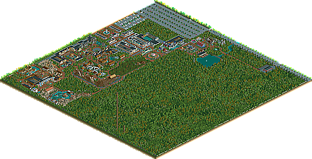
Park / Seven Stars Entertainment Parks Germany

Park_2733 Seven Stars Entertainment Parks Germany

743 Comments

  • Nokia%s's Photo
    i love it with a passion.
  • posix%s's Photo
    the queue line is just so gorgeous ...
    such a simple ride and it lives SO much! that's what's so amazing about your parkmaking. you even managed to integrate the steam train well with it ...
  • Beagle%s's Photo
    Thanks a lot! :)


    Next to Yoshi Jr. the new railroad station "Super Mario Land"...


    Posted Image


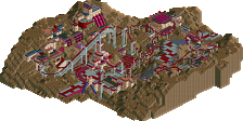
    And an overview how large the new section will be!


    Posted Image


    Beagle
  • Todd Lee%s's Photo
    I love the 3 brown huts. They look just like the little bad guys/mushrooms/whatever they are.
  • Brent%s's Photo
    It kinda reminds me of BonBon Land...

    But I'm liking it.
  • Beagle%s's Photo
    "Toad's Flying Mushroom" has arrived at the new "Super Mario Land" section...

    Posted Image


    Now Yoshi - The Coaster is getting his theming... The first step is taken! :)

    Posted Image


    See you at Seven Stars Entertainment Park

    Beagle
  • Todd Lee%s's Photo
    I love that ride! I don't think you could have themed it any better than that. The mushroom buildings are excellent (station included), and the green castle is perfection. (the green makes it blend in a little bit, but not too much.)

    Edit: Actually, the coaster does have 1 minor problem.. The first drop is way under supported.

    Edited by Todd Lee, 12 December 2008 - 08:28 AM.

  • Steve%s's Photo
    I like the idea of having the bigger ride with the "Jr." version of it accompanying it, but I feel like the bigger Yoshi ride looks too tame to have a smaller version of it. I could see the same audience (smaller children) being attracted to both rides. It would make more sense if you made the big Yoshi coaster a little more rough; I'd suggest a new coaster type and maybe even a loop? That way it would be easy to distinguish the kiddy rides from the rides geared more towards teens and adults.

    I still like where it's going, though.
  • Xophe%s's Photo
    I love the cartoony look you've got going here and those curvy roofs are really nice. Not so keen on the crappy custom scenery but I guess it's kind of necessary for the theme.
  • Katapultable%s's Photo
    Don't get me wrong, I like the park. It has an Europa Park feeling to it. But the Super Mario section doesn't fit in, in my opinion. And two Juniorcoasters right next to each other... Like Steve mentioned, make it more teen/adult oriented. The rest of the park looks totally awesome. I like the idea of a pannekoekenhuis.
  • Todd Lee%s's Photo
    I just noticed the "toad" house. (red and white) Very cool. Nice choice of colors and ride placement.
  • JDP%s's Photo
    Having the same type/ style of coaster next to each other is irking the hell out of me and also having two coasters in a kiddie area at that. Don't get me wrong, it can be done, just not the way you have pulled it off here (for both subjects). They are way to close to each other. Another thing is what's with only having 5 cars on that train. For a coaster of its size, it should have a lot more.

    Other then what I mentioned, theming and everything else looks fantastic.
    -JDP
  • Beagle%s's Photo
    @JDP... You are right... now the trains are longer (9 cars)

    @Todd Lee... The problem with the missing support is fixed! :)

    @Coaster King... since 1985 the "Super Mario Land" section existed at Seven Stars Entertainment
    Park. It was, it is and it ever will be the main section of the park! But it was the time for a makeover... ;)


    So, "Yoshi - The Coaster" is nearly finished...

    Posted Image


    See you at Seven Stars Entertainment Parks

    Beagle

    Edited by Beagle, 17 December 2008 - 02:39 PM.

  • Splitvision%s's Photo
    I think you have a fantastic atmosphere going on here. Only complaints I have is what others have mentioned - it looks wierd with the same coaster type so close to each other. I'm also not too keen on the mushroom houses, I think it is their colour that bugs me. And maybe they should have a bit more detail. The Yoshi Coaster is immensely cute :D And I love the paths, it's really the perfect path for Nintendo themes.

    Edited by Splitvision, 17 December 2008 - 11:56 AM.

  • Goliath123%s's Photo
    Nearly finished?
    The parks great man and so's the coaster!
  • nin%s's Photo
    To be honest, this entire section looks a little amateur for you, Beagle. Yes, it is good, but imo it doesn't quite match up with the rest of the park. I'm not quite sure, but it be because of the way your making the buildings, rides, etc. I don't know, it doesn't quite represent the "Mario" universe. I see what you're going for, but I don't think you've quite grasped the concept.

    On a side note, the Yoshi coaster looks pretty neat, reminds me of Coastersaurus over at Legoland California.
  • posix%s's Photo
    i agree with nin. the recent screens don't look up to par to what you usually show.
  • Cocoa%s's Photo
    ^Really? I think it's really good, the same quality as always.
  • Beagle%s's Photo
    @Posix
    I think the reason why you think so is, because I didn't show unfinished screens in the past.
    But when the missig houses and attractions are build, I hope you will change your oppinion!

    (Das Bild, was ich vom Themenbereich im Kopf habe sieht natürlich ganz anders aus,
    aber es fehlen halt noch alle Dinge, die die gebauten Gebäude und Attraktionen zu
    einem Themenbereich verschmelzen lassen. Es ist halt mein System beim Bau erst
    die Fixpunkte eines Bereiches zu bauen und dann erst den Rest. Aber vielleicht ist es
    zur Abwechslung ja auch mal ganz spannend zu sehen, wie bei Seven Stars ein
    Themenbereich wächst und entsteht!?! ;) )


    Best regards Beagle
  • JDP%s's Photo
    ^Yeah some finished screens would do wonders.
    -JDP