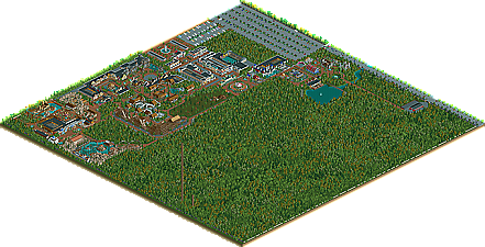
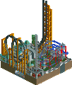
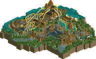
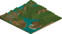
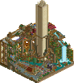
Park / Seven Stars Entertainment Parks Germany

Park_2733 Seven Stars Entertainment Parks Germany

743 Comments

  • Scorchio%s's Photo
    What on earth is the Nivea Children's World s'posed to be? It looks bland and boring, even if realistic.
  • cg?%s's Photo
    It's nice enough, I guess, but I don't think RCT2 is nearly as well suited to this style as RCT, or even RCT3. It demands either a degree of simplicity RCT2 is nearly incapable of, or a degree of detail RCT2 is nearly incapable of, and to really make it work takes a very skilled hand. Judging by the sloppiness of these screens, you do not have a very skilled hand.

    Still, it's nice to see a park like this. Make me a bit nostalgic for the early days of the "NE style" (long before NE, actually), which really started with things like this, and then evolved into what we know today. Ah... memories.

    Well, whatever.

    Even if you could pull this off well, I doubt I'd like it. Realism is incapable of ever being as truly captivating as reality.
  • Beagle%s's Photo
    It's a small area where you find a few attractions for kids. This Area is sponsered by "Nivea".
    You can find those areas for example at the Europa Park or at the Heide Park.

    Take a look here and will understand what the Nivea Kinderland (Childrensland) is :lol:

    Europa Park

    Beagle
  • Beagle%s's Photo
    1981

    In the season 1980 the visitor rise was enormous. We had 1.9 millions visitors. 400.000 visitors more than last year

    All our measures in the last season to increase the capacities were made by the large visitor increase niece.

    IOur new park extension should solve the problems, but we do not believe it, because the new main attraction is in direct proximity to the netherlands area.

    With the building of our first rollercoaster we want to solve the problem of the capacities. Finally we have an attraction in the park, which has a very high capacity

    In the new season the ticketprice for adults rises to 14 Marks and for children rises to 10 Marks.

    The family ticket: With two adults the children pay only half. That means: Parents with e.g. two childrens pay only 38, - instead of 48, - Marks.


    New 1981

    Mexico

    El Loco - Rollercoaster

    Estación - Seven Stars Express

    Grachtenfahrt


    Park Map 1981

    Posted Image

    Posted Image

    Posted Image

    Posted Image

    Posted Image


    See you at Seven Stars Entertainment Parks

    Beagle (SSEP / SSFF)
  • sfgadv02%s's Photo
    Wow, the park continue to impress me alot. :D
  • cg?%s's Photo
    Why? Because of a completely terrible mineride coaster? Wow! There's a turn! Wow! There's a helix! Wow! There's another turn! Wow! There's another helix! Wow! There's a "dip" (and even that is pushing it)!

    Pathetic.

    You know, "realistic" parks are allowed to have good rides!
  • posix%s's Photo
    hahaha, so true.
  • Hexiage%s's Photo
    hi beagle, dien park sieht gut aus.
    die architektur deiner häuser sieht sehr real aus!dein stil gefällt mir.
    der minencoaster sieht aber noch ziemlich unfetrig aus, aber das eingangshaus sieht gut aus.
    dafür gefällt mir der bahnhof der eisenbahn nicht!die farben, die archy, gefällt mir einfahc nicht!
    aber mahc wieter so!
  • Roberto Roboparks%s's Photo
    The Powered Coaster looks terrible, and the theming doesn't really strike me as realistic, but Grachtenfahrt is actually quite nice.
  • Beagle%s's Photo
    I believe some of you didn't understand what Seven Stars is. It is a Park with a story. El Loco is the first coaster in the park. It's 1981 and not 2005. So the coaster is very small and the theming is bad, I know, but it is typical for a park in Germany 1981.

    For the next year the plans are, to complete the theming of El Loco.


    Thats the plans of Seven Stars, how El Loco look like next year

    Posted Image

    Posted Image

    See you at Seven Stars
    Beagle
  • Highball%s's Photo
    I think once that screen is seen in game it won't look that great. The structure is simple, and the rockwork is overpowering. Try throwing in some trees and maybe some architecture into the mountainous area to help with that.

    And don't make the building a square. Try altering the shape a little to spicen it up.
  • Roberto Roboparks%s's Photo
    I agree with Iceman. The rocks might look overwhelming in-game.
  • Testudo%s's Photo
    :OMG:

    Wow! Just f-ing fantastic!

    Amazingly well done architecture. It's very, very realistic. Bravo on the presentation, too!
  • Toon%s's Photo
    ^Blast from the past! Love it when old members make appearances.
  • Powersun%s's Photo
    Hey Beagle!

    Schaut echt schön aus .. zwar sind die Berge etwas einseitig .. aber wie du schon sagtest ... es ist 1. 1981 ... 2. Deutschland nicht Amerika *g* ... und 3. ist dies hier NE und die haben glaube ich nicht wirklich Ahnung was du überhaupt mit dem Park erreichen möchtest bzw. darstellen möchtest. :(

    Naja ich bin auf jedenfall auf den 2. Bauabschnitt des Bereiches schon sehr gespannt.
    Ich hoffe es kommt noch mal ne Neuerung für das Nivea-Kinderland.

    Bis dann Flip
  • Phatage%s's Photo
    I actually disagree with Iceman here, this is one of my favorite screens I've seen in a while; its just so real and I can see myself riding that coaster for a cheap credit. The layout isn't anything special, and yet its perfect for the powered mine train type of ride that it is. I hate it when people turn mine trains into thrill rides that young children wouldn't even think of riding, the whole purpose of any mine train is to be a family style coaster with lighter pacing and heights. The theming is just so realistic, I would maybe take out some of the rocks in the last turn and put maybe another wagon or some other sort of theming that isn't architecture there, because you already have only rocks where the 2nd helix is and I really think adding anymore buildings would just ruin the great feel that you have going on here. The station is perfect, especially for the ride and theming. I love the rooves looking like they aren't brand new and the path layout and canopes and everything are layed out so realistically. I also love how you're making a story with this park; that the park wasn't built overnight and that it has a history: it has a life! This is seriously the park I'm looking foward to the most when completed, keep it up!
  • Hexiage%s's Photo
    hey beagle, ich mag es auch! es ist schön real, zwar en bischen einseitig...vielleicht hättest du noch mehr bäume/büsche mit einbringen sollen,aber egal.
    und mach dir nichts draus,wenn manche ihr deinen park nicht mögen, ist halt NE...
  • Beagle%s's Photo
    News

    In the next season, Seven Stars will build a Splash. The name of the Splash will be 'La onda - the wave' The Splash will be placed in the mexican area of the park.

    Here two picture of 'La onda (under construction)

    Posted Image

    Posted Image


    See you at Seven Stars

    Beagle
  • Dark-Daxter%s's Photo
    With the realistic thought i think its a bad ride. The ride doesnt have a good splash, its goes up right after the splash. But the rest looks fine.
  • mantis%s's Photo
    Not sure about the lift hill being visible on that short rise - could you hack river ride in the reverse direction down that bit so that it covers up the lift hill with water? I really like the whole layout of it, though - very well thought out IMO.