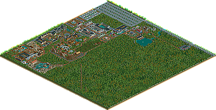
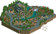
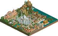
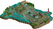
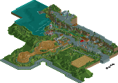
Park / Seven Stars Entertainment Parks Germany

Park_2733 Seven Stars Entertainment Parks Germany

743 Comments

  • Ling%s's Photo
    it looks pretty nice, but I would like to see an actual screen. That archy looks amazing.
  • Leonardofury%s's Photo

    I have to agree with Nitrous. It's ok, I don't see why everybody is raving about it.


    I like it especially because of the view the guests would get. Imagine looking at a deep water filled canyon from that path and then watching a rollercoaster plummet into it.
  • dr dirt%s's Photo
    I really don't like the trees in the middle of the mountain-area. Also the small building to the left looks strange, it looks like you decided to make it just so the rollercoaster has another tunnel. I wouldn't mind if it weren't so tall and thin, it's something a real park would probably not do imo. The rest looks good, and I love the mountain idea.

    Edited by dr dirt, 24 November 2006 - 08:56 AM.

  • Beagle%s's Photo
    The complete Coaster is under construction. So, the tower on the left
    is standing alone, because the other things (houses, mountains) aren't built, yet.

    On this screen you can see that the left and the right areas are not themed yet...

    Posted Image


    it's not magic... it's Seven Stars Entertainment Park

    Beagle
  • eman%s's Photo
    Can't wait to see the finished coaster with theming. :)
  • Geoff%s's Photo
    It's so different from what we regularly see in RCT. But, I could imagine something like this in a real amusement park. I really like it.
  • JDP%s's Photo
    that looks soo different. lay out wise, for rct2.
    -JDP
  • Kumba%s's Photo
    I got to admit this park has not impressed me that much, but if you send it in for spotlight (Do you plan too?) i'll take fanfare into consideration a little, 500+ replys is amazing, I think you can get a SRU at worst by the look of things.
  • vekoma9%s's Photo
    I have been looking at this since the start, and it looks pretty good. Your buildings are amazing, but the coasters aren't that great. That is the only part that kills the park a little. Other than that it is a great park to look at.
  • Ling%s's Photo
    wow, looks great, Beagle
  • ][ntamin22%s's Photo
    kind of awkwardly placed, there...
    i dunno, i don't think this one wroks quite as well as your previous coaster efforts.
  • Genius638%s's Photo
    the photoshopped pic looked better...this coaster looks really out of place here.
  • JDP%s's Photo
    ^Its different. Thats why i like it. Everyone is just used to seeing the normal and not the unnormal... if that makes any sense.
    -JDP
  • Gwazi%s's Photo
    ^ ...abnormal... Not unnormal. :p

    From a distance, it looks nice. I don't know if I'll be able to tell until you finish it how nice it really is, though. Keep going. ;)
  • ][ntamin22%s's Photo
    i don't mean the custom rocks and such (though they, too, work less well in this screen than previous ones) i mean the way there's a block of fully themed coaster surrounded by flat blank land. it just doesn't fit... the poor Arrow looks so scrunched it might as well be a wilde maus.
  • Beagle%s's Photo
    Posted Image

    The first Seven Stars Entertainment Park - Homepage is out now!!!

    The page isn't complete... but you can take a first look.


    Seven Stars - Homepage

    or click on my signature...


    It's not magic... it's Seven Stars Entertainment Park

    Beagle

    Edited by Beagle, 02 May 2007 - 01:36 PM.

  • zodiac%s's Photo
    Does this site have an English version cause I cant exactly read German...
  • Beagle%s's Photo
    It's under construction...


    Beagle
  • J K%s's Photo
    Im really impressed. The fact that you've done that makes me love this project 10 times more because you are obviously commited.
  • eman%s's Photo
    Absolutely amazing man. I can't read the website of course, but the layout and mass of images and stuff is awesome. I really cant wait for the release on this one!