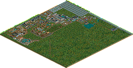
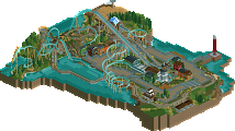
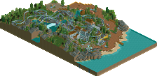
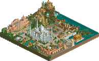
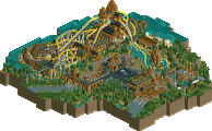
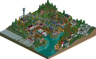
Park / Seven Stars Entertainment Parks Germany

Park_2733 Seven Stars Entertainment Parks Germany

743 Comments

  • supertrooper%s's Photo
    I still love it and think you are brilliant.
  • Panic%s's Photo
    Rocks and small variations in height do make a difference, Ling. All I know is that there's no finer demonstration of how single-minded RCT2 parkmaking has become than ridiculously detailed custom scenery buildings and theming on completely flat ground, along with coasters of mixed quality.

    BTW Beagle, I have no problem with Big Bear looking like Robin Hood objectively. For all I know, that's perfect for realism and a good call. That part was entirely addressing people swooning over it as if it was the most novel thing ever.

    And Ling, I would say something about how much you post in the AD, but I did the same thing at your post count... :D
  • Ling%s's Photo
    That's why I can't make my way in this place, then. I suck at buildings.

    And what the hell did you do to my post count?
  • Panic%s's Photo
    when I had as many posts as you do now, i mean.
  • posix%s's Photo
    panic, and most others of "you guys"; you're just portraying you haven't understood the whole point of realistic style parkmaking. and truly if i had your horizon i'd hate this park.

    you're telling the guy he's too lazy to terraform, to make actual rooves...

    i wonder why you don't realize just what an inhuman amount of planning and concept work went into this park before the actualy practical part of constructing it in game.

    what people praise about this park is not really the complex design of the buildings or landscaping, it's how skillfully beagle manages to take us into the world of seven stars, how much we feel like being in his park, watching it progress as if it's really happening.
    that's the art of realistic parkmaking.

    it's so exciting.
    especially seeing sterile dull buildings with ugly rooves because guess what, they're new and exactly looking, feeling, smelling, .... like they would in a real life park.
    same for those rocks by the way, or any other "ugly" spot in this park.


    in other words,
    this is the best advertisement i've ever seen.

    :)
  • JDP%s's Photo
    anyway... i still love this park and I am just going to live with your coaster designs :happy: ...your adv. screen of the stand up looks really sweet. Your an artist in and out of the game, lol... another thing, dont let people get to you is because not matterrrrrrr what, there will be always one person whos dont like someones work.
    -JDP
  • Ling%s's Photo
    I think I agree with that^... I can't really tell...

    I love your park, Beagle, and can't wait to see it myself
  • trav%s's Photo

    panic, and most others of "you guys"; you're just portraying you haven't understood the whole point of realistic style parkmaking. and truly if i had your horizon i'd hate this park.

    you're telling the guy he's too lazy to terraform, to make actual rooves...

    i wonder why you don't realize just what an inhuman amount of planning and concept work went into this park before the actualy practical part of constructing it in game.

    what people praise about this park is not really the complex design of the buildings or landscaping, it's how skillfully beagle manages to take us into the world of seven stars, how much we feel like being in his park, watching it progress as if it's really happening.
    that's the art of realistic parkmaking.

    it's so exciting.
    especially seeing sterile dull buildings with ugly rooves because guess what, they're new and exactly looking, feeling, smelling, .... like they would in a real life park.
    same for those rocks by the way, or any other "ugly" spot in this park.
    in other words,
    this is the best advertisement i've ever seen.

    :)


    But...the way you advertise a park doesn't make the content any better...Just think about it posix...How much did you see slob or Nate or anyone like that advertise? I bet they didn't advertise as much as Beagle here, and then, when they released their parks, it sucks you in, it may not be completely realistic, but then again, is anything you can make in RCT completely realistic?

    I think that in RCT, this realism and fantasy thing is bullshit. The people who do realism just want an easy way out, because "realism is minimalism" *I've seen that in another thread somewhere, can't remember where*. But then, there are people who can stay on the realism side of the line, but still actually make it look good, by putting a few fantastic ideas in. And guess what, the word fantastic is deprived from fantasy! *I know that is a fact because we spent a whole hour talking about it at school last week*
  • Panic%s's Photo
    I agree exactly with Trav's first point. Superb advertising doesn't make an actual park any better. It just makes the advertisement better.
  • posix%s's Photo
    you misunderstood that.
    i didn't say the park is so good because the advertising is.

    i've seen a similar park like this from paul. a parkmaker from rct-guide.nl.
    it was the first rct2 park that came close to awe me like those parks in the good old ll days. it was never advertised, alright?
    i won't even link it. you'll find it ugly. very. and furthermore, dull, boring and "easy-way-out". so don't worry :)

    really, right now i feel this debate is pointless.
  • Metropole%s's Photo
    I like to aim for realism trav, but I dont do it because its an easy way out at all. I'd say its the complete opposite in fact.
  • Beagle%s's Photo
    I know that some people mean, NE Style is the one and only way to build a park... but I think so.
    Realism isn't minimalism, it's just another way to build a park. And if someone didn't built a park with a history, like Seven Stars, he can't judge how difficult the planning is...

    You don't like the Seven Stars style, and I don't like the over themed and childlike NE style, but it doesn't matter, because I have fun to build a Park like Seven Stars and that's the main thing, I think. :)

    News

    Seven Stars presenting you two new artworks (under construction)

    Posted Image

    Posted Image


    It's not magic... it' Seven Stars Entertainment Park

    Beagle

    Edited by Beagle, 17 October 2006 - 02:11 PM.

  • trav%s's Photo
    You aim for realism, but do you or do you not have fantasy in your parks as well?
  • Metropole%s's Photo
    Of course I do Trav, the whole of safety in alarms is fantasy in that I formulated the ideas in my mind, and that the rides are all based on fantasy creatures (which is somewhat unrelated). But I blieve I build it in a style that is realistic in that I include realistic details and research into theme parks & companies to formulate my coaster designs, buildings. theming etc. To me, that isnt the easy way out.

    Saying that, I think we should direct further comments to RCTFans topic in the Discussion forum.

    Beagle, the park's looking great! I really do enjoy the way you are advertising this. And what you say is totally true. Look forward to the next update!

    Metro 8)
  • JDP%s's Photo
    Screens look pretty good. I never was a fan of the "paintings" but it does look nice. Second screen looks really intresting, nice work Begeal.

    And for the record Trav, I rather look at a park the aims a realisim then fantasy. Thats why I can't wait to see some of Geewhzz's work to be released and thats why I love this park so much. But hey thats just me...
    -JDP
  • zburns999%s's Photo
    Screens are looking pretty nice as usual. The entrance-way for Ikarus is pretty convincing. Not sure about the white building by the tilt-a-whirl though.
    And I just noticed the train tunnel, which looks excellent. Also, out of curiosity, what's your park rating?
  • JJ%s's Photo

    i've seen a similar park like this from paul. a parkmaker from rct-guide.nl.


    lol. I don't know how many time I have told him to stop building flat, but he keeps using the damn netherlands excuse which even people from netherlands were fed up with, well some of them (not the ones who use it)
    But this is much better than paul anyways !"!
  • super rich%s's Photo
    Looking cool. But this efefct on the images i feel and looks liek its covering up some things which need sorting lol.
  • Ling%s's Photo
    in that last pic, the lattice covers for that queue should have some kind of fence around them, otherwise they look like they're floating. Other than that, it looks great.
  • posix%s's Photo

    I know that some people mean, NE Style is the one and only way to build a park... but I think so.
    Realism isn't minimalism, it's just another way to build a park. And if someone didn't built a park with a history, like Seven Stars, he can't judge how difficult the planning is...

    You don't like the Seven Stars style, and I don't like the over themed and childlike NE style, but it doesn't matter, because I have fun to build a Park like Seven Stars and that's the main thing, I think. :)

    man, why would you only have stupid icq messenger??

    cool screens by the way.
    though the pavillon is a little big.