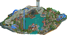
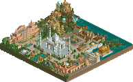
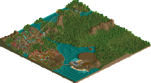
Park / Seven Stars Entertainment Parks Germany

Park_2733 Seven Stars Entertainment Parks Germany

743 Comments

  • JDP%s's Photo
    ^^^^^^^^^^^^^^^^^^^^^^^^^^^^^^^^^^^

    Is that a double corkscrew in that coaster? Aww man...
    -JDP

    i'm glad im not the only one who noticed it...
    -JDP
  • Alex Rider%s's Photo
    Basically I read the whole flipping topic to see the screens instead of continuing work on my own park. I think that says a lot really. Amazing work.
  • sexy_overload%s's Photo
    that looks super slutty and nice

    your forgiven for burning canada.
  • Beagle%s's Photo
    News

    Because of the 15th anniversary of Seven Stars in 1990, we present you a review of each season...
    little preview of the season 1990.

    Season 1975
    Season 1976
    Season 1977
    Season 1978
    Season 1979

    Season 1980
    Season 1981
    Season 1982
    Season 1983
    Season 1984

    Season 1985
    Season 1986
    Season 1987
    Season 1988
    Season 1989

    Season 1990


    It's not magic... it's Seven Stars Entertainment Park

    Beagle

    Edited by Beagle, 17 October 2006 - 05:51 AM.

  • Gwazi%s's Photo
    Lookin' good. I like all the development from screen to screen.
  • ][ntamin22%s's Photo
    I hope Seven stars was reimbursed for the sickeningly short lifespan of Big bear....
    did it like.. kill an entire trainload of people or something?
  • JDP%s's Photo
    Hey Begeal.... ugh how bout that 1990 download? looks great
    -JDP
  • Ling%s's Photo
    sweet.
  • Leonardofury%s's Photo

    ^^^^^^^^^^^^^^^^^^^^^^^^^^^^^^^^^^^

    i'm glad im not the only one who noticed it...
    -JDP


    Though let's be honest here, B&M are a rollercoaster design company. They built what you want (within reason). Some parks have a very good idea about what they want (Multiple inversion inverted rollercoaster, must be under 150ft tall due to height restrictions, have a throughput of 1500 guests per hour and fit in a specific space in the park, for example) others parks are a little fuzzier with their specification (We want a family coaster to fit into this space, can you suggest a design?). If Seven Stars request a specific track element, such as a double wingover, I don't think it's unrealistic that B&M would accomodate them. Just because B&M haven't built a rollercoaster with a double wingover yet, doesn't mean that they wouldn't build one if asked. In fact, Drayton Manor (Tamworth, UK) has Shockwave an Intamin Stand-Up with a double wingover, and the Intamin and B&M designs are very simular, so I don't see a problem with it.

    This looks good Beagle, looking forward to the release.
  • Phatage%s's Photo
    your arguement would be valid if at least one park did what you said, otherwise we have to assume the parks either do not have a say with flatspins or all that do are indifferent, ut b&m have said no before to things like building a 300ft+ coaster on an ohioian peninsula, meaning that they can exemplify the qualities intilled by the dare program as much as a non-consenting girl
  • Panic%s's Photo
    Do I have to leave the site now for saying that I'm not getting into this park much at all?

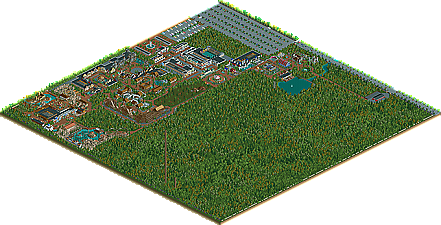
    You haven't raised a single corner of a land tile one level in the entire park, instead relying entirely on cheesy custom scenery to take the place of good landscaping, such as those incredibly cartoonish-looking WW rocks. Those buildings look pretty awesome, yet you seem to care nothing about the landscape around and particularly behind them, which makes them look incredibly artificial and "constructed" on the ground, in my opinion one of the general problems with RCT2 parkmaking today. This park is the epitome of that problem - the entire park is basically themed areas and green grass with trees plucked on it separating them. Divert your attention from custom scenery and the buildings toward the landscaping tool (some small rolling hills, some natural rocks and small streams here and there, but most of all, just some derivation across the landscape instead of the same thing everywhere) and this park will look vastly more aesthetically pleasing. Check out parks such as Thrillmatic for examples on that.

    Also, I don't know whether it is that coaster building expectations and standards have really dropped this much or that people are getting diverted by the Photoshopping of the pictures, but everyone seems to be orgasming over the coasters in this park when really they're not that special. The woodie that everyone was crying over a few pages back was a simple derivation of the Robin Hood model that comes with the game. Call it realistic 80s if you want, but you can be realistic 80s and entirely creative at the same time. The B&M doesn't look enough like a realistic early 90s B&M standup to justify the realism of the rest of the park and of the advertising scheme, and I don't know why it's getting praised like it is. On the large scale, check out models such as the Vortexes and Iron Wolf, because they're a lot more concise than that. For one, if this coaster is 1990 then I'd assume the loop would be right after the drop, with none of the dilly-dallying you have in between. Double corkscrew? That's fine for 1990 I think. On the small scale, a few things. The best simulation of a B&M first drop is a banked shallow down turn at the beginning followed by a steep straight section, not a steep twist at the beginning. Also, get rid of the overly tight drop angle changes such as those just before and after the brake run, because the G-forces caused by those would be insane. If you're going to go for this amount of realism overall, then you have to apply the same for your coasters and be this picky and OCD. That's just the way it is. Nothing can lag behind, particularly the coasters. This is RollerCoaster Tycoon we're playing, after all.

    I don't mean to come down on you this harshly, and this post was probably fueled as much by everyone saying OMGBBQGREAT throughout as it was by the park itself. I also don't mean to make you lose confidence in your own work, just to point out some things that I really think need addressing, if this park is to live up to the superb advertising scheme.
  • Jazz%s's Photo
    I agree with Panic... while this park certainly has some solid architecture, it's not 'brilliant' as some people think it is. The coasters are nothing great, not to mention there is a massive amount of custom scenery here. Also, the extreme flatness is also a problem, realistic parks don't necessarily mean it's totally flat.

    I know it may sound harsh, but I just think it's ridiculous how much credit this park is getting.
  • trav%s's Photo
    I also have to agree. To be honest, I don't like much of the architecture either, because it is all facades, which to me suggests that you can't be arsed with making a roof. I can understand a lot of it being facades, but there is only one area that seems to have at least 2 or 3 buildings without black roof, which is the one with the bobsled, which is coincidently, my favorite area. I also have to agree with the landscaping, it just looks like a cheap and easy way out, and doesn't look as good as it could. And anyway, how many theme parks do you know that have path at the same level all the way throughout the park? Never mind land around the coasters.
  • Genius638%s's Photo
    It is getting more common, the flat land. But it really is a hassle to make hills and palins that look realistic, instead of just the pyramids. Still, terraforming is one of the attributes of a good parkmaker.

    The park overall looks good, but again, not very interesting from afar at least because of the lack of landscaping
  • zburns999%s's Photo
    I'm also going to agree with Panic, Trav, and Jazz. This really is a great park, but I can't really get into some of the archy, and the landscaping is nonexistant. As for the rest, I'll reserve my judgement untill I download.
  • JDP%s's Photo

    Also, I don't know whether it is that coaster building expectations and standards have really dropped this much or that people are getting diverted by the Photoshopping of the pictures, but everyone seems to be orgasming over the coasters in this park when really they're not that special. The woodie that everyone was crying over a few pages back was a simple derivation of the Robin Hood model that comes with the game. Call it realistic 80s if you want, but you can be realistic 80s and entirely creative at the same time. The B&M doesn't look enough like a realistic early 90s B&M standup to justify the realism of the rest of the park and of the advertising scheme, and I don't know why it's getting praised like it is. On the large scale, check out models such as the Vortexes and Iron Wolf, because they're a lot more concise than that. For one, if this coaster is 1990 then I'd assume the loop would be right after the drop, with none of the dilly-dallying you have in between. Double corkscrew? That's fine for 1990 I think. On the small scale, a few things. The best simulation of a B&M first drop is a banked shallow down turn at the beginning followed by a steep straight section, not a steep twist at the beginning. Also, get rid of the overly tight drop angle changes such as those just before and after the brake run, because the G-forces caused by those would be insane. If you're going to go for this amount of realism overall, then you have to apply the same for your coasters and be this picky and OCD. That's just the way it is. Nothing can lag behind, particularly the coasters. This is RollerCoaster Tycoon we're playing, after all.

    THANK YOU PANIC! Seriously, i really thought i was going crazy when i thought the woodie looked like Robin Hood. Seriously man, you nailed this right on the head... ashame i never said anything 8@
    -JDP
  • Beagle%s's Photo
    First, most of the "real" parks are flat as a pan cake.
    Home of Seven Stars is northern Germany, so it is very realistic that the park is so flat like it is,
    because in this area of Germany there aren't any hills or mountains.

    If some people think, that the black roofs are ugly... I think so too, but look at Google Earth.
    Most of the "real" parks looks from above exactly the same... beautifull front and "ugly" back.

    A few people said, B&M didn't build a coaster like "Ikarus",
    so "Ikarus" is a bad coaster and not realistic... :SA:
    Otherwise, a few people don't like, that "Big Bear" looked like "Robin Hood". 8@
    In opinion some people should decide first, what they want, before they write down their opinion.

    I think, money rules the world, and if any park would have a coaster like "Ikarus"...
    B&M would have built the coaster.

    I think, to build a coaster that looks like Shockwave for example, is realistic, but is it creative too?
    I don't think so. 8@

    Seven Stars has a different style like the typicall NE style, and that is good. Like it or hate it... :)


    And now, for all people which like flat pan cake parks with ugly black roofs,
    here the whole history of Seven Stars Entertainment Park in one Flash-video.


    History 1975 - 1990
    (Thanks to Noel)


    :idea: Ideas for my new signature:

    It's not a pan cake... it's Seven Stars Entertainment Park
    or
    It's not typicall NE style... it's Seven Stars Entertainment Park :kiss:


    Posted Image


    It's not magic... it's Seven Stars Entertainment Park

    Beagle

    Edited by Beagle, 16 October 2006 - 05:32 PM.

  • Ling%s's Photo
    or... how about we let people do parks their own god damned way?
  • Panic%s's Photo
    Well I wasn't suggesting major landscaping and height differences throughout or anything like that, because I recognize that most parks are fairly flat. I was more talking about lateral variation throughout the empty spaces, maybe as little as one or two levels, as well as some variation in the land surface types and in the foliage. Just as it's nice to have something to do to "pass the time," it's nice to have something with a little variation and character to look at to "pass the space." Unless you're planning on filling up that space later on. When you are in the more densely themed areas, it also doesn't hurt to have a rock here that's a level or two above the ground, or maybe a depression here. That's why I suggest you look at Thrillmatic and similar parks.

    And I stand by my point about the B&M. No matter how extravagant it could be, and I do understand your point, a B&M coaster built so early in the company's history would probably go right into the vertical loop, have the shallow turn on the first drop, and have beginnings and ends of drops and hills that are not as sharp and G-force-inducing as those before and after the brakes.
  • Ling%s's Photo

    Well I wasn't suggesting major landscaping and height differences throughout or anything like that, because I recognize that most parks are fairly flat. I was more talking about lateral variation throughout the empty spaces, maybe as little as one or two levels, as well as some variation in the land surface types and in the foliage. Just as it's nice to have something to do to "pass the time," it's nice to have something with a little variation and character to look at to "pass the space." Unless you're planning on filling up that space later on. When you are in the more densely themed areas, it also doesn't hurt to have a rock here that's a level or two above the ground, or maybe a depression here. That's why I suggest you look at Thrillmatic and similar parks.

    If you mean like something for a space in the middle of a large midway, then you're right, it would help. But just a raise in level isn't particularly important, and would probably go unnoticed if themed over/pathed over. It's also a lot of work if you're making a giant plane, then smoothing the edges.

    And I stand by my point about the B&M. No matter how extravagant it could be, and I do understand your point, a B&M coaster built so early in the company's history would probably go right into the vertical loop, have the shallow turn on the first drop, and have beginnings and ends of drops and hills that are not as sharp and G-force-inducing as those before and after the brakes.

    I can't really argue this point, because I guess I don't really know about B&Ms from the 1990s.