Park / Seven Stars Entertainment Parks Germany
-
 31-December 08
- Views 66,280
- Downloads 677
- Fans 4
- Comments 743
-
4 fans
 Fans of this park
-
 Download Park
677
-
 Objects
427
-
 Tags
Tags

Should have checked out this topic sooner, what a nice suprise.
Here are some good news! The new season (1986) will start at the next weekend.
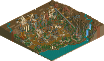
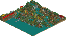
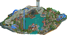
And here is a new (unfinished) artwork from the next great attraction at Seven Stars Entertainment Park. This attraction will open in 1987... The flying Dutchman.
See you at Seven Stars
Beagle
the screen looks nice enough, but it looks like your landscaping needs a little work. it looks as though you kind of randomly raised the land wherever, and you didn't really take time to make it flow. don't be afraid to have flat areas (i assume the ones there are unfinished). i really can't see any other faults than the landscaping.
With this kind of pictures I get some information about, what the users think about my ideas. If the users say, this attraction is good, Seven Stars will build it in the next years, but if the users say it is crap, so I can say it's only an artwork. So Seven Stars can be sure, that only good attractions find their way into the park.
See you at Seven Stars
Beagle
As for the screenie. I like the archy, it has a very convincing realistic theme, but as Tracid said you should try to make the landscaping more realistic. Also some added details wouldn't hurt to add to the realism, but since it's just an artwork of the idea I suppose you may decide to add details later. Overall, I like the screen and the atmosphere, though it is incomplete as you said.
who are you anyway? i mean you're german? heh. never thought we'd have one who can pull off realism.
i love the flying dutchman ride.
time to get this park finished, though.
We could increase our number of visitors again. We had 2.6 millions visitorsin the last season. That is a rise of 300.000 visitors.
In the area of Mexico, Seven Stars has build a Snackbar "La Bodega" and a new shop "El Viejo" At the Super Mario Land the Photopoint is shift next to Luigis Restaurant. At the old place of the Photopoint, now the show "Mario on stage" took place. This show will replace the "Freilichtbühne" at the Nivea Kinderland after this season. And last but not least the new Bobsleigh Coaster "Schweizer Bobbahn"
Seven Stars doesn't increase the prices!!!
Park price list
Adults_______: 20,- Marks
Children_____: 14,- Marks
Familyticket__: 52,- Marks (2 adults & 2 Children)
Camp Liberty price list
Overnight accomodation___: 18,- Marks per person
Breakfast_______________: 25,- Marks per person
Half-board______________: 35,- Marks per person
New 1985
El Viejo
La Bodega
Schweizer Bobbahn
Mario on Stage
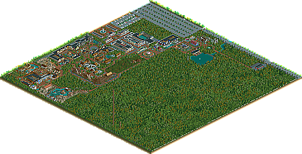
Seven Stars Parkmap 1986 (click)
See you at Seven Stars
Beagle
i think what he's going for is have the unnaturally crafted artificial rocks used in parks. and no matter how simple they are used here, they work, in a way.
what really would improve that bobsled is not have the lifthill go over the roof of that building, i'd say.
The mario show looks cool too, the boats on the water ride look nice.
Marshy
See you at Seven Stars
Beagle
well, another reason why that coaster sucks badly.
-X-