Park / La Vitesse
-
 20-April 13
- Views 2,276
- Downloads 562
- Fans 0
- Comments 11

-
 41.92%(required: 65%)
 Design Submission

Kumba 60% disneylandian192 50% Jonny93 50% Pacificoaster 50% zburns999 50% Coupon 45% Steve 45% Goliath123 40% In:Cities 40% Maverix 40% turbin3 35% Wanted 35% wheres_walto 35% prodigy 30% robbie92 25% 41.92% -
 No fans of this park
-
 Download Park
562
-
 Objects
233
-
 Tags
Tags
![park_2847 [PT4 R5] I Am the Elephant Seal](https://www.nedesigns.com/uploads/parks/2847/aerialt2500.png)
![park_2840 [PT4 R4] The Catherine Palace St. Petersburg](https://www.nedesigns.com/uploads/parks/2840/aerialt2497.png)
![park_2838 [PT4 R4] God's Own Country](https://www.nedesigns.com/uploads/parks/2838/aerialt2492.png)


Auf Wiedersehen
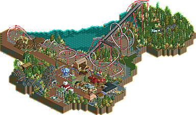
The Station building was an interpretation of Dimi's Marrons Chauds Station. This was supposed to look like a little Suisse village, which I think didn't work very well. As I said earlier, I didn't expect too much.
Try to work out the theming a bit better, because it doesnt like a swiss village actually. For me its very helpful to watch throught some other parks in the database to understand it better how to theme structures.
If i remember correctly the pace of the coaster was a bit to slow.
@Jonny: Well I somehow think, that the little alleys around the Q, looked pretty cool, yet I am sure that all in all it doesn't look very "swissish". I tried to get inspiration by Dimi's Marrons Chaud but I somehow only worked with the Station I think. Anyway, I am glad to her that you consider this a pretty solid first submission,
thanks to you two
I think this definitely shows potential but there are also a lot of things you can improve on.
First of all I really like the setting, you tried to do more than just a generic parking lot coaster (little dig here at the rest of the community), and that was a good decision. It's more difficult to pull off but definitely pays of to really try and incorporate the coaster into the landscape. Maybe you should've still pulled this idea further though. Next time really think how you can create the best possible interaction between landscaping and coaster. Let it dodge rock formations, maybe let it fly through canyons, let it surf on the water or stuff like that.
Then some technical things. For B&Ms you should generally use a pre drop right after the lift hill and only build 1 mid course brake section. The little brake before the corkscrews is kinda awkward. Also Definitely don't do that Loop->Zero-G-Roll combo again because like this it'd knock people out. Too much G-Force, too quick after the loop, and it shouldn't be on the same height as the bottom of the loop either. If anything let the track rise up first and then put a 0-G-Roll.
Your architecture and your foliage will get better the more you practice and the more you play the game. But again I really think this is a good start and it shows great potential for your upcoming projects.
Keep up the good work bro!
Since it is a consider a very weak part in the coasters layout, I'd like to comment on the break shortly before the corkscrew - I forgot to undo them, because (if you watch this in game you will notice) they aren't even necessary, and don't slow down the trains. This is totally my fault.
The first drop and big loop are just the same as in Kumba's KUMBA design. I see what you mean concerning the Zero-G-LOOP Combination, I already thought that this would be pretty brutal in reality, yet I liked the idea and the "flow" of this structure.
@all: I was wondering how the red building with the green roofs would be accepted, because I liked it actually. Same thing with the Rail-Station (except for the awkward Rooftop) The Rest of the buildings where just there for the heck of it.
Thanks for each comment and I glad you guys still enjoyed this, though it was far from a Design winner.
Auf Wiedersehen
I think your problem is, that you try to build something "cool". And from this point of view, the two rolls over the lift hill seem to be a good idea. But they actually destroy the flow of the Coaster. Know you have a very fast roll and a rather slow roll in your B&M Coaster (even when B&M's rarely have rolls like this).
The same thing with the interlocking corcscrews. You had to brake the train at some random point just to get the right speed and you have that huge turnaround, just to have this element in a coaster. Try to look at real B&M's and learn from that. I know, it's not the most "special" thing if you just build what B&M builds, but there is a reason B&M builds it that way. Interlocking Corcscrews for example are best used as the last element of the coaster, right after the last brake run, because this way you already have the right speed and you have another block-section for more capacity.
Auf Wiedersehen bei Version1 goes big!
Yeah, i think the turn connecting the two corcscrews is a little to big. Take a look into "Kumba" (by Kumba) to see how it's done.