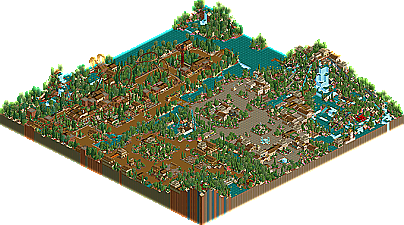
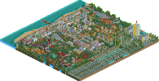
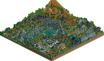
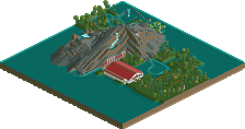
While I admire your confidence in continuing in this style, it does appear to be regressing It's like, you started with some great innovative stuff in BGSA, then started showing some confusing architecture in the more recent screens, and here none of the buildings really jumped out at all. Your rides are always fun to watch (especially those rapids) but apart from that I tend to agree with what's been said - some more general...'substance'...would have been nice.
Great job on placing in the top 20 of the best contest ever though.
I don't know. The color's were nice and the tree selection was okay. I love the waterfalls and the way you used flowers throughout. But everything else seemed really blah. The landscaping was very artificial and it just didn't "feel" right. It's good to have land-height variations but they need to be done right to look natural, and it that way, this failed. The coaster was very nice and I love the red flowers in the area, very beautiful. For the most part that's what this park was, beautiful and colorful yet still monotone. It's CONTRAST that creates cool effects and there was almost none in this map.
Work on your landscaping and constrasting color use and you're set.
This park suffered from...a rather weak coaster line-up.
Oh dear...
Anyway, I don't really know what to say. Looks okay, I guess. I don't want to repeat anything said in here, but then, you don't seem to have a problem with doing that with parks
Is there any way that the rest of the RCT2 parks can be uploaded w/o the Export Custom Scenery box checked to save time for anyone not with high speed internet, as well as to save New Element from bandwidth problems.
It'd work as long as you have just one of the RCT2 parks released so far opened up.
I thought the park was ruined by the landscaping. Your tarmac choices were very strange and you used a very odd variety of tall trees. The flowers were the only part I thought added to the beauty of the park. I thought your architecture was good, and the hacks were interesting (but done before)...
The park as a whole was very boring because we've seen this style before.. you're beginning to run into the problem that Kumba ran into.. all your work is starting to look identical.
Pretty much, I feel the same way about this park as many of you guys.
You chose beautiful flowers for each area all of which added greatly to the park's atmosphere. Overall, the park had a pretty good look, but when I look closer, there are so many things I just can't like about this park, specifically the horrible landscaping, the repetitive and plain boring architecture, and the somewhat strange tree selection.
All of these things, along with the fact that there isn't really any substance to this park (only 2 big rides, both of which were solid, but nothing special) really prohibited me from loving this park.
Either way, great work NC in an obviously competitive competition, and good luck to you in the future.
Wow NC, I thought this park was absolutely beautiful. The flowers and their color were just perfect. They definitely set the tone and mood for the park. That one big waterfall was just amazing... I could not keep my eyes off it!
The things--for me-- that bothered me about the park, was the plain architecture. I wish you would have tried something unusual, and took advantage of the capabilites RCT2 could handle. For you, your architecture is beautiful, but something we have all seen before. To put it into simplest terms, it's very "safe".
The coaster was very strong, a nice layout, as so was the rapids. The land types were not always the best of choices, but it did not distract me. I think you're entry would have sky-rocketed if you would have broaden out your architecture and make your park seem more original, and given a particular sense of style so that when people opened up the park, they would have said, "That's an NC park!"
Overall, lovely. Unlucky at not being placed higher.
This just continues to perplex me. If you haven't seen the all the parks, I find it hard to understand how you can think he should've placed higher. He actually finished one slot higher than where I placed him, and I did see all the parks. I think he's just lucky VTD liked it so much.
The parks in this contest were quite brilliant overall, and by the quality of the lower parks, you guys should be getting very excited about everything that is coming next.
Hey, I just noticed, I'm the only judge to have the bottom 5 parks as my bottom 5 parks! I guess my shockers are still to come
I had alot of fun building this park, i tried to make it fun with alot of little things to click on and look at, yeah i think my landscape in this park is a bit hit or miss, the reason i had black wooden sided land is to mainly give a colourful atmosphere.
Anyways it has been a great competition so far and alot of fun.
Cannot wait to see the rest of the entries and by the looks of the ones released atm the higher parks are going to be mindblowing.
Thanks Iris for giving me a place to participate in this great competition.
You know, the little scene where the the rapids ride comes down the final drop, and the queue goes over it, and back out on a little ledge and back in, and the ride goes past the Picture Spot and turns under the ruined arch and past the waterfalls? That's pretty cool.
And there are a few other nice things like that. But for the most part...
I thought that you chose a very safe style to use in such a high stakes contest. That was your main problem...like people said, you went with what you have done over and over already...there was nothing there that was unexpected from you or anything that said you were "going all out"....I think you just approached this contest the wrong way....the rapids were nice, the foliage was good...I hope you expand your skills by trying new things in the future.
32 Comments
mantis Offline
Great job on placing in the top 20 of the best contest ever though.
Ride6 Offline
Work on your landscaping and constrasting color use and you're set.
ride6
Micool Offline
Oh dear...
Anyway, I don't really know what to say. Looks okay, I guess. I don't want to repeat anything said in here, but then, you don't seem to have a problem with doing that with parks
iBrent Offline
It'd work as long as you have just one of the RCT2 parks released so far opened up.
Just a thought.
Jacko Shanty Offline
The park as a whole was very boring because we've seen this style before.. you're beginning to run into the problem that Kumba ran into.. all your work is starting to look identical.
sloB Offline
You chose beautiful flowers for each area all of which added greatly to the park's atmosphere. Overall, the park had a pretty good look, but when I look closer, there are so many things I just can't like about this park, specifically the horrible landscaping, the repetitive and plain boring architecture, and the somewhat strange tree selection.
All of these things, along with the fact that there isn't really any substance to this park (only 2 big rides, both of which were solid, but nothing special) really prohibited me from loving this park.
Either way, great work NC in an obviously competitive competition, and good luck to you in the future.
Geoff Offline
The things--for me-- that bothered me about the park, was the plain architecture. I wish you would have tried something unusual, and took advantage of the capabilites RCT2 could handle. For you, your architecture is beautiful, but something we have all seen before. To put it into simplest terms, it's very "safe".
The coaster was very strong, a nice layout, as so was the rapids. The land types were not always the best of choices, but it did not distract me. I think you're entry would have sky-rocketed if you would have broaden out your architecture and make your park seem more original, and given a particular sense of style so that when people opened up the park, they would have said, "That's an NC park!"
Good job overall.
w33maniac Offline
Steve Offline
I liked the coaster the most probably. Just never do 2 cobra rolls, again.
The rapids, yeah.. they were great. I liked the monster head the most.
The thing that dragged this down for me, was the landscaping.
It was terrible, Chris. Sand with black wood sidings? Hell no.
Aside from that, yeah, it was great. Keep it up.
artist Offline
I had alot of fun building this park, i tried to make it fun with alot of little things to click on and look at, yeah i think my landscape in this park is a bit hit or miss, the reason i had black wooden sided land is to mainly give a colourful atmosphere.
Anyways it has been a great competition so far and alot of fun.
Cannot wait to see the rest of the entries and by the looks of the ones released atm the higher parks are going to be mindblowing.
Thanks Iris for giving me a place to participate in this great competition.
cBass Offline
And there are a few other nice things like that. But for the most part...
rK_ Offline
You cant expect greatness to come so quick, he did what he could in the time, hes still high on my list though.
AustinPowers Offline