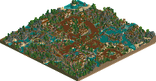
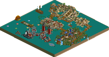
Park / Palmshades Florida

Park_273 Palmshades Florida

32 Comments

  • iris%s's Photo
    Posted ImagePosted Image

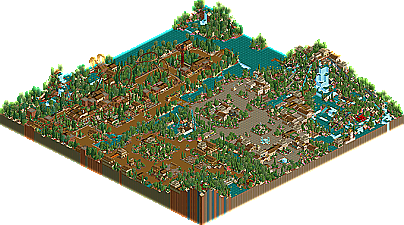
    Palm Springs Florida by nemesis chris

    Through great screenshots in various projects, nemesis chris has developed himself quite a following, and has been putting up a pretty strong threat in the non-parkmaker area. In lots of people's minds, he's been placed in that elite category of parkmakers including voodoo, slob, and John, all with somewhat similar styles, and all extremely talented. He managed to squeak in 12 votes in the Best Non-NE Parkmaker Award, more then John or slob, so he's obviously doing something people like. However, to me...he's missing that special something at the moment. He seems to be building the same thing over and over again. He's missing that special class, that 'magic' that the other non-parkmakres have to their parks, and I sorta see NC turning into a modern day Roboparks: building quality work with not enough varience. Palm Springs is a great example, the architecture seen here is great work, but nothing we haven't seen from his screens in the Ad. District. Other then the terrific rapids ride, there is nothing overly impressive, although it's all 'good' work. Chris just better be careful, or else he'll be stuck in that 'good' category, and miss out on the opportunies that 'great' parkmakers get.
  • bokti%s's Photo
    psss . feel that Chris ? scorched by the man himself .
  • Janus%s's Photo
    I didn't like this park much at all... I've seen it all before. The architecture, the (horrible) landscaping, the boring tree selection. It's all the same as every screen you've shown (which in turn looked pretty much like every screen Voodoo has shown), and though it was a bit nice at first, now it's just annoying IMO.
    There were no clear themes (same architectural style, same foilage with only small variations, if any, same sort of theming), nothing memorable about it, just, well, meh.
  • JKay%s's Photo
    From what I can see, this looks like a "run-of-the-mill" park from NC, which probably explains the ranking. Basically a mini version of BGE / BGSA / BG??
  • deanosrs%s's Photo
    I liked the park, but as it's been said, all the themes were basically the same.

    Your coaster was nice, but broke down too often - because you changed the train types. It's better to hack the train from its correct station onto a different track, I find.

    Nice park though and I wasn't expecting to see it for a while... the other entries must be awesome...

    *edit... my other comment on the park would be that it didn't use the space that efficiently - the water, wide paths, expansive log flume, large clumps of foliage etc. was the reason why you only had room for one coaster, whereas most other entries so far have had 2-4 coasters.
  • Leighx%s's Photo
    I really liked this park and found it fun to look at, i think it should of placed higher but there ya go.
    great park chris.
    :et:
  • Tech Artist%s's Photo
    The architecture could have been better and the landscaping needs some major work but overall I liked this park. I also liked that custom Chinese Dragon head you built out of 1/4 blocks, that was really cool. IMO this park should have place higher, oh well.

    Nice work NC!
  • Six Frags%s's Photo
    ^+^^ How can you say this should've placed higher, while you haven't seen the other entries yet..

    I liked some parts of the park, and disliked others...
    It seems like you're style is mixing LL elements of parkmaking with rct2... sometimes it works out, but sometimes it just doesn't imo... like some buildings missing detail...
    I liked the height variations you added here and there in the park, which gave the overall look depth...

    SF
  • Metropole%s's Photo
    Is there any reason why the park is called palmsprings florida and the logo says Palmshades Flrodia....?

    Anyway, the park was nice, probably my favourite so far. The landscaping definately needed work, especially around the rapids, but the architecture and foliage were nice. As most have said, it was nothing groundbreak, but a solid park.

    Metro B)
  • jon%s's Photo
    It may be identical to NC's other projects. But I thoroughly enjoyed it. It is simply beautiful NC. Well done.

    If this is 19th. No.1 must be incredible.
  • Evil WME%s's Photo
    tis nice, really. But it kinda ends there, as been said before. i liked a lot of nifty details though.

    and even though i've been ripped off plenty of times... =P

    ..

    If... WME would have judged

    1-18. ?
    19. Elements- Gir
    20. Darkwood Amusements- Posix
    21. Palm Springs Florida- NC
    22. Country Squire Amusement Park- rwadams
    23. Poplar Grove- Ride6
  • Marshy%s's Photo

    I also liked that custom Chinese Dragon head you built out of 1/4 blocks, that was really cool

    That was in Voodoo's PT rapids, wasn't it?

    Anyways.

    I liked it, it had a lot of good point and bad points. I thought the rapids/splash boats were cool, but it wasn't very "new"

    Marshy
  • Tech Artist%s's Photo

    That was in Voodoo's PT rapids, wasn't it?

    I think it might have been but I don't remember..... ???
  • gymkid dude%s's Photo
    to me, this just looked good. I love the way NC uses flowers, foliage, and different land types. I also think he coulda done with one more coaster, but he chose to go for rapids instead. I agree the buildings may have not be complex enough, but I just love the way he does trees, bushes, and flowers. Plus, I'm a fan of all the waterfalls, especially those interacting with the rapids and the coaster.
  • PymGuy%s's Photo
    This park was just okay, IMO.
    There was nothing outstanding about it. Nothing unique, nothing eye-catching, basically nothing to keep my interest.
    It looks exactly what other people have done in the past, and who wants to see the same stuff again?
    And what was with that one area? It was so small and had no purpose. The rapids was pretty much the only thing that caught my attention.
    You're not a bad parkmaker, nemesis chris. Next time just do something unique, make the park your own.
  • rK_%s's Photo
    i was disappointed by this, the screen he let show was showing he was straying away from the usual type of square and cluttered style he works with well but he did it again, and again. I hope you soon find that element your missing chris, you have the potential, you just need to explore your minds possibilities. But i must say, i loved the colors of the foliage, its just ive already seen it before.
  • penguinBOB%s's Photo
    This park was nice, but it would have been much better as a section of a solo... I felt that it was lacking another coaster, even a junior one would have been nice. I liked the flyer and its section, but the entrance part, I really didn't like, save the rapids, and they were alright. Oh yeah, was that supposed to be a flyer or a 4d? If it was a 4d, then that shows a lack of skills with what the game already provides.

    Even though I realize you went with what you felt strong with, you need to be more adventuresome, try new things. That's what gets you places in life.
  • Richie%s's Photo
    This is definately the best park so far, IMO. By quite a long way too. I didnt like the flyer an awful lot, the unbanked train on banked curve drops was annoying, maybe u should have use the flying coaster trains instead?

    Overall, lovely. Unlucky at not being placed higher.

    ------------

    Deano, you should downlaod the reliablitly patch, it fixes the problem with coaster breakdowns. Catch me on aim and ill find the links for you.
  • Toon%s's Photo

    Overall, lovely. Unlucky at not being placed higher.

    This just continues to perplex me. If you haven't seen the all the parks, I find it hard to understand how you can think he should've placed higher. He actually finished one slot higher than where I placed him, and I did see all the parks. I think he's just lucky VTD liked it so much.

    The parks in this contest were quite brilliant overall, and by the quality of the lower parks, you guys should be getting very excited about everything that is coming next.

    Hey, I just noticed, I'm the only judge to have the bottom 5 parks as my bottom 5 parks! I guess my shockers are still to come :w00t:
  • Richie%s's Photo

    Overall, lovely. Unlucky at not being placed higher.

    This just continues to perplex me. If you haven't seen the all the parks, I find it hard to understand how you can think he should've placed higher. He actually finished one slot higher than where I placed him, and I did see all the parks. I think he's just lucky VTD liked it so much.

    The parks in this contest were quite brilliant overall, and by the quality of the lower parks, you guys should be getting very excited about everything that is coming next.

    I mean unlucky not to be any higher, i know there must be some amazing work if this isnt higher. Im not say 'you should have been higher' just unlucky he wasnt better for a higher position. Im confusin myself now ???