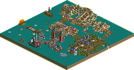
The craziest, looniest, most maniacal parkmaker this side of Mala and cBass brings his latest effort to us....kinda. After realizing just how pressed for time he was, he scrambled to get the park finished by the deadline, dumping an ocean on this park just to fill the space, leaving a lot left to be desired. The work he did complete is classic Micool though...even better then classic Micool. The sandy, Egyptian area is absolutely perfect in my opinion for Micool's unique style of parkmaking. The entrance area is the same, with the cool use of S&S Cars as 'lights', and large sculptures sticking out of the ground. The sunset on the horizon is a cool touch and just shows the great ideas Micool has in his psychotic head, it's just a shame that this park had to be turned into Waterworld because of time limitations. But it's also a problem I've began seeing with Micool, where he ends up building a few great things to start off, but then either becomes rushed because of time, or just bored with the park, as the quality gradually decreases with the construction of the park. Hopefully Micool can break out of this trend and bring that one amazing fantasy park to us that we all know he's capable of.
well, i never like micool parks much, honestly. This is basically how i feel about the majority of this park, however, that area with driftwood river was actually very impressing. And i'm flattered with the evil sign. looks just like me . The coaster was as horrible as ever. The sunset i dammit liked. Man, if the rest of the park was as cool as the egyptian area, it would have seriously been a contender.
What was there in this park I loved, unfortunately there wasn't enough of it.
So many really cool ideas.
The entrance or Cairo Company would have to be my favourite areas. I can't decide between the 2 as the entrance had some awesome ideas like the lights but Cairo Comapny was just generally an awesome area.
You've already mentioned the coaster and well yeh your'e right.
If there was more in this park i'm sure it would have been one of the top parks in the contest.
Mmm.. I didn't really like it. I would personally have placed it further down. The first, obvious thing is that about 50% of the park is completed. I had done an entry to about 75% but didn't enter it for this reason, and I'd have rather kept the themes back for larger maps. tbh, I didn't really like the flower stacking and the tall, rapids towers were pretty ugly imo. I loved the happy place because it payed attention to detail, something that, for me, was only evident in the entrance of the park. The Egyptian area was nice enough... but as micool himself said, the coaster was "sucky".
Still, always nice to see micool parks, just this one I didn't particularly fall for.
That cherry tree/abstract cube trick's a keeper! I think the only area that didn't appeal to me was the GGG area, but you yourself said that was a rush-job. Great work on the entrance though, with all those 'lights' and the cool 'lighthouse' etc.
three months of time to work and he comes up with that shit about time limitations?
of course i don't know how it was exactly that you were prohibited from building... not that i care enough to... but color me crazy if i call you a dumbass. nice park. eh. or partition.
the egyptian area is the best quality thing released so far in the competition...lovely atmosphere and micoolish goodness. The entrance area is hot on it's heels, and with more like this, I could have seen this knocking on the doorstep of the top 10.
I am a Micool whore.
You have this undeniable fun you put into your work, adding crazy and zany ideas that somehow work to make Great Park.
Yeah, there was a lot of water, but what was inside the water (as you put it) was very good.
I really enjoyed the Cairo Company area, it definatly shows what you can do, and make it look good. Loved the log flume!
The other two areas were mediocre, but still I enjoyed them. I mean, I know you were rushed and all, but there was just nothing there to hold my interest.
But hey, there's no denying the skill that was put into this. Good job Micool, and finish more next time ya wanker.
I agree with pretty much everyone else- the Egyptian section was fantastic. I can only image a full map of quality work like that... Plus, all the sculptures were great, and the carousel flowers were a cool idea. It's such a strange park... but it's easily the best so far. Looking forward to your next solo!
Flashes of brilliance with the hornblower, hot water towers, the sunset, the lighthouse, and the flower floaters. Some of the other sculptures didn't turn out as well, and the park is a little empty.
The truth is, bokti, I only had about a month, since I restarted my entry and I wasn't really able to work on it for a while. But enough with the shitty excuses - it sucks! I had to finish something because I told myself (well, and iris...and I needed to) I would finish something. Since I said at the beginning that I was definately entering. So I entered my very skilled rendition of water. And ships. Come on, didn't anyone like the ships? The flower one was cool...
Anyway, I didn't really expect it to finish this high and I'm kind of glad it's announced so I don't have to check in at the library every day. Hopefully I will have my internet back by the end of the contest. If not, whatever.
The point is, thanks for all the compliments. I really enjoyed reading them. I had a lot of fun with what I built and maybe sometime I'll turn it into a good mini park or even a full park. (Thanks, OZONE!) I'm already back to work...expect a release from me soon. (Soon like corkscrewed, lol)
(No really, you guys didn't like the flower ship?)
Definately the best entry so far. That sunset was excellent. And the boats ruled. Loves the sculptures you made, and i spent quite a while looking at it all, even though it had less to it than the other entries. That can only be a good thing.
I liked the sunset, the boats (the flower one was fucking awesome). And holy shit, I loved the lighthouse. Never would have thought of that.
Exactly. I loved the boats and the flower one was the 'Micoolest' thing I've ever seen. Everything that was there was pretty damn cool really. Personally I didn't exactly love the Egypt area. Alot of it has to do with the fact that I have NEVER liked that bright sand. Personally I loved the enterence since it was beautiful, natural and creative with that certain Micool flair. Personally I love what was there, and even though the water hurt it I still think what was there had alot of potental.
If only you could finish a full map and have all of it look this good.
I can't say it is my most favorite park of all time, but it was interesting. Micool has really improved since "The Happy Place". THP displayed none of the usual "rules" to parkmaking, and IMO, turned out horribly because of it. This however, Micool has learned, or atleast applied, a lot of the basics. Mind you, he still has a ways to go, but he's definetly on the right track. My biggest suggestion: Stop using the hedge fences.
I actully liked this park, it looked so fun and creative. The only thing that drags this park down is the massive amount of water and lack of areas but other than that it is a nice park. Nice work Micool!
Micool, you pulled a Mantis-in-the-High-Rollers!! Pretty much what everyone else has said is true... what you did make was generally pretty cool, but the catch was the lack of, um, land. Of course, I heard that Mantis actually was able to put in a (comparatively) full effort this time, so maybe you'll go crazy on the next contest!
25 Comments
iris Offline
Harmony Harbor by Micool
The craziest, looniest, most maniacal parkmaker this side of Mala and cBass brings his latest effort to us....kinda. After realizing just how pressed for time he was, he scrambled to get the park finished by the deadline, dumping an ocean on this park just to fill the space, leaving a lot left to be desired. The work he did complete is classic Micool though...even better then classic Micool. The sandy, Egyptian area is absolutely perfect in my opinion for Micool's unique style of parkmaking. The entrance area is the same, with the cool use of S&S Cars as 'lights', and large sculptures sticking out of the ground. The sunset on the horizon is a cool touch and just shows the great ideas Micool has in his psychotic head, it's just a shame that this park had to be turned into Waterworld because of time limitations. But it's also a problem I've began seeing with Micool, where he ends up building a few great things to start off, but then either becomes rushed because of time, or just bored with the park, as the quality gradually decreases with the construction of the park. Hopefully Micool can break out of this trend and bring that one amazing fantasy park to us that we all know he's capable of.
Evil WME Offline
If... WME would have judged
1-17. ?
18. Elements- Gir
19. Darkwood Amusements- Posix
20. Harmony Harbor- Micool
21. Palm Springs Florida- NC
22. Country Squire Amusement Park- rwadams
23. Poplar Grove- Ride6
Twisted Offline
So many really cool ideas.
The entrance or Cairo Company would have to be my favourite areas. I can't decide between the 2 as the entrance had some awesome ideas like the lights but Cairo Comapny was just generally an awesome area.
You've already mentioned the coaster and well yeh your'e right.
If there was more in this park i'm sure it would have been one of the top parks in the contest.
Well done!
deanosrs Online
Still, always nice to see micool parks, just this one I didn't particularly fall for.
mantis Offline
bokti Offline
of course i don't know how it was exactly that you were prohibited from building... not that i care enough to... but color me crazy if i call you a dumbass. nice park. eh. or partition.
gymkid dude Offline
Raven-SDI Offline
Raven's Comments
I liked this park a bunch. I didn't even know Micoooooooooool did it, but i kinda figured it was his. I am such a mark.
I am all for watter and trees and shit, but not a rendition of "Waterworld".
Time to make "The Unhappy Place".
Raven-SDI
§
PymGuy Offline
You have this undeniable fun you put into your work, adding crazy and zany ideas that somehow work to make Great Park.
Yeah, there was a lot of water, but what was inside the water (as you put it) was very good.
I really enjoyed the Cairo Company area, it definatly shows what you can do, and make it look good. Loved the log flume!
The other two areas were mediocre, but still I enjoyed them. I mean, I know you were rushed and all, but there was just nothing there to hold my interest.
But hey, there's no denying the skill that was put into this. Good job Micool, and finish more next time ya wanker.
P.S. I've never had so much fun reading banners.
Valp Offline
How I Rank Them:
18) Harmony Harbor- Micool
19) Poplar Grove- ride6
20) Darkwood Amusements- Posix
21) Elements- gir
22) Palm Springs Florida- NC
23) Country Squire AP- rwadams
cBass Offline
Fun park, Micool, and a nice strong theme.
Micool Offline
Anyway, I didn't really expect it to finish this high and I'm kind of glad it's announced so I don't have to check in at the library every day. Hopefully I will have my internet back by the end of the contest. If not, whatever.
The point is, thanks for all the compliments. I really enjoyed reading them. I had a lot of fun with what I built and maybe sometime I'll turn it into a good mini park or even a full park. (Thanks, OZONE!) I'm already back to work...expect a release from me soon. (Soon like corkscrewed, lol)
(No really, you guys didn't like the flower ship?)
Metropole Offline
Metro
Steve Offline
I liked the sunset, the boats (the flower one was fucking awesome).
And holy shit, I loved the lighthouse. Never would have thought of that.
The only problem was that there wasn't enough water.
Ride6 Offline
If only you could finish a full map and have all of it look this good.
ride6
natelox Offline
Caddie Gone Mad Offline
-Opinions on this park soon...
Tech Artist Offline
Corkscrewed Offline
mantis Offline
Micool - of course I loved the flower boat