Park / Dovahkiin
-
 11-April 13
- Views 3,722
- Downloads 617
- Fans 0
- Comments 15

-
 57.31%(required: 65%)
 Design Submission

Wanted 90% nin 70% Coupon 65% Airtime 60% Kumba 60% Maverix 60% Pacificoaster 60% tyandor 60% BelgianGuy 55% disneylandian192 55% turbin3 55% Arjan v l 50% Goliath123 50% pierrot 45% wheres_walto 45% 57.31% -
 No fans of this park
-
 Download Park
617
-
 Objects
228
-
 Tags
Tags

![park_2603 [NEDC2 #8] The Legend of Zelda Snowhead](https://www.nedesigns.com/uploads/parks/2603/aerialt2323.png)
![park_2815 [PT4 R1] Unnamed Entry](https://www.nedesigns.com/uploads/parks/2815/aerialt2478.png)


![park_2813 [PT4 R1] Alton Towers Entrance](https://www.nedesigns.com/uploads/parks/2813/aerialt2477.png)
BigB Offline
Thx to the people involved in the voting process.
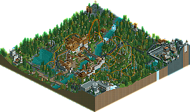
MCI and I had a lot of fun building this because Skyrim is just an awesome game,
this is not a recreation, but if u look closer, i think u will see where this design takes place...
In the end we had so much ideas, maybe it would have been better to do a whole themepark in Skyrim Theme
And please forgive me the horrible translation mistake from "Drachenblut" to "Dragonblood", it's meant to be "Dragonborn", it was allready sent in when I recognized this ...
So here is Dovahkiin -- the layout is made by MCI by the way , I personally really like it -- I hope you like it =)
And I think I can allready promise that their will be more cooperational work from us in "near" future... ^^
Have fun with it ;P
The NCSO in this submission was very well done. If it were not for the overused colorable gumdrops and the little penis memorial area it was not too noticeable at first glance ,which is a compliment!
The layout was very fun. The chain seemed a tad fast, and I think the first drop turn worked well to keep the layout compact, but would have still preferred the tradition vertical drop more I think. (Points for creativity though). Even though those large angled track pieces make a layout very flowy, excessive use of these can be a little unimpressive- sort of like taking the easy way out. (See Pacificoaster's design for beautiful examples of flow).
Even though this was NCSO, I was uninspired by the foliage. I wish I could give you more constructive feedback on this, but I can't put my finger on what it really was that I didn't care for.
The map layout seemed poorly thought out, I got the feeling that the two corner areas were last minute additions that I think deserved more space on the map. Great job on this submission though, keep it up and you'll get design for sure!
That said, this as a whole didn't deserve the design status, but damn was it a fun entry. Like it's mentioned above, the foliage and landscaping as a whole could've been better, and some things executed to a higher standard (as they felt rushed, maybe?). Some of the architecture was rather elaborate for a NCSO submission, specifically the station, which was awesome and I instantly recognized what you were going for. But on the other hand, you fell victim to the simplified archy that most NCSO submissions have, exhibited by the blocky village buildings. Why didn't you guys try to recreate the game's archy more? The Bannered Mare could've looked so much nicer.
The layout was cool and I liked it's footprint, but it only looked good from one angle imo. The lift was awesome, but more thought could've been put into its placement. It's just out there in the woods. Emphasize it! It's one of the most important things on the map!
Overall this was great, though. With more time it definitely could've bee a design. Ya did good, kiddos.
It's nice to see how much better your work is once it's decently inspired. The darkness you chose to save the park with wasn't really for me. Another early impression I had was that the architecture was pretty random and thus incomprehensive to the viewer. The path layout was part good, part very bad. Some of the land elevations were too much, creating a disharmony when moving outside the main centerpiece.
The coaster is just amazing also his station.
Like posix already said the architecture felt a bit random for me too. For myself i never played skyrim but when i saw the pictures of your inspiration i didn't feel this gigantism from the game in your park. Try to improve your architecture and foilage and i think you can easily get an accolade.
Overall I´m very pleased with the way we finished this.
Yeah, the foliage was a bit rushed. When we started this Colorado-Fan was involved in the planning process and wanted to do the foliage in the end. But when it came to the point the only thing left to do was the foliage, he didn´t wanted to do it anymore/he got the save and didn´t show up the next month. So BigB and I did it ourselfes, maybe a bit rushed as I said before.
The penis memorial is supposed to be a stone circle (or do u mean the Tower in the corner?!), like there are a few in skyrim.
Maybe we should have listened to gee, who told us it was looking like penises in our stream a few weeks back...
The funny thing is, although knowing each other for 4years now BigB and myself never did a collab before. What a shame because, as BigB said, it was a ton of fun building this together.
lg.
MCI
BigB Offline
4 years ?!
god ! I'm going sentimental
well actually it's not really true we didn't a collab before, this is just the only one that found an end...
And now I know what that guy says in those fus-roh-dah videos
I'm pretty much a noob to this game, but I really loved the coaster. I've been dying to build an Intamin wing coaster, and this was a great layout for one. I agree with the above comments though. The foliage could use a little work and the surrounding areas (though cool) were lacking in a bit of detail.
I meant Intamin Wing Coaster as in Skyrush. I believe that's what they called it, unless I'm mistaken. If I'm wrong, my bad.
Wing Coasters
No idea why they call it wing coaster, especially when they have Wing Rider Coasters