Park / Qomolangma

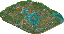
Park_2711 Qomolangma

15 Comments

  • Comment System%s's Photo
  • RMM%s's Photo
    ... ouch.
  • csw%s's Photo
    The colors were a bit too contrasting to me.
  • Ling%s's Photo
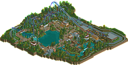
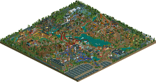
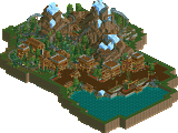
    Your roto drop was glitched and wouldn't operate. A lot of the fog glitched because it was placed too high or too low, and the path seemed to always be too thin. I loved the layout and the colors on the coaster, but the surroundings were quite weak. The buildings felt too small and insubstantial, and while the rapids were a nice addition, they just don't do anything or interact with much. Foliage colors were too unreal. Too much brown in the middle of the map, and I felt the little details here and there ended up being confusing (like the grey ramps in the middle of one of the helices). Also I don't think your transfer track would work at all.

    On the whole this sounds more negative than my actual impression of the park... I can just see why it didn't win.

    I am surprised that Phatage and pierrot voted it so highly, though.
  • Xeccah%s's Photo
    Whilst the other components lacking, especially the rapids, I found the layout to be pretty damn good, and that would compensate for a low-key design. Obviously that wasn't the case, but I think you're ready to shoot for the next echelon in skill.
  • Austin55%s's Photo
    Ah well, feels good to finish something.

    Qomolangma (The Q is silent, btw) started two years ago after a trip to Disneyland and Animal Kingdom. I was very inspired by the theming around Expedition Everest. I wanted to do a design incorporating some of that, but with a coaster type that I hadn't seen get a design in a while, so I went with an Intamin Hyper, the idea to combine Expedition:Everest with Expedition: GeForce. I built very quickly at first but slowed down drastically as I neared finish and frankly, got sick of the design and submitted it in a state far better than what it could have been. At least it felt nice to finish something, even though I new it was not as good as I or the panelists knew it could have been.

    Special thanks to Louis who did some hacking and invisiblising entrances (W7 issues) and all the testers.
  • Phatage%s's Photo
    I don't think you should've submitted this. There's no rule that you have to release every single thing you work on, and if releasing it is an issue of you justifying the time you spent making on it, I think you'll eventually come to learn that you can learn a lot from failures (maybe even more than successes). This just lacked the inspiration that I've seen you accomplish in other releases and so it came off as something I've seen 100 times, like something Ling would make. We've seen you do better, and I'd say a general rule is if you don't think what you're about to release is as good if not better than what you've released before, save it to your hard drive and forget about it. Who knows, maybe you'll find inspiration to one day finish it properly and make it into something special, but I find the probability of that happening is much lower when you've already released it.
  • Arjan v l%s's Photo
    Sorry Austin, i really wanted to vote higher, but it just didn't felt right if i did.
    The design missed out on a lot, unfortunately.

    It felt like it was an old design that you had to finish, no matter what...
    It also felt like it wasn't yours...strange...i know you're so much better.;)
  • JJ%s's Photo
    I have to disagree with Phatage, you should always release your work, no matter how good or bad. And as from the votes some people thought this was design worthy, so it was definitely worth the time submitting it as competitive. Even if not your best work.
  • Louis!%s's Photo
    I gave my thoughts in a stream and am too lazy to right it all down again.

    But my favourite part has to be the effort you went to putting a hidden entertainer into a cave, and then left him named Entertainer 1. Perfect. I'm still chucking at that.

    I'm surprised no one is picking up on the layout. I personally really like it.
  • bdawgtk1982%s's Photo
    Those shrooms bro...
  • Austin55%s's Photo

    I don't think you should've submitted this. There's no rule that you have to release every single thing you work on, and if releasing it is an issue of you justifying the time you spent making on it, I think you'll eventually come to learn that you can learn a lot from failures (maybe even more than successes). This just lacked the inspiration that I've seen you accomplish in other releases and so it came off as something I've seen 100 times, like something Ling would make. We've seen you do better, and I'd say a general rule is if you don't think what you're about to release is as good if not better than what you've released before, save it to your hard drive and forget about it. Who knows, maybe you'll find inspiration to one day finish it properly and make it into something special, but I find the probability of that happening is much lower when you've already released it.


    Phatage, you have a way with words, these are my favorite type of comments. I do wonder though, what on my release page is better than this? I have no doubt in my mind that this is the best thing I have ever released, which is really only 3 things now 100%, and one of those was only a small part with BG. If personally like Qomo way better than Superman. And that's why I submitted it. It was finished as far as I was concerned, I built everything I had wanted to build, and I though it might be design worthy.


    Sorry Austin, i really wanted to vote higher, but it just didn't felt right if i did.
    The design missed out on a lot, unfortunately.

    It felt like it was an old design that you had to finish, no matter what...
    It also felt like it wasn't yours...strange...i know you're so much better.;)/>


    NEVER vote for anything if it doesn't feel right. You would be right about that, it was. Thanks!


    I have to disagree with Phatage, you should always release your work, no matter how good or bad. And as from the votes some people thought this was design worthy, so it was definitely worth the time submitting it as competitive. Even if not your best work.


    I kinda agree with this, but just because I always love seeing new RCT work, it doesnt matter if it wins anything or not, usually anything above 50% feels pretty special, I hope people think that about this to.


    I gave my thoughts in a stream and am too lazy to right it all down again.

    But my favourite part has to be the effort you went to putting a hidden entertainer into a cave, and then left him named Entertainer 1. Perfect. I'm still chucking at that.

    I'm surprised no one is picking up on the layout. I personally really like it.


    Entertainer 1 is clearly a satirical take on the modern day influences of named characters in RCT2 designs.

    Those shrooms bro...


    :SA:
  • Wanted%s's Photo
    Awww really? I loved this!
  • Phatage%s's Photo
    In terms of releases I thought your rec of Krypton Coaster was very good, definitely better than this. People automatically assume recs are easier than 'original' work because you're not really creating something yourself, but there's just as many if not more challenges when trying to shape RCT's relative simpleness into something that passes off as a real roller coaster/park. You show a lot of screens that have promise too but I think you're showing too much to keep your attention on the park until release - I know that for me, getting to show people things I haven't posted screens of before was a huge motivation to finish.
  • Arjan v l%s's Photo
    ^^ That last sentence is gold...
  • Jackoasta%s's Photo
    Phatage's right, you really shouldn't have submitted this and the fact you need to submit every project you. Next time, you could use this as a basic building block and then you can build up from there. The colours of the coaster don't go very well and it seemed rushed. But we know you can achieve your true potential and we know you have some unique ideas. If something goes wrong or you think that the project looks the way you don't want it. Don't submit it and use it to learn from what you have done wrong. Don't get frustrated with it, you can always try again next time and learn from it. That's what's in my book matey, but overall I thought it was a good try.