Highlights:
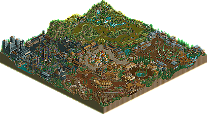
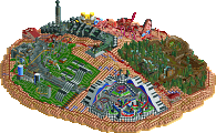
- I personally enjoyed all of the steel coasters... epecially Wolf and the Troll King. The invert wasn't as good, but that cobra roll looked awesome...
- Music: the music in each section really added to the atmosphere (especially using the Martian music in the troll area!)
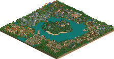
- Witch's Castle: Fantastic... I would really love to start seeing more of this 'BIG' architecture in RCT2... it's just so fascinating to me!
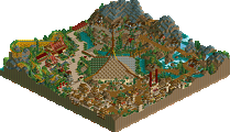
- The Troll Area: Excellent, man... the landscaping, the waterfalls, the coaster, the colors... just great.
Lowlights:
- The wooden coaster was just a little slow for my tastes... it was really a letdown to me, but the rest of the section was nice.
- The architecture was nice, but more creativity and variation would spruce the park up more... the more the detail, the more time we'll spend exploring it (although all of your coaster stations were very nice).
Overall, great job... looking forward to your other stuff.
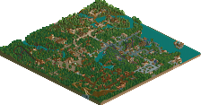
A solid park here. The architecture was classic Six Frags....large, and mostly nice with some blocky buildings in there (like around the invert)
The coaster layouts weren't great, i disliked the invert, but the woodie was good. Some nice concepts in there.
The thing i enjoyed most about the park was the central plaza. Some nice colours and architecture. There were also some good ideas, some well excecuted, some not so well.
The park was "complete" unlike some of the entries so props on that. I think i prefered micools entry, but it has been one of the better parks of the contest so far.
Thanks for the compliments, I'm glad to see people like big buildings... there will also be large buildings in LXG and I guess that 200x200 map will fit my style better...
I agree on the bad pacing on the woodie... and on the inverts layout... Guess I shouldn't have put in 4 coasters, but rather payed attention to one... too late now...
Thanks again, and now I'm VERY curious to the other entries!
I loved the big buildings....and the detail was great. The architecture was always very interesting, and I thought that the theming and big building made for a wonderful atmosphere. One flaw I saw though was the large empty spaces left because of large areas of pathing...like in the troll area....try a bit smaller paths next time. Overall, a great park that I personally think should have placed at least a couple higher...but good job anyway.
Fairly decent park, in my opinion. The architecture, though frankly bad in places (entrance area), was generally well-done, and each of the themed areas was nicely developed and original. The atmosphere was there sometimes too, and though the coasters felt a bit strange they worked.
However, I dislike how you constantly re-use a few concepts in your architecture, like the little 1x1 towers, the general shapes of buildings, and some other stuff. It makes each theme, and each park you build, too similar. Also the paths might have been a bit too wide for my taste.
24 Comments
Valp Offline
Highlights:
- I personally enjoyed all of the steel coasters... epecially Wolf and the Troll King. The invert wasn't as good, but that cobra roll looked awesome...
- Music: the music in each section really added to the atmosphere (especially using the Martian music in the troll area!)
- Witch's Castle: Fantastic... I would really love to start seeing more of this 'BIG' architecture in RCT2... it's just so fascinating to me!
- The Troll Area: Excellent, man... the landscaping, the waterfalls, the coaster, the colors... just great.
Lowlights:
- The wooden coaster was just a little slow for my tastes... it was really a letdown to me, but the rest of the section was nice.
- The architecture was nice, but more creativity and variation would spruce the park up more... the more the detail, the more time we'll spend exploring it (although all of your coaster stations were very nice).
Overall, great job... looking forward to your other stuff.
Metropole Offline
The coaster layouts weren't great, i disliked the invert, but the woodie was good. Some nice concepts in there.
The thing i enjoyed most about the park was the central plaza. Some nice colours and architecture. There were also some good ideas, some well excecuted, some not so well.
The park was "complete" unlike some of the entries so props on that. I think i prefered micools entry, but it has been one of the better parks of the contest so far.
Great job SF
Metro
Six Frags Offline
I agree on the bad pacing on the woodie... and on the inverts layout... Guess I shouldn't have put in 4 coasters, but rather payed attention to one... too late now...
Thanks again, and now I'm VERY curious to the other entries!
SF
AustinPowers Offline
Janus Offline
However, I dislike how you constantly re-use a few concepts in your architecture, like the little 1x1 towers, the general shapes of buildings, and some other stuff. It makes each theme, and each park you build, too similar. Also the paths might have been a bit too wide for my taste.