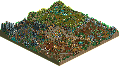
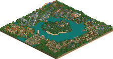
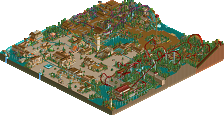
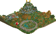
I have to admit, I was pretty surprised by Six Frags. After he too seemingly snuck into the Pro Tour with an under-par preliminary ride, where he made a member-themed coaster themed to Dragon Inferno, he brings us a bigger taste of his work, a four-themed area minipark. Some of the areas work in my opinion, and some don't. He has a style that is all his own, as he builds on a much larger scale then most parkmakers. He's not afraid to try out new things, and experiement with anything to get the desired effect, no matter how many 'rules' of parkmaking he breaks, and that makes his parks fun to look at (just like his Mythologix park in the Ad. District). He definitely has the spooky theme down pretty well as can be reprsented by the area in this park, as the others are a bit more hit or miss. Some people will really appreciate this park, and some won't like it at all, as can be reflected by the drastic differences in our judges ratings.
Wow, I'm astonished by some of the judges ratings, and placings... Looks almost like some wanted to drag me down... I wasn't expecting a high placing though...
Anywayz, I think I've surprised quite a few people looking at the prediction lists, and I had a lot of fun building the park...
Maybe I should've build on it a while longer, but I'm satisfied with end result, and I'm always releasing my stuff how I build it, meaning not deleting stuff...
No, that's why I said 'It looks almost like', I'm not saying that they did... you, Raven and Pyro obviously didn't like it as much as Toon and VTD... I admit my style is a hit or miss, but I just like building like that, meaning big pathing, building on a large scale... and that's why I understand the judges that gave it a low ranking.... I'm happy to see that people do like my style though...
Nothing in this park really stood out to me, everything seemed to just fall together, which was a good thing and a bad thing.
You have the consistancy down, but if you'd just make something to capture our attention, then you'd be better off.
One complaint is the lack of color throughout the areas. I'm sure the movie wasn't bright and happy, but come on.
The rides were pretty good, interacting with surroundings, but again nothing stood out.
Overall, this park was nice, I liked it. Your architecture is definatly your strong point, but next time try to add some color and personality to your park. Keep it up.
I loved the Troll area... that was awesome. The rapids were awesome, the archy was beautiful, and that Martian music is so fucking catchy. The Huntsman area I also loved... I'm a sucker for wooden coasters, and the one in here was very well done. Also, the theming on the Disenchanted Fort was superb. I didn't like the Wolf area that much, the coaster was too short and the splash ride was too long. The Witch area was okay. Not a big fan of the coaster. However, I loved how you used the track to make the skulls peek out... very creative. Overall, a very good park IMO.
I gotta say, I was surprised too. While there are some serious color problems, and the coasters are average at best, this park was so much fun to explore. Six Frags especially surprised me with his ability to landscape. So far, this park is the best landscaped park in the competition.
Great job Six Frags, on a pleasantly surprising park, and now I'm looking forward to LXG.
I Really liked this park, lots of great stuff. I loved the troll area, that was awsome even tho it was only like 2 colors. Lots of great archy too, very good use of the blocks. Only thing i did not like was the coasters, they were ok and well themed but got slow and had brake runs at odd moments.
All and all it had a great overall atmosphere, very forest like. It was also nice to see you use all the room that you had to fill the map. Best Entry yet IMO.
im surprised some of the judges marked this so low. This was the first park that didn't have something really wrong with it. It had a solid lineup of coasters, no problems there. It had good architecture. It had creative themes. It was clearly finished. Nice theming. Good pathing. Good 1/4 tile block usage. Almost all of the other entries had a major flaw, and this didn't, so im kinda surprised to see it ranked below some of the previous entries.
It's not really a park where you could say the quality is there. It quite frankly isn't. There is theming all over the place, the architecture is messy, the coasters are a bit average. (a lot better than a lot of other coasters i've seen in RCT2) What it does have is an immense world like feel to it. The troll king area was great, as was the spooky one and the one with the wooden. I think it's the amount of time you get to have to take to look at this park is what elevates it above any other park seen before it. I won't ever take any kind of architectural idea, or theme, or even anything from this park to influence mine, but i still enjoyed looking at it. What it does very well is make the map look about 4 times better than what it looks like when i view my own entry, among others of course. That is what is so immense about it. (yes, that does have a double meaning.) So even though it's not a winner, i believe I'd have placed it a lot higher than #17. I'm also keeping my eye on this guy, since the quality bit can be improved. The adventurous, creative mind he clearly has should enable him to improve greatly from this.
If... WME would have judged
1-16. ? 17. The 10th Kingdom- Six Frags 18. Elements- Gir 19. Darkwood Amusements- Posix 20. Harmony Harbor- Micool 21. Palm Springs Florida- NC 22. Country Squire Amusement Park- rwadams 23. Poplar Grove- Ride6
im very surprised to see six frags' park up already. i was expecting it to be in the final 10.
i think it was a pretty good park, and if its ranked 17 the other parks must be unbelievable, im looking forward to seeing them.
I thought the coasters really let this park down. I disagree with Pyro about the architecture and 'colours' comment - I think there was enough variation in there, and each area stood out. But the coasters were pretty painful - hardly any focus at all...that B&M flyer had just on flip in it? The invert had two double-inversions which failed to stand out, the woodie was totally squashed into the corner and had a flat-180 which I always think looks ugly (see: JS's coaster in CLAP). But your architecture and little touches (like the cool block-work in the troll area) were excellent.
Hit-or-miss park...but for effort and pay-off it's the best so far.
I admit my style is a hit or miss, but I just like building like that, meaning big pathing, building on a large scale... and that's why I understand the judges that gave it a low ranking.... I'm happy to see that people do like my style though...
I know what you mean by larger architecture. I tend to do the same thing with my parks. I find that larger structures allow for more detail. Maybe we should do something together one day.
I'll take a look at the park tonight, as I find your work really attractive. I'll check back in when I have seen it.
Awsome work SF. I really liked exploring this park, each area was unique and just fun too look around. My only complaint is the green area,(forgot the name, I am assuming that is the Troll area.) I thought there could have been some more buildings in there than there was.
My favorite area was the big black area(forgot the name again), it was just awsome.
Best park of the comp by far, in my opinion! I really liked the troll area the best.. mostly because of the cool little sculptures and that eerie music. Your architecture in the entrance plaza and in the middle was the best. A few too many coasters I thought, though. But it was a very very fun park to look through, and I think LXG will be surprising a lot more people, as well.
BTW, anyone notice how half of the LL parks have already placed? Looks like RCT2 will dominate soon.
This is easily my favorite entry so far. The park layout is great, and the areas are all cearly themed. The Troll Kingdom especially catches my eye, making use of my favorite color and some intriguing 1/16 tile sculptures to create an almost Seuss-like atmosphere.
The coasters also run through some nice atmospheres, but I was puzzled by the early break runs in 3 out of the 4. I got kind of tired of the B&Ms, so I think the coaster selection could have been more daring.
To be honest: the other sixteen should better be very good, because I think 17th place is way too low otherwise.
One note: why the hell are RCT2 and LL judged at the same game!?!?!? They're so different and still they are taken as one
It simply isn't right, because it's not to compare!
Personnally I really liked it. I don't care for the color use and although the coaster collection was solid it wasn't very appealing to me and the layouts seemed pretty sloppy. The Troll King got around that but the pacing went bad. None of the archetecture really blew me away, but it's better than I could've done. The theming was nice but it was just about the characters, rather than the excellent story. I'm glad you did this theme anyway. The landscaping is great btw. Possably the best thus far in the contest.
Great work, although I believe it is my 2nd favorite, behind micool's.
24 Comments
iris Offline
The 10th Kingdom by Six Frags
I have to admit, I was pretty surprised by Six Frags. After he too seemingly snuck into the Pro Tour with an under-par preliminary ride, where he made a member-themed coaster themed to Dragon Inferno, he brings us a bigger taste of his work, a four-themed area minipark. Some of the areas work in my opinion, and some don't. He has a style that is all his own, as he builds on a much larger scale then most parkmakers. He's not afraid to try out new things, and experiement with anything to get the desired effect, no matter how many 'rules' of parkmaking he breaks, and that makes his parks fun to look at (just like his Mythologix park in the Ad. District). He definitely has the spooky theme down pretty well as can be reprsented by the area in this park, as the others are a bit more hit or miss. Some people will really appreciate this park, and some won't like it at all, as can be reflected by the drastic differences in our judges ratings.
Six Frags Offline
Anywayz, I think I've surprised quite a few people looking at the prediction lists, and I had a lot of fun building the park...
Maybe I should've build on it a while longer, but I'm satisfied with end result, and I'm always releasing my stuff how I build it, meaning not deleting stuff...
SF
iris Offline
Steve Offline
My favorite was the entrance area. Best architecture in the park, imo.
And you managed to fit a shitload of rides in there, dude.
Excellent work. Can't wait to see LXG.
Six Frags Offline
SF
iwillkillu999 Offline
PymGuy Offline
You have the consistancy down, but if you'd just make something to capture our attention, then you'd be better off.
One complaint is the lack of color throughout the areas. I'm sure the movie wasn't bright and happy, but come on.
The rides were pretty good, interacting with surroundings, but again nothing stood out.
Overall, this park was nice, I liked it. Your architecture is definatly your strong point, but next time try to add some color and personality to your park. Keep it up.
Elephant6 Offline
sloB Offline
Great job Six Frags, on a pleasantly surprising park, and now I'm looking forward to LXG.
Kumba Offline
All and all it had a great overall atmosphere, very forest like. It was also nice to see you use all the room that you had to fill the map. Best Entry yet IMO.
gymkid dude Offline
NJ Six Frags
Evil WME Offline
It's not really a park where you could say the quality is there. It quite frankly isn't. There is theming all over the place, the architecture is messy, the coasters are a bit average. (a lot better than a lot of other coasters i've seen in RCT2) What it does have is an immense world like feel to it. The troll king area was great, as was the spooky one and the one with the wooden. I think it's the amount of time you get to have to take to look at this park is what elevates it above any other park seen before it. I won't ever take any kind of architectural idea, or theme, or even anything from this park to influence mine, but i still enjoyed looking at it. What it does very well is make the map look about 4 times better than what it looks like when i view my own entry, among others of course. That is what is so immense about it. (yes, that does have a double meaning.) So even though it's not a winner, i believe I'd have placed it a lot higher than #17. I'm also keeping my eye on this guy, since the quality bit can be improved. The adventurous, creative mind he clearly has should enable him to improve greatly from this.
If... WME would have judged
1-16. ?
17. The 10th Kingdom- Six Frags
18. Elements- Gir
19. Darkwood Amusements- Posix
20. Harmony Harbor- Micool
21. Palm Springs Florida- NC
22. Country Squire Amusement Park- rwadams
23. Poplar Grove- Ride6
shameless Offline
i think it was a pretty good park, and if its ranked 17 the other parks must be unbelievable, im looking forward to seeing them.
mantis Offline
Hit-or-miss park...but for effort and pay-off it's the best so far.
Highball Offline
I'll take a look at the park tonight, as I find your work really attractive. I'll check back in when I have seen it.
Tech Artist Offline
My favorite area was the big black area(forgot the name again), it was just awsome.
Nice work SF!
Jacko Shanty Offline
BTW, anyone notice how half of the LL parks have already placed? Looks like RCT2 will dominate soon.
cBass Offline
The coasters also run through some nice atmospheres, but I was puzzled by the early break runs in 3 out of the 4. I got kind of tired of the B&Ms, so I think the coaster selection could have been more daring.
Oh, and nice elephants!
tyandor Offline
One note: why the hell are RCT2 and LL judged at the same game!?!?!? They're so different and still they are taken as one
It simply isn't right, because it's not to compare!
Ride6 Offline
Great work, although I believe it is my 2nd favorite, behind micool's.
ride6