Park / The Fairwood Flyer
-
 06-August 07
- Views 1,764
- Downloads 376
- Fans 0
- Comments 9
-
 No fans of this park
-
 Download Park
376
-
 Objects
1
-
 Tags
Tags
![park_4701 [NEDC5 - 09/10] Paradise Palms](https://www.nedesigns.com/uploads/parks/4701/aerialt4572.png)
inVersed Offline
Edited by geewhzz, 30 June 2014 - 02:30 PM.
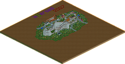
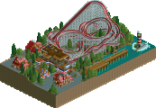
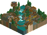
I really liked the details tossed in like the icey stall with the huge cup and straw, then their was the character meet tent, something long overdue in RCT. Just other parts seemed pretty toss together.
The coaster was pretty good, very slow on the turn arounds, but I could tell thats what you were going for. Also I loved the arched entrance for the Q.
Nice work man. I hope you enter again.
Kumba
I thought they were paced perfectly for the type of coaster.
Amazing details though. I loved the new ride under construction especially.
I still wish this wasn't the end for you with this style. Whatever...your fantasy park looks like it could be just as good.
Nice idea with the custom Ice-Stall.
inVersed Offline
@Kumba- I am glad you were able to see I intended for the turnarounds to be slow to make it seem a bit more realistic.. I do plant on submitting something else to NE, just i wanna try something on a larger scale like a full park.
@Comet- Thanks for your comment, i am glad you liked the pacing of the coaster, that is something i wanted to stress with this design. BTW maybe this won't be the end of the realism for me.. you never know what i could pull outta my sleeve next.
@RCTFAN- I am not gonna lie i had thought about doing the shake roof over the station toward the end of my work on this to make it shorter but changed my mind because im too lazy to rebuild it.
@Geewhzz- I am glad you liked the design. As of right now, i am playing around with different styles (realism, fantasy, semi-realism etc.) once i get a chance to experience build using them all I will decide which style i want to stick with. Right now i am leaning to a point between semi-realism and all out realism.
@egg_head- That custom ice-stall is my favorite detail in there and was completely last minute.
Personally, I was kind of surprised this didn't make NE design, but Kumba was right, like he told me it is pretty bare layout and it doesn't have the same amount of realistic details that are in parks like WWAP.
inVersed Offline
yeah... didnt quite make the cut
I loved the general atmosphere, i think you nailed it perfectly. The coaster itself was great, nice and compact like a classic woodie should be.
So basically i think you've been robbed