Park / New Element's Realma Digitale'
-
 21-June 04
- Views 5,479
- Downloads 624
- Fans 0
- Comments 32
-
 No fans of this park
-
 Download Park
624
-
 Objects
264
-
 Tags
Tags
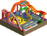
![park_2373 [H2H6] R1 - Heaven's Kitchen - The Atlantean Ark](https://www.nedesigns.com/uploads/parks/2373/aerialt2126.png)
it was a decent park but i think six frags' park was better.
Richie Offline
I liked the wacky colors and themes, great ideas....
some fab archy in there with some nice coaster pieces added in there for secerny good job.
Exxxcccceeeeellllleeeeennnnnntttttt!
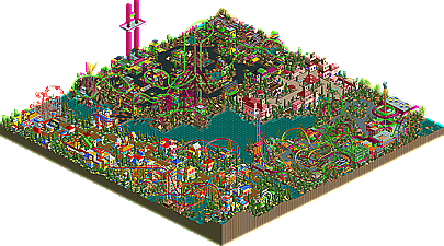
It was so fun to look at! I spent about an hour just browsing around the park. The DDR and Homestar runner areas were perfect. Hax0r was just beautiful. Everything executed itself perfectly. Perfect placement, names, colors.... I LOVE THIS PARK
Great opening shot of the "Choose Difficulty" coasters. However, I don't think you need to make them that fast. When the intensity of the Easy is 8, the Medium is 20, and the Hard is 21, I think we've got a problem.
The other area was nice and I think enough has been said about it. One thing though: bunny hops on suspended coasters are NOT cool.
The rest of the park is very bright and interesting, a great deal to look at in such a small park. Probably my fav one so far.
I thought the colours was a bit questionable, in the Homestar runner section it was a bit too much bright clashing colours for me, but the l33t section was l33t and atmospheric and all. Cool giga coaster too.
Entrance area was ok, the giant mushrooms are a neat idea, but other than that it wasn't that interesting.
I'm not sure I like the flowers everywhere, makes it a bit messy and unfocused mostly, but it works in the l33t section, but really not in the Homestar section.
I like this park more than I thought I would based on your screen. There are lots of great 1/4 sculptures and signs. The Area 1337 was probably my favorite (despite the coaster supports), but I really like all your themes.
The coasters in the HomeStar section are my favorite, but I winced at the long underground sections.
Some of the architecture looks phoned in, while other buildings really seem inspired. At a quick glance I can't find a building without that same wall with the door.
But in general the park's fun to look at. Thanks for doing something different!
I have a statement!
No, I'm not going to walkthru my own park and say how good it is.
Anyways, for the last 8 months basically, the PT has been my sole project. Well, there's one other thing, but that only has one area done, and it will be finished. Am I glad? Yes. The PT gave me a great chance to try out some fun things, with my rapids, the GTA entry, and my actual PT.
I realize that not all of the judges, or even people from the community, would have gotten the themes. Homestar runner is a website which I find hilarious, with some interesting characters. If you don't know this, you most likely didn't get all of the names, rides, etc.
Dance Dance Revolution is a video game I'm sure most of you have heard of, even if you don't know a lot about the game. It has 3 difficulty settings, light, standard, and heavy, which are represented by the 3 LIM coasters. The other rides are named for songs.
Leetspeak is what online FPS players use to try to sound cool. I find it hilarious. I thought it would be interesting to make an area, and plus, "hax0r" is the best name for a ride I've ever come up with.
Onto the RCT side of things...I knew I wasn't going to win, so I picked themes that I enjoyed. I didn't care if the judges didn't get it. I had the best time making this park, it was far from a "job". My goal was for those who didn't get it to at least enjoy the RCT side of things, and for those that understood the themes to really enjoy it.
One of my other goals was to pick coasters that you didn't see in every single park. I avoided inverts, steel twisters, flyers, rapids, mine train, etc. I went with a giga, suspended, mouser, and tri-dueling LIM's, because these are pretty hard to make, and I think it paid off. Plus, "trogdor: the burninator" just kinda fit as a suspended.
Thanks for all of the comments, criticisms, etc, and I'm glad that homestar finally got his RCT area. I honestly don't see my style changing that much, and I honestly never see myself building a "nice" mideival-woodsy-tropical-junglish area again. I like this style, and I will continue to refine the architecture and landscaping aspects of it, but I realized that I build in practically a total different scale than everyone else (buildings are MUCH smaller, paths are not 6 tiles wide, etc). So, I'm happy, and it may mean that I never become parkmaker, but I can honestly say that I am not going to change my style for it.
I had a blast making it, and hopefully you guys will see some more creative work in my next upcoming project.
Thanks for the great contest, iris, I look forward to seeing the rest of the entries.