Park / New Element's Realma Digitale'
-
 21-June 04
- Views 5,100
- Downloads 516
- Fans 0
- Comments 32
-
 No fans of this park
-
 Download Park
516
-
 Objects
264
-
 Tags
Tags
![park_2373 [H2H6] R1 - Heaven's Kitchen - The Atlantean Ark](https://www.nedesigns.com/uploads/parks/2373/aerialt2126.png)
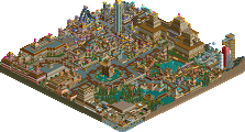
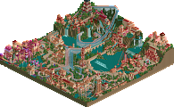
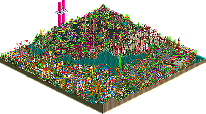
New Element's Realma Digital by Gymkid Dude
Gymkid's style is definitely one of the more hit or miss styles in all of New Element. His parks look completely different then everyone else's, with a more cartoony, unique, somewhat boxy feel to them that really separates them from anything else anyone is making. While people that enjoy the abstract will like gymkid's style of parkmaking, those that don't simply won't. In the Hi-Rollers Contest he brought forth the incredibly unique Aquazone, an amazing idea that was unfortunately almost ruined with a dizzying amount of flowers crowding the park. His preliminary entry was his shining moment though, as he built a Grand Theft Auto adventure ride that emulated the game so well that it earned itself the "Best Adventure Ride of the Year" award. In this latest project, Gymkid focused in on his cartoony style of parkmaking, and instead of trying to change it, he embraced it with different cartoonish-themes, such as the Homestarr Runner themed area. It's a great park, and one of the most fun ones to look through, but there are problems as well. The coasters of the park seem to dominate, but not in the good way, in more of an out of control, unrefined way that hurts the park's appeal. The architecture is good, but like I said, not for everyone. Still, it's a very unique entry and exactly what one would expect from gymkid, so job well done my friend.
However, I felt the landscaping was pretty bad in most places, the foliage was a little insane and the architecture could do with a little detail to spice it up.
But i looked at the park for a while, and I enjoyed it more than the other entries, so nice one Gymkid!
Metro
Nice entry afterall gym..
SF
btw; anyone else had that verifying object thing when loading?
I absolutely loved the idea and theme for the park, and you pulled it off great. Who would have thought DDR would look good in RCT?
Your buildings, although nice and colorful, ended up being pretty square and boring. But I'll forgive you, becuase your work with the 1/4th tiles was very good.
I loved the coasters, and even though they sprawled over the areas, they still had fun layouts.
Really great job, Gymkid Dude. Keep on putting out fun parks like this and you'll be just fine in my book.
I loved all the creative ideas, 1/4th scupltures, and colors. I am also glad you did an area based on Homestar Runner, that was my favorite area. I would like to know, how come you didn't do anything for Strongbad in that area?
Nice work Gymkid!
It had amazing color, great 1/4 scenery (Trogdor and Homestar were fucking awesome. Seriously.
Sexy colors on that giga too.
Excellent work, gym.
Looking forward to your next project.
I love it. The DDR area is the best IMO but all of it is sweet. The Intamin had a great layout but it had poor pacing. I hate seeing a ride of that type cresting a hill at anything under 30mph. But the layout was nutty and the lift speed shows that you were battling the other stuff.
The LIM trio were spazy. I love em'. Sure their ratings are total shit but they are so fun to watch. I was laughing my balls off the first time I saw them run. It was such a jolt seeing them run the secound I opened the park.
Great Work and I doupt this park desirved to be this low.
ride6
This park is sooo much fun! I really have no complaint save trogdor didn't burninate another village (perhaps one with knights, lol)... So yeah. I'll look back on it again, but as of now, excellent stuff.
but man you really ruined it with the treeing and landscapeing (if i can call it that) I know you can do well at this, i have seen it in your old mini's and GTA. that part could have been alot nicer.
Overall a great entry, about even with SF for currant best entry.
7.5/10
You've shown everyone what you can do, and I expect you'll become quite popular after you finish your solo (if it ever gets done, lol).
it looks like a work entry. as in, it doesn't look like gymkid had the skill to pull of something amazing, but certainly did try. I didn't really like the mushrooms much, i did like the person with the speech blob a lot, that was sweet. Then again, all those flowers, all that stuff. Intense coasters.. no shops/stalls. Home star runner was by far the best area in the park. I'm just disliking the unopenability a lot. I did like the Haxor sign too. That was nice. Just stick to making cool things maybe, but really the coasters and the colors. Ack.
If... WME would have judged
1-15. ?
16. The 10th Kingdom- Six Frags
17. Elements- Gir
18. Darkwood Amusements- Posix
19. N.E.R.D.- Gymkid Dude
20. Harmony Harbor- Micool
21. Palm Springs Florida- NC
22. Country Squire Amusement Park- rwadams
23. Poplar Grove- Ride6
Oh well. It still a very nice park.