Park / Monsoon
-
 07-August 08
- Views 4,485
- Downloads 573
- Fans 1
- Comments 14
-

-
 74.38%(required: none)
 Design

geewhzz 90% Cocoa 80% ][ntamin22 80% 5dave 75% csw 75% MCI 75% Liampie 70% Louis! 70% posix 70% Poke 65% 74.38% -
1 fan
 Fans of this park
-
 Full-Size Map
-
 Download Park
573
-
 Tags
Tags
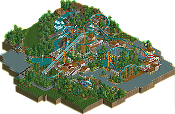
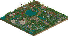
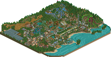
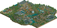
Congratulations jusmith!
inVersed Offline
And thanks for those full size overviews whoever does them they really come in handy for me when there's LL releases.
great job, always nice to see a LL release.
But yeah, good stuff, jusmith. Glad you are doing well with LL.
Some things to work on -- your architecture could use some further refinement. A little too reliant on the banners I think. And don't be afraid to venture beyond simple 2x2 shapes and sloped roofs. That's what separates good LL architecture from great LL architecture. I've always found that it helps to reference real life buildings, especially when you're building in LL, because there's a tendency to fall into patterns because of the limited options. Trying to mimic real-life architecture forces you to break some of those habits. Your rocky terrain is almost there, but a little too triangular for my taste (if that makes sense). Take a look at Schuessler's parks (should be on the parkmaker page) and spend some time just with the landscaping. He's the master. That's how I learned it.
Overall, this is a very classy piece of parkmaking. Not too far out of line from what we'd see from the LL parkmakers back in the day. Nice to see people still giving LL a try. Keep working at it. I can see you've got a real eye for textures and colors. Everything else is just practice.
The coaster design was the biggest problem for me, as I wanted it to interact with landscaping but also with other parts of the park (paths, buildings, etc.) Originally I had another inversion going half underground, but I could make it look natural, it just looked really forced, so I scrapped it.
Thank you Coaster Ed for your in depth coverage (I'm in Olympics mode, lol). I truly respect your opinions as you have made some of my favourite works in RCT. I totally agree about my architecture, it was very simple and somewhat boring at times. In my new park, though, I have been looking at real life buildings, and trying to use more varieties of objects and track pieces to make my architecure, rather than raised land and banners. So thanks for that.
I hope some more comment, even if it is just from the overview (which is really cool by the way!)
jusmith
Looking forward to seeing a full park from you.
hpg Offline
Congrats on the design. I'm loving the atmosphere in this design--I'd love to see you make a full park of this quality. Everything has a certain elegance to it that's a rare find these days. Also, while the archy is a bit simplistic, I think it still works fairly well as such. It certainly didn't detract from the design in my eyes, even if it didn't do much to enhance it.
you seriously need to plan a full scale, LL needs more heart like this, plus if you can execute a whole park as seamless an simply as nice to look at as this flyer a spotlight is just waiting for you man, amazing job jusmith!
Edited by Alchemist L7, 13 August 2008 - 07:32 AM.