Park / Discovery Island
-
 08-April 07
- Views 6,200
- Downloads 622
- Fans 1
- Comments 47
-
1 fan
 Fans of this park
-
 Download Park
622
-
 Objects
187
-
 Tags
Tags
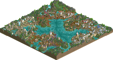
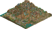
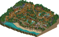
Otherwise, it is a huge improvement.
Although I think it would be better having the back spike over water because the water doesn't really add any excitement to the front spike.
Another thing is I think you should break up the glass a little bit, it's too continuous and it shouldn't start at ground level. You should attempt at interior in the glass buildings, since it's so easy to see in the buildings.
Also, is the ride called Reef, or is that the exit to something else?
Zodiac, Gwazi - Water will be sorted.
Gwazi - I quite like the glass ATM, so that wont change. Signs I can change. They're not actually placed in random directions, each one turns 90*, I quite like it like that. And foliage isn't my strong point and I don't think it ever will be, however I do put a bit of thought into it. I can work on my foliage at a later stage.
gir - Supports I know about, there isnt much I can do. And thanks.
Comet - Thanks. The water is that side because it is that side, Lol. Interiors can be done, I dont know if I will though. Yes the Impulse is called Reef. Couldn't think of much else.
Thanks for all the comments. I should have another screen soon.
Oh yeah, and for foliage help, look at work from Turtle and J K. They have some excellent styles with it, and will help a ton.
Edited by Gwazi, 06 May 2007 - 01:31 PM.
The water area under the spike looks a little too forced, like it looks like the only purpose of the water is so the ride can be over it. Maybe you should try making the water area a little more natural looking. Also, I dont really like the net thing, but I never have really liked ride scenery, maybe because I was never in the community during rct1 days. IMO it would look better with kind of a themed arch or tunnel over the parth.
The shops and buildings look really nice, but they might look even better with a few balconies and less windows but I dont really think thats a problem
Edited by Camcorder22, 06 May 2007 - 04:04 PM.
Other than that keep up the good work.
Ride6
Edited by vekoma9, 06 May 2007 - 06:22 PM.
Gwazi - I'll see what I can do with the glass thickness.
Camcorder22 - Thanks. The water actually does spread out, you just can't see it here.
Leonardofury - They are there. You just can't see them very well, I don't understand why. But I promise you that there are 4 posts holding them up.
by Pineapple
Before entering Discovery Island please collect/purchase your tickets at Island Gateway. If you wish to report a complaint or speak to a member of our customer service team please make your way to Guest Services. Thankyou.
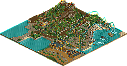
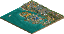
The first thing you see as you enter Discovery Island into Caribe Plaza is Reef.
Launching you forwards into a twisting vertical spike only to come straight back down again is a thrill you'll never forget on our very own Intamin Impulse.
Caribe Plaza also hosts two exciting flat rides. Caribe Rum Barrels and Ruthless Voyage are sure to be fun for all the family.
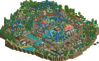
For the more daring, why not test your fear on Caribe Plaza's 2nd coaster. Hirakin a B&M Sit-Down. With 5 massive inversions and building up speed constantly, this one is not to be missed.
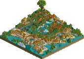
Need to recover. Why not take a gentle rapid ride around the Eastern Lagoon. You never know how wet you will get on Tifon River.
Moving into Southern Mexicana, you will come across Los Tikantos, a GCI Woodie that certainly packs a punch.
Also situated in Southern Mexicana are Tulanis and El Tipidago, two flat rides that will certainly get your heart racing.
Throughout the park there are many shops and cafes for a well earned rest, be sure to check out the wonderful surroundings as well.
Enjoy your visit at Discovery Island.
Download will be up soon.
Edited by Pineapple, 17 May 2007 - 02:51 PM.
Thanks for the comment.
i hope it wins something
Hirakin looks good, i'm intrigued.
Edited by zodiac, 18 May 2007 - 02:21 PM.
-JDP
Lloyd - Thanks, it means a lot.
zodiac - Damn you! I thought I took it out quickly enough! Just don't let Buckeye Becky here you say that!
JDP - It's going to stay at 9 cars as that is what I have sent it in with.
Link to download.
This can now be placed in placed in the released section, thanks.
//Pineapple