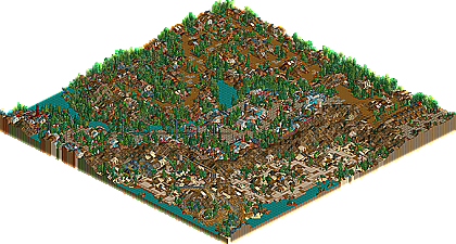
dang it, but yeah, those mountains were very nice, I wasn't liking that first corkscrew on the corkscrew coaster, but I thought it was fine as far as how much it went into the ground. It highlighted the inversions and helixes and stuff. The woody was cool, but a bit short, and Machine was very neat too. The architecture was top notch, and nothing wrong with it, all was very interesting and detailed. I liked all the theming, but those ticket counters were a bit odd, just didn't like the green hats...
I have no idea what vTd was thinking... this by far deserved to be ranked a bit higher, but we'll see as more entries get released.
the major gripe i have with it, is the dark atmosphere you've got going on. I think it's the trees and landscaping and certain color choices. They remind me of Natelox' old parks (which i was never a fan of) I'm just really thinking in terms of what if you took a walk on the bright side... like without the dark undertone. I think you made it work quite well, since there are still some non dark colors, and it still came out gloomy, but really, i'd much prefer it to be happy. Maybe the track should even stick out more. Nonetheless, it's amazing how the track all fits in. About the coasters, the woodie was pretty nice. Nothing spectacular, but woodies are hard to make just nice like this one as well. The corkscrew again reminded me of Natelox' older work, not really that bad i guess.. nothing i'd ever make. Machine was lovely, the idea to have it riding so high above the path is ingenious. And whatever more i say, it comes down to the fact that i wished it was brighter.. anyways, very nice park, and showing your name belongs on that parkmaker slot.
If... WME would have judged
1-12. ? 13. Gouvia Point- Voodoo 14. Continent Traasok- Twisted 15. The 10th Kingdom- Six Frags 16. Elements- Gir 17. Darkwood Amusements- Posix 18. Ancient Enchantments- Prince Ashitaka 19. N.E.R.D.- Gymkid Dude 20. Harmony Harbor- Micool 21. Palm Springs Florida- NC 22. Country Squire Amusement Park- rwadams 23. Poplar Grove- Ride6
I realise the coasters wern't as good as they could have been. Assyrian was short as I really didnt leave much room for it so had to squash it in. Cuirassier I feel is the best of the coasters but I can see where people are coming from with it being underground for too long as it is. The intensity is also a little high but in the rush I was in I just didn't have time to play around with it. Machine was forced to be made in the small area between Fort Cornaa and Taybusa so is a little odd. The only thing I was really going for with the coasters was to as ride6 says get them to blend in nicely but probably should ahve payed more attention elsewhere.
I enjoyed playing around with all the track accents trying to come up with new ways of doing them using multiple pieces of track rather than just a Virginia Reel or whatever so I appreciate the comments on them.
I also realise I used themes that have been done hundreds of times before. I was just having a lack of imagination at the time so decided to use themes that were easy but tried to do them with something a little different so that they wern't like all the other ones out there. I don't think I did too bad in that.
The whole park was rushed which probably did affect it. Wonder where i'd have placed if I started in the first week...
WME my parks tend to be darker because I just dont really like using the yellow walls which are really the only walls I didn't use and they're also the brightest. I find when I use them it looks ugly but people like mantis use them really well and it looks ace.
I'm interested in hearing what Posix would have to say as one area was inspired by him and of course I want to know what vTd has to say.
It's a pity there isn't much interest in LL as i'm positive there's some great LL parks to come.
Thanks again I really appreciate all the comments especially the ones that I should have placed higher and that I got screwed by vTd.
The entrance and the area up to Fort Cornaa looked really plain to me and I think there should have been more foliage. Other than that it is a very nice park. Nice work Twisted!
I liked this park but I thought it could have been better. It really showed that you rushed in the park too. Many of the areas looked like they were waiting to be refined and tweaked. I really liked the landscaping job you did...also your theming and use of foliage...those elements made for an enjoyable atmosphere. I'm sure you would have placed higher with more time and some more original ideas.
No offense to Twisted, but I find it amazing he's a parkmaker considering he hardly releases anything. Of course, this proved to me why, but it also proved why in a month, I will be asking the same question again. His work is good, the architecture is quite good actually, but it's nothing to lose sleep over. "Metropolis Pt 1: Cycrosis" was very cool, although it could have been better with fewer trees. The mountain range showed some great landscaping talent. Hopefully you'll knock me off my chair with your next release.
This park never ceased to have me looking around, wanting to just explore it.
I absolutely loved the coasters. They just interacted with the land and scenery so well, and had great layouts too.
Every area of the park had some uniqueness to it, even though all the themes have been done before.
I really enjoyed the futuristic area the most, mainly because of the buildings and it made me feel like I was there, atmosphere is definatly the key in this park.
The architecture was very good, nice use of coasters and other things as scenery.
Overall, this was some quality work, Twisted. I really enjoy your parks.
Very cool, I really liked it. Great use of track theming, cool architecture, nice landscaping, everything was just cool. It did feel like there was something missing though, I can't put my finger on what, but it's like the park could've been better than it is... Maybe it was the time limit, or something. Nice park nevertheless.
28 Comments
penguinBOB Offline
dang it, but yeah, those mountains were very nice, I wasn't liking that first corkscrew on the corkscrew coaster, but I thought it was fine as far as how much it went into the ground. It highlighted the inversions and helixes and stuff. The woody was cool, but a bit short, and Machine was very neat too. The architecture was top notch, and nothing wrong with it, all was very interesting and detailed. I liked all the theming, but those ticket counters were a bit odd, just didn't like the green hats...
I have no idea what vTd was thinking... this by far deserved to be ranked a bit higher, but we'll see as more entries get released.
cBass Offline
Evil WME Offline
very very interesting, to say the least.
the major gripe i have with it, is the dark atmosphere you've got going on. I think it's the trees and landscaping and certain color choices. They remind me of Natelox' old parks (which i was never a fan of) I'm just really thinking in terms of what if you took a walk on the bright side... like without the dark undertone. I think you made it work quite well, since there are still some non dark colors, and it still came out gloomy, but really, i'd much prefer it to be happy. Maybe the track should even stick out more. Nonetheless, it's amazing how the track all fits in. About the coasters, the woodie was pretty nice. Nothing spectacular, but woodies are hard to make just nice like this one as well. The corkscrew again reminded me of Natelox' older work, not really that bad i guess.. nothing i'd ever make. Machine was lovely, the idea to have it riding so high above the path is ingenious. And whatever more i say, it comes down to the fact that i wished it was brighter.. anyways, very nice park, and showing your name belongs on that parkmaker slot.
If... WME would have judged
1-12. ?
13. Gouvia Point- Voodoo
14. Continent Traasok- Twisted
15. The 10th Kingdom- Six Frags
16. Elements- Gir
17. Darkwood Amusements- Posix
18. Ancient Enchantments- Prince Ashitaka
19. N.E.R.D.- Gymkid Dude
20. Harmony Harbor- Micool
21. Palm Springs Florida- NC
22. Country Squire Amusement Park- rwadams
23. Poplar Grove- Ride6
Twisted Offline
I realise the coasters wern't as good as they could have been. Assyrian was short as I really didnt leave much room for it so had to squash it in. Cuirassier I feel is the best of the coasters but I can see where people are coming from with it being underground for too long as it is. The intensity is also a little high but in the rush I was in I just didn't have time to play around with it. Machine was forced to be made in the small area between Fort Cornaa and Taybusa so is a little odd. The only thing I was really going for with the coasters was to as ride6 says get them to blend in nicely but probably should ahve payed more attention elsewhere.
I enjoyed playing around with all the track accents trying to come up with new ways of doing them using multiple pieces of track rather than just a Virginia Reel or whatever so I appreciate the comments on them.
I also realise I used themes that have been done hundreds of times before. I was just having a lack of imagination at the time so decided to use themes that were easy but tried to do them with something a little different so that they wern't like all the other ones out there. I don't think I did too bad in that.
The whole park was rushed which probably did affect it. Wonder where i'd have placed if I started in the first week...
WME my parks tend to be darker because I just dont really like using the yellow walls which are really the only walls I didn't use and they're also the brightest. I find when I use them it looks ugly but people like mantis use them really well and it looks ace.
I'm interested in hearing what Posix would have to say as one area was inspired by him and of course I want to know what vTd has to say.
It's a pity there isn't much interest in LL as i'm positive there's some great LL parks to come.
Thanks again I really appreciate all the comments especially the ones that I should have placed higher and that I got screwed by vTd.
Tech Artist Offline
AustinPowers Offline
natelox Offline
PymGuy Offline
I absolutely loved the coasters. They just interacted with the land and scenery so well, and had great layouts too.
Every area of the park had some uniqueness to it, even though all the themes have been done before.
I really enjoyed the futuristic area the most, mainly because of the buildings and it made me feel like I was there, atmosphere is definatly the key in this park.
The architecture was very good, nice use of coasters and other things as scenery.
Overall, this was some quality work, Twisted. I really enjoy your parks.
Janus Offline