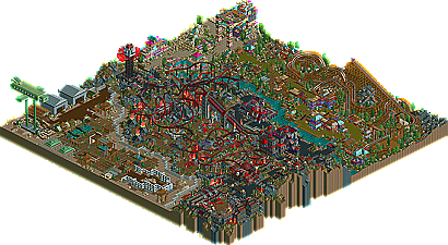
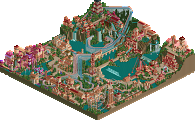
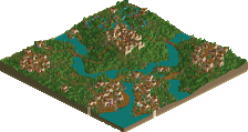
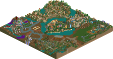
You have improved but i didnt enjoy this park as much as other people have.
I think the dino area was really cool, great buildings and some wicked use of colour.
But the other areas just seemed to be a little rushed, i mean the army base section basicly let the whole park down alot, the entrance area was ok but didnt seem like it fitted in with the rest of the park and that hell area was a little over done imo, i mean you are just hacking for the sake of hacking. There really wasnt any point of having the destroyed coaster trains and stuff.
The soul shaker ( think thats what its called) was pretty impresive, i liked that alot. But like i said the hell area was very overdone, too much going on with the duelers and all the coaster trains flying everywhere.
Anyways its a pretty good park, proberly your best yet.
I just think it should of came lower, i liked Twisted's,Prince's and Voodoo's much better.
Oh and wicked walkthrough, i enjoyed reading that.
First, great job... in my opinion, it's definitely the best park yet...
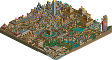
I loved the entrance- the bright colors, the height of some of the architecture, the beautiful waterfalls, and that wonderful oriental music combined for a very pleasant area.
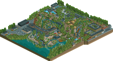
The Dinosaur area was good as well- the colors you used in your architecture was fantastic, but the coaster was the highlight of the section... nice speed, nice layout...
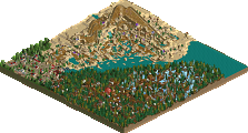
Hell was the best area in the park I think... it was so dark and haunting, but then again, you managed to make it light and enjoyable at the same time. The coaster(s) were a little long, but the height of the landscape and all of the architecture made the section...
The Army area was pulled off very well, but it just didn't fit in with the rest of the park... the hangars, planes, obstacle course... all were handled well.
The best thing about the park was all of the ideas... the dinosaur sayings, the fossil digs, the tar pit, the broken hell cars, the demons in their cages, the hell olympics, the plane drop rides, the obstacle course... I've never really seen any of those, and they were all pulled of so well... your creativity was apparent in just about every aspect of the park- one of the best 'different' parks since Wisconsin or Big Top Circus Park.
Now, if you'll just use those ideas in cohesive themes... you'll have one stunning park. I, for one, can't wait for the release of Bayfront.
It seemed really big, compared the other pt entries.
Anyways, I really enjoyed it. The para-training ride was extremly creative! You're a freaking genious Kumba!! The Rex woodie had a nice, smooth fun looking layout that made me want to go on it. Everything was so well done. I wish you would have just stuck to one or two themes instead of three. I wanted to see more of the army theme, and less of the hell theme.
I really like this park, Kumba. It was fun to look through the whole thing. The themes were all done well, but I'm not sure why they're all in the same park. Anyway, Great job!
favorites:
- the waterfalls going through ruins in the entrance
- all the scenes around the beemers, and the coasters themselves. beautifully timed. some cool use of fire.
- devil's kitchen, sweet architecture.
- ditto the library of souls, which I'm proud to keep running.
- plane bad, tanks good (and it has nothing to do with the colors)
- nice woody!
Amazing park Kumba! It took me quite a while to look at it which really means something because the length of time I look at a park generally goes hand in hand with how much I like it.
I'll start with what I didn't like: There was too much open land. I understand it in the army area...but there were other areas where there was unnecessary openness. I also think that you went a bit overboard with the 1/4 tile scenery used for theming, like the egyptian blocks and the logs and the bones, etc...I did not like the airplane that you made for the paratrooper training rides, it just didn't look right. I didn't like the Dino area that much....mainly because of the other areas really, the dino area was just too boring compared to the other areas...not as many cool ideas or hacks...one other thing was the complete unconnectedness of the areas.
Now, what I liked: The entrance area was very colorful and I liked the waterfalls and the tall structure. The hell area was amazing. The hacks were great and added to the atmosphere tremendously. The architecture in this area was extremely good, the details and forms just all went together to create very interesting buildings. The coasters were all really good...and the duelers were well done. The most creative area was the army area. I really loved it. The training course was very well done and the shooting ranges were cool. The tanks were really nice also, very realistic looking.
Overall a great park. This really shows your enthusiasm for the game.
man, the hardest park to place, i can tell. It's got some incredible shit, while at the same time, there's a sense that it isn't that great. More potential couldn't be there however. The biggest aspect to this that hurts the park is the different areas imo. The dino area had the greatest flowers i've ever seen. that big building is lovely (with the colors) The waterfall near it was awesome. The one fourth square stools on a path are absolutely brilliant.. but then.. I don't know about the hell area, but what contrast, really. And imo, i think it's too helly. As in it's fantasy like, and there's too much fire. There are still some amazing archy thingies and whatever, but it just doesn't all come together for me. Soul mixer, is a great idea again. para training was amazing, again, great idea (and execution, something that seems to not be needed for others, but the most important part for me) The area there was kinda plain. The black scenery tile made the best part of hell, the olympics, a lot better. With four bright areas like the two in this park, imo, it would have been a major contender to win the pro tour. It might not even look so now, but you should see how areas usually come together, when they fit together. Even though it really wasn't the best 'park', all the points for kudos, and possibly the one guy I'd have given a parkmaker spot over this (if he keeps this up on a solo, he'll grab a spot anyways, so doesn't matter really, and trust me, this guy 'll get there eventually. Look at the spirit for making lots of preliminary parks just to get in ) This grabs the top of my list, without further adieu...
If... WME would have judged
1-11. ? 12. Darwood Grove- Kumba 13. Gouvia Point- Voodoo 14. Continent Traasok- Twisted 15. The 10th Kingdom- Six Frags 16. Elements- Gir 17. Darkwood Amusements- Posix 18. Ancient Enchantments- Prince Ashitaka 19. N.E.R.D.- Gymkid Dude 20. Harmony Harbor- Micool 21. Palm Springs Florida- NC 22. Country Squire Amusement Park- rwadams 23. Poplar Grove- Ride6
btw, i thought it was weird that you posted a walkthrough in your own park's topic, but nonetheless, i really enjoyed reading it. The blonde tall anti-social.. must have been disguised as me =P. I'm not that tall and i even tried remaining friends with you.. untill now Anyways, i loved the amount of people in it, Blitzie's contribution to the story, and Marshy's. Really funny, best walkthrough ever.
up ahead of him Kumba saw Marshy "training" and trying to shot targets aswell, Kumba looked around to see if anyone was watching and then blasted Marshy's head off. Kumba steped over Marshy's dead body shot some more targets
Kumba...i'd like to further comment that im surprised by all of the witticism in this park. You sound like a stupid mofo when you post, yet "Rex Go' Give it to ya" is simply brilliant.
When I first saw that screen Kumba posted, I thought "Holy crap, we might have a winner here". But when I opened the park, the only part of the park that kept the same quality as that screen was the place that screen was taken. I mean, the architecture, the tree selection and placement, the path layout, the colours, it was all flawless. "Dino Digs" is one of my most favorite themed areas ever. But the rest of the park didn't even show up for the competition. The hell theme was okay, the army base had nothing to do with anything and the bright coloured 'happy land' left me wondering what was he thinking? Outside "Dino Digs", the only thing that really impressed me was the lively sculpture on top of "Soul Mixer" (that was so cool). Kumba, you have tons of talent, just make a whole filled with it and you wo't have any troubles.
Though I really enjoyed all the cool ideas and the hacks, and the park was really fun to look at the first two times, I don't really feel like looking at it again. It lacks a certain depth, there is really no thought put into it as a whole at all, so the park doesn't grow with time, it just gets old. The themes aren't very developed, the park layout was pretty bad, and that really takes down the park for me, which is sad because the park has so much potential. The Dino area seemed to be the most thought-out one, and it's also the one I like the most... Great job anyway, the park is very cool despite those flaws, looking forward to BP.
Nice walkthrough too.
30 Comments
artist Offline
You have improved but i didnt enjoy this park as much as other people have.
I think the dino area was really cool, great buildings and some wicked use of colour.
But the other areas just seemed to be a little rushed, i mean the army base section basicly let the whole park down alot, the entrance area was ok but didnt seem like it fitted in with the rest of the park and that hell area was a little over done imo, i mean you are just hacking for the sake of hacking. There really wasnt any point of having the destroyed coaster trains and stuff.
The soul shaker ( think thats what its called) was pretty impresive, i liked that alot. But like i said the hell area was very overdone, too much going on with the duelers and all the coaster trains flying everywhere.
Anyways its a pretty good park, proberly your best yet.
I just think it should of came lower, i liked Twisted's,Prince's and Voodoo's much better.
Oh and wicked walkthrough, i enjoyed reading that.
Valp Offline
I loved the entrance- the bright colors, the height of some of the architecture, the beautiful waterfalls, and that wonderful oriental music combined for a very pleasant area.
The Dinosaur area was good as well- the colors you used in your architecture was fantastic, but the coaster was the highlight of the section... nice speed, nice layout...
Hell was the best area in the park I think... it was so dark and haunting, but then again, you managed to make it light and enjoyable at the same time. The coaster(s) were a little long, but the height of the landscape and all of the architecture made the section...
The Army area was pulled off very well, but it just didn't fit in with the rest of the park... the hangars, planes, obstacle course... all were handled well.
The best thing about the park was all of the ideas... the dinosaur sayings, the fossil digs, the tar pit, the broken hell cars, the demons in their cages, the hell olympics, the plane drop rides, the obstacle course... I've never really seen any of those, and they were all pulled of so well... your creativity was apparent in just about every aspect of the park- one of the best 'different' parks since Wisconsin or Big Top Circus Park.
Now, if you'll just use those ideas in cohesive themes... you'll have one stunning park. I, for one, can't wait for the release of Bayfront.
Geoff Offline
Anyways, I really enjoyed it. The para-training ride was extremly creative! You're a freaking genious Kumba!! The Rex woodie had a nice, smooth fun looking layout that made me want to go on it. Everything was so well done. I wish you would have just stuck to one or two themes instead of three. I wanted to see more of the army theme, and less of the hell theme.
A really nice entry though.
cBass Offline
favorites:
- the waterfalls going through ruins in the entrance
- all the scenes around the beemers, and the coasters themselves. beautifully timed. some cool use of fire.
- devil's kitchen, sweet architecture.
- ditto the library of souls, which I'm proud to keep running.
- plane bad, tanks good (and it has nothing to do with the colors)
- nice woody!
Now STFU and make more parks.
AustinPowers Offline
I'll start with what I didn't like: There was too much open land. I understand it in the army area...but there were other areas where there was unnecessary openness. I also think that you went a bit overboard with the 1/4 tile scenery used for theming, like the egyptian blocks and the logs and the bones, etc...I did not like the airplane that you made for the paratrooper training rides, it just didn't look right. I didn't like the Dino area that much....mainly because of the other areas really, the dino area was just too boring compared to the other areas...not as many cool ideas or hacks...one other thing was the complete unconnectedness of the areas.
Now, what I liked: The entrance area was very colorful and I liked the waterfalls and the tall structure. The hell area was amazing. The hacks were great and added to the atmosphere tremendously. The architecture in this area was extremely good, the details and forms just all went together to create very interesting buildings. The coasters were all really good...and the duelers were well done. The most creative area was the army area. I really loved it. The training course was very well done and the shooting ranges were cool. The tanks were really nice also, very realistic looking.
Overall a great park. This really shows your enthusiasm for the game.
Evil WME Offline
If... WME would have judged
1-11. ?
12. Darwood Grove- Kumba
13. Gouvia Point- Voodoo
14. Continent Traasok- Twisted
15. The 10th Kingdom- Six Frags
16. Elements- Gir
17. Darkwood Amusements- Posix
18. Ancient Enchantments- Prince Ashitaka
19. N.E.R.D.- Gymkid Dude
20. Harmony Harbor- Micool
21. Palm Springs Florida- NC
22. Country Squire Amusement Park- rwadams
23. Poplar Grove- Ride6
Evil WME Offline
Marshy Offline
gymkid dude Offline
It certainly seems that great things await you...
natelox Offline
Janus Offline
Nice walkthrough too.