Park / Electric Park
-
 23-February 13
- Views 10,286
- Downloads 957
- Fans 4
- Comments 21
-

-
 55.38%(required: 50%)
 Bronze

Wanted 65% Airtime 60% Austin55 60% In:Cities 60% nin 60% robbie92 60% Sulakke 60% Fizzix 55% Liampie 55% Maverix 55% Pacificoaster 55% Jonny93 50% pierrot 50% prodigy 40% tyandor 40% 55.38% -
4 fans
 Fans of this park
-
 Full-Size Map
-
 Download Park
957
-
 Objects
258
-
 Tags
Tags
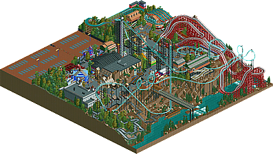
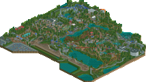
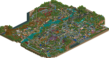
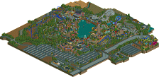
Okay, as for the replies…
Chorkiel: Thanks man! Hope you got to download. That’s where the park comes to life!
Liampie: As I said before, no worries haha. I appreciate the file switch. The version with more peeps is a lot more fun in my opinion, and I got a chance to fix the back of the Famous Fries building, where I originally forgot a few blocks.
Sammy: Thanks dude!
Wanted: Thanks so much for the praise, man! Also, I’m glad you liked Moosic Express. It was kind of squeezed in there, but I ended up being really happy with the ferocity of the layout. The thing would beat the living hell out of you in real life haha.
Ling: No worries, man. I knew it wouldn’t be for everyone. I actually wasn’t even sure it would pick up an accolade. I was very pleased that it did, being such a small map.
RCT2Day: Thanks for the reply! The only thing I can really say is “to each his own,” I suppose. Architecture has never been my strong point, but I think that I’ve always made up in atmosphere for what I lack in technical skill. However, not all will agree, and that’s fine!
Goliath123: Strong praise indeed! Glad you enjoyed it that much man. Goliath was quite the design!
Robbie: Wow. Wow wow wow. Thanks man! There are a few people that I always know will “get” my stuff haha. And by that, I mean that I think we view the game in a similar manner, and appreciate much of the same things. Thanks again!
RCTER2: So glad you feel that way. The original RCT scenarios were lively, atmospheric, and just plain fun! Glad I could recreate that feeling.
Gir: So glad somebody pointed that out; it was a big inspiration for the layout of the park. Always loved that scenario…just wished it had more room to build. I cheated a bit and gave myself my own “Whispering Cliffs” scenario.
Corkscrewy: Haha glad you noticed. I always have a good time naming my staff and entertainers.
Fizzix: Bronze is fine with me! Glad you enjoyed it, though.
Cocoa: Yeah, that’s basically the best comment I’ve ever received for anything I’ve ever built. Thanks so much man!
Harkonnen: Glad you liked it! If you are looking for some good NCSO, may I suggest “Hidden Valley” by JDP. It’s an awesome park that won silver on here a little while back.
Austin55: I always like when the strengths other people find in my work are the same as the ones I perceive. I really do enjoy chasing that “fun twist on realism.” I’ve never considered myself a realistic builder, per se, as most of what I build wouldn’t really exist in real life in the same way as something built by Robbie or CP6. I can’t compete with that, so I don’t try haha. The stuff I try to build is basically what I think would be realistic in an RCT world, if that makes any sense. Oh, and I know the parking lot is a little bit of a space-eater. I chose to include it for three main reasons: 1) I wanted some negative space on a map that I new would be quite cluttered. 2) I wanted to capture a little bit of a Waldameer feel, with the parking lot jammed right up against the park fence, and the water ride towering over the lot. 3) I was afraid I wouldn't finish the park without eating up some space, even with how small the map was. Hope that clears it up a bit haha. Thanks for the comment man!
Sam: Glad someone commented on Scranton Screamer, as I’m really happy with how that layout ended up. It really carries the park as a big ticket ride, I think, and I’ve had enough fun just watching it bounce around from one part of the park to the next haha. Also, the part from the second vertical loop to the brake run is probably the best consistent interaction-with-surroundings I’ve ever managed to create. From the skimming along the cliff-side, to the turn under the station, and to the final upward helix over the path, under the Moosic Express, and into the station—I have to say that I was really pleased! And glad you liked the park in general man! And it feels good to have picked up the game again.
Thanks so much for the comments guys. Keep em coming! I’d love to hear from some of the panelists who voted but have not commented yet.
Airtime Offline
The car park and valley felt rushed and almost wasted. I thought you could of done something more with those areas. The park really felt like it was missing a few entry buildings.
However I did really enjoy this park. I loved the area around the fountains. The splash boats area and the area by the woodie had a great atmosphere.
I loved the megalooper's layout but I really wish the batwing wasn't right over the woodie's layout, If only you had a slightly bigger map to give these two coasters a little more space, I know your going for Kennywood but still. I have no idea why but I loved the two corkscrews and turn around.
The woodie's layout was great apart from the second drop into the valley. It felt very awkward and forced, I also didn't like that sort of double-up. The series of turns after the lift looked great.
Nice rock climbing wall and hammer game.
Another thing I didn't like was the go karts. They seemed like a complete space filler and quite unrealistic.
Great release anyway Zburns. It was a fun park and I hope this park gave you a spark to build more stuff.
Oh and I really wanted to give you 10% more but there was the odd thing that kept it back, sorry dude.