Park / Electric Park

21 Comments

  • Comment System%s's Photo
  • chorkiel%s's Photo
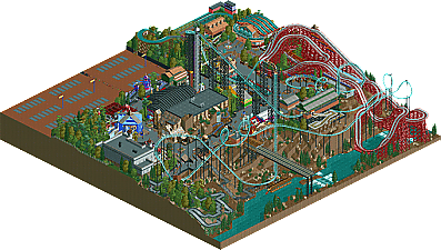
    From the overview:
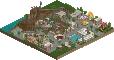
    I really loved this! It reminds me of when I came first to this site and these kind of parks were uploaded quite frequently. Loved what you did with this. On one hand it could easily have been a scenario of RCT itself but on the otherhand it's much more and much better than that.
    Great job!
  • Liampie%s's Photo
    For those who downloaded this park already, yours truly has been a stupid admin when he forgot to include the readme and a corrected savegame. You might want to re-download. :)
  • SSSammy%s's Photo
    you the man zburns!
  • Wanted%s's Photo
    It was so fun looking through this zburns! I fell in love with the woodie
  • Ling%s's Photo
    I'm sorry, but I don't get this at all. I could see it being accolade-worthy maybe five or six years ago, but not now, especially on such a small scale.
  • RCT2day%s's Photo
    I'm with ling on this one. While its fun and nostalgic, it is not up to par with a modern bronze. For example, the station for the phantom's revenge coaster is very boring and just a block with several different walls. I give it a 35 or 40%. Sorry zburns, just couldn't get into it.
  • Goliath123%s's Photo
    I reckon this is better then Goliath, some people just think differently i guess
  • robbie92%s's Photo
    This was utterly fantastic. Like I've said many times, and like what nin's repeated for years, you have a way of making RCT feel so exciting. It feels like how it would feel if you were visiting a park: excitement, wonder, and a certain liveliness that's incredibly difficult to replicate in RCT. Your work is just so damn fun. Even if your work isn't the most technically-detailed or clean, you manage to make it feel more park-like than pretty much anyone else. This is what most realism should be.

    The park itself was absolutely amazing. I loved the ravine setting and the general compactness of the park. And the colors... SO cartoony, in the best way possible. My one color qualm was the woodie; it looks better and things look a bit more cohesive when the track is the same color as the supports, like you had it in the original screen. The other issue for me was the parking lot, which didn't look all that great; had it been done better, it would've worked really well there, but at this stage, I just want more park.

    My 60% may seem like a low score, but had this been a full-scale of the same quality and atmosphere, you'd easily get at least a 90%.
  • RCTER2%s's Photo
    Although it's an RCT2 park it gives me an RCT1 feeling, I don't know why.
  • gir%s's Photo
    Heh, reminds me of the Whispering Cliffs scenario!
  • Corkscrewy%s's Photo
    My first celebrity appearance in an accolade!!!! So of course I love it.
  • Wanted%s's Photo

    This was utterly fantastic. Like I've said many times, and like what nin's repeated for years, you have a way of making RCT feel so exciting. It feels like how it would feel if you were visiting a park: excitement, wonder, and a certain liveliness that's incredibly difficult to replicate in RCT. Your work is just so damn fun. Even if your work isn't the most technically-detailed or clean, you manage to make it feel more park-like than pretty much anyone else. This is what most realism should be.


    +1
    You have a way with words robbie

    If you were to make a fullscale park with this style and it kept the same amount of excitement, I would vote spotlight for this.
  • Fizzix%s's Photo
    I was somewhere between Rob and Ling on this. I enjoyed what was there, but I also felt something lacking in archy. Loved the layouts and atmosphere, but I didn't feel like I hadn't seen anything before. I will admit I watched the mine ride more than I would like to admit though. Overall, strong Bronze, but nothing more.
  • RCT2day%s's Photo

    My first celebrity appearance in an accolade!!!! So of course I love it.


    Are you the guy Avaninecommuter is refering to when he says "monotonous NCS architecture?" Because there is some logic to that. I kid, I kid.
  • Corkscrewy%s's Photo
    you mean out of the very few screens i've shown?? hhaha

    but no i get it haha
  • Cocoa%s's Photo
    what an awesome little park. really feels like kennywood and is just so much fun to watch. I love how it feels like a scenario, so nostalgic and lively, and yet also brims with detail and atmosphere and excellent aesthetics. I got the feeling, when I was watching the rollercoasters make their circuits (something I rarely do in full) that when chris sawyer made the game, this is the sort of park he imagined us building. It just feels like the definition of rct. good job :)
  • Harkonnen%s's Photo
    Just gotta like RCT 1 Feeling.

    1st time I've seen good work with non-custom scenery. How great XD
  • Austin55%s's Photo
    5Dave nailed the logo.

    Zburns-I hope you play more! You are one of my favorite players and always have a fun twist on realism and a focus on coasters. This park obviously had a lot of nostalgia, but in 3 different ways
    -NCSO always has a bit of a nostalgic feel
    -You used a park (kennywood) as a base that is itself nostalgic
    -The crazy, perhaps unrealistic way you did some things, like the go karts.

    I wish it was maybe a bit bigger/substantiate, perhaps with a park instead of a parking lot.
  • RamSam12%s's Photo
    Great to finally see another release from you. Scranton Screamer is amazing, and the dark rides were especially fun to watch since they reminded me very much of the ones at Kennywood. Even for how small the park is, it should have been a silver.