Park / Peregrine
-
 23-February 13
- Views 2,129
- Downloads 531
- Fans 0
- Comments 5
-
 36.92%(required: 65%)
 Design Submission

Jonny93 55% Arjan v l 45% Austin55 45% In:Cities 45% Liampie 45% Phatage 45% zburns999 45% Coupon 35% Maverix 35% robbie92 35% tyandor 30% Wanted 30% nin 25% Pacificoaster 20% prodigy 20% 36.92% -
 No fans of this park
-
 Download Park
531
-
 Objects
222
-
 Tags
Tags
![park_2843 [PT4 R4] Living Large](https://www.nedesigns.com/uploads/parks/2843/aerialt2495.png)
![park_2614 [NEDC2 #1] Winter is Coming](https://www.nedesigns.com/uploads/parks/2614/aerialt2316.png)


Looking forward to seeing more!
And Angroc, good to see you around again too.
For a better score next time, my advice would be...
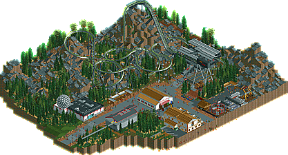
Foliage needs improvement, some variation in species and colors, it was very generic now.
The coaster design wasn't bad, but not great either. I did however like the use of a transfer track, good job.
Architecture wasn't really interesting.
Like Liampie said, it's a bit boring.