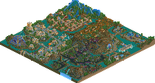
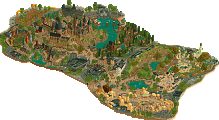
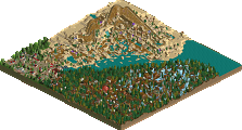
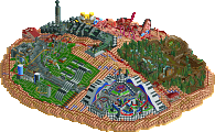
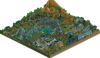
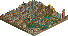
Park / Universal's Cayman Islands of Adventure

Park_264 Universal's Cayman Islands of Adventure

32 Comments

  • Steve%s's Photo
    This park kicked serious ass, dude.

    I loved the architecture, the foliage, and everything else.
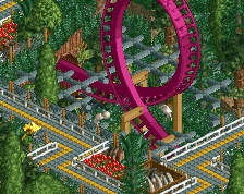
    It just flowed so well, and the transition from area to area was great. The Jurassic Park area was my favorite. It looked really cool with the gloomy yet suiting colors. Great coaster hacking too (on both coasters).

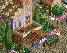
    Those stairs on the light house thing were fucking cool, too.

    Congratulations slob, on a great park, and that well deserved Parkmaker spot!
  • Ride6%s's Photo
    Eh. I just didn't connect with it and it's not really a top ten worthy park IMO. I feel that Kumba, John or Twisted should've gotten this spot. It's nice but I found a few buildings with form defects (mine are worse, so please don't get started) and the "midevil" area didn't look very Midevil at all. I liked both the coasters and the river of adventure. All the area's were beautiful and some of the archetecture was really good (Jurassic Park Discovery Center building kicks ass). The Lighthouse was mighty nice too. The stairs are fucking sweet.

    I just wasn't able to get into the atmosphere like I wanted to or was able to in the other three that I mentioned. It's great, but not what I would place at 10th, more like 12th. Still very very good in places.

    Personally I guess my expectations were set high by your water coaster (still your best work IMO).

    Looking forward to the future parks!

    ride6
  • sloB%s's Photo
    I'm back from Canada. Perfect timing, eh?

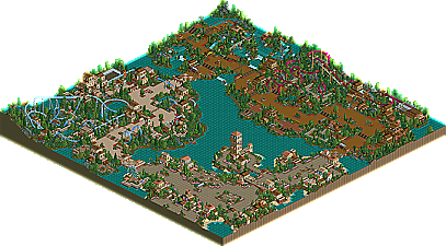
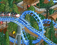
    Okay, first of all, the park. Universal's Cayman IOA is basically my ode to classic LL parkmaking. It's a throwback to the old days (which I wish I had been a part of), influenced by such classic parkmakers as SA (=P, how ironic), Harakiri, and obviously my personal fave, Shuessler. Obviously I wanted the park to ooze with atmosphere, hence the overload of bright, classic flowers. Also, I wanted to stay away from doing a boring coaster line-up of B&M Twisters and such, so I went for Intamin Mega Looper and the B&M terrain-hugging invert, both of which I'm very proud of.

    Second, big huge thanks to iris and Adix for co-ordinating this amazing contest and of course, a much love for the wonderful panel of judges who labored (I hope :p) over these parks, to justly place them. So far, it's been a blast to watch, and I'm sure the real stuff hasn't even begun.

    Thanks to all you guys that seem to like the park (a lot of you :)) and as recent news has shown, this is certainly just the beginning for slob.
  • Dixi%s's Photo
    Gotta give it to you slob, you've been my faviorate non-parkmaker for a long time now, your parks look so.... refined? Its so easy to look at, I just love the ideas/way it was pulled off, you deserved the spot through and through. You are an idol of RCT2 IMO because you know how to use the game right, im not a fan of the over load style and I think you're style is neither too basic nor too OTT, almost perfection. Great work, im lookin forward to more stuff from you.
  • Toon%s's Photo
    It always happens when you judge parks, that no matter how much time you give them, you always later realize you made some errors. This is the first park to come up in the competition that I actually feel I placed considerably to low. I think it may have suffered because I unintentionally looked at Voodoo's, John's and NC's parks directly before it and perhaps missed what this park had over those ones. This is definitely a top ten piece of work and you deserve the parkmaker spot. Congrats!
  • artist%s's Photo
    Congrat Slob.

    This park is amazing i love everthing, from the little signs to the breathtaking coasters.

    You definetly deserve this spot more than anybody else.
  • mantis%s's Photo

    You and John build a lot alike.  I noticed you both had the same idea to build boat gates for your water rides out of coaster track - something I'd never seen before until now.

    You obviously don't look at LL parks :(
  • Phatage%s's Photo
    To be honest, I liked Johns much better because it was much more accurate than your entry slob. I would have actually liked your entry a lot better if it weren't called IOA and that I wouldn't expect something of that quality, but nonetheless would still not like it too much for the fact the architecture in Camelot happened to be the same style as POC and Jurrassic Park, with some minor differences sometimes. One of the biggest things I don't like about this park is that I wouldn't know it were meant to be IOA unless it were in the name, because aside from all the sections looking the same architecturally, they looked nothing like IOA. Jurrassic Park for example had a great prehistoric feel to it, but there was nothing that signified that it was Jurrasic Park. You could have made the JP building, or the large fences, or maybe even a huge T-rex or something out of quarter-tiles, but nothing was there. Also, the rides in the park were good as rides, but with Universal, even a sitdown coaster is taken up a notch by launching it unexpectedly on a lift hill, or an invert being dueled with another invert. I'm not saying that you should've used those exact rides or miniature versions, but none of the rides were innovative, probably the single thing that makes IOA so great to me. On the plus side though, the rides were pretty true to their respective manufacturers besides the totally innaccurate transfer tracks and tables, and I think when making a park from a real chain that realism should be taken in to account also.

    I'm sorry if I sound so negative about this, but after seeing Miniseas and Darwood being beat by this as well as the fact that pretty much nobody else has said negative things about this park compared to others, I felt compelled to post this. Congrats again on the spot though.
  • cBass%s's Photo
    *sigh*, more windows that look like doors. Oh well, at least this park has some coasters!

    I thought both coasters were entertaining and well done. The foliage was kinda nice too, though a little more variation between areas would have been nice.
  • Janus%s's Photo
    Wow, excellent park. I loved the attention to detail, which really makes this park stand out from other similar parks, except for RoB of course. Some more variation foilage-wise could have been good, perhaps, but the characteristic little touches in each section was really cool, like the rocks and the occasional dead trees in the medieval section, the beach parts in the entrance section, and so forth. Cool signs, too.
    I felt the architecture was a bit too generic, but it was still very well done and I guess it fits what you were going for and it didn't look bad in any way. All the little restaurants and other eating areas really added to the atmosphere. Though nothing new or overly innovative, I suppose it wasn't intended to be.
    Very nice rides too, I liked the hacked coaster the most.
  • natelox%s's Photo
    As with most of the RCT2 contestants, I haven't seen any of their work. Slob, another parkmaker who's previous work eluded me, was very good. There were some things I didn't like, such as the extra wide paths, the colours in "Port Of Entry" and the overuse of Toon's beams. But there was a lot to like about this park. "Lost Camelot" was just beautiful, the architecture here and in Jurassic Park were both outstanding. Slob showed some great creativity with this take on the RRP guard rails (very cool) and the look-like-it's-going-to-collapase-anytime-soon spiral staircase up the 'lighthouse'. Definetly worthy of the parkmaker position. Keep up the great work!
  • AustinPowers%s's Photo
    I liked this park a lot slob. It was atmospheric and I could really imagine walking through it in real life. The entrance was some of the best architecture in the park. I liked the spiral stairs on the tower idea, I thought it looked great. One of the most subtle things in the park that helped create such a 'niceness' overall were the little signs everywhere and the eating areas. The things I didn't like about the park were the bland colors and the relative 'safeness' of the park. You really didn't go out on a limb, you made what you knew would be liked. I also didn't particularly like Pendragon...in between the elements was the main let down for me. However, I did like Pteradon. Everything seemed to go together for that coaster. Overall, a nice park. I'd like to see you try something a bit more creative though.
  • Xeccah%s's Photo

    what i dont get about this park is that it feels that it is in the worst ways attempting to be ll in rct2, without any of the realistic telegraphing and deliberate, purposeful structure that makes slobs other work so well. 


    okay, yeah port of entry is colorful and has a ton of pastels, but theyre used haphazardly here and in most places doesn't have that interesting variation in the structures themselves and how they're creatively used to form a seamless, organic line from end-to-end that makes port of entry, along with the themeing, so special of an area. i do think its the weakest part of the park though


    the other areas are a bit better bound and cohesive, with some but not enough elements to make them particularly interesting aesthetically. the ride design was nothing really of note either.