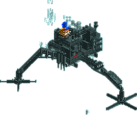
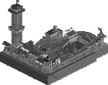
Good, could be great if there were surroundings, preferably a theme park setting. This would be mindblowingly cool as just a huge structure hovering over a path somewhere. Over a mainstreet? Wouldn't that blow your mind? I love how the elephant gets a toxic shower from one particular angle. Don't think it was intentional but it was a little funny.
This map made more sense than my past micro maps. Have you seen Lost Properties? Don't bother. (lol, 153 downloads)
Good, could be great if there were surroundings, preferably a theme park setting. This would be mindblowingly cool as just a huge structure hovering over a path somewhere. Over a mainstreet? Wouldn't that blow your mind? I love how the elephant gets a toxic shower from one particular angle. Don't think it was intentional but it was a little funny.
thats quite close what I tried to build at first! well, it was fucked up unfortunately. the lack of time helped to lost all motivation in this project, I hate rushing.
this might be recreated at sometime because I planned lot of sick ideas.
This map made more sense than my past micro maps. Have you seen Lost Properties? Don't bother.
I downloaded all of your works already
I don't get the balloon stall but that may just be a reference that I don't get.
the lack of time helped to lost all motivation in this project, I hate rushing.
What lack of time? You did not need to enter this month. You could have waited many more months to send it in.
This was really cool and I loved the detail. I think I ended up ranking it last because to me it seemed rushed and like a wild gimmick. Still this was a very strong round, so don't be to upset with it not finishing at the top.
5 Comments
Comment System Offline
Louis! Offline
Liampie Offline
This map made more sense than my past micro maps. Have you seen Lost Properties? Don't bother. (lol, 153 downloads)
chorkiel Offline
I don't get the balloon stall but that may just be a reference that I don't get.
pierrot Offline
thats quite close what I tried to build at first! well, it was fucked up unfortunately. the lack of time helped to lost all motivation in this project,
I hate rushing.
this might be recreated at sometime because I planned lot of sick ideas.
I downloaded all of your works already
yeah it looks hilarious to me either.
Kumba Offline
This was really cool and I loved the detail. I think I ended up ranking it last because to me it seemed rushed and like a wild gimmick. Still this was a very strong round, so don't be to upset with it not finishing at the top.