Park / Goliath
-
 28-January 13
- Views 16,472
- Downloads 1,131
- Fans 7
- Comments 40
-

-
 84.62%(required: 65%)
 Design

Airtime 95% Coupon 95% nin 95% Kumba 90% Maverix 90% pierrot 90% robbie92 90% Austin55 85% CedarPoint6 85% Liampie 80% Pacificoaster 80% disneylandian192 75% wheres_walto 75% Wanted 70% RMM 60% 84.62% -
7 fans
 Fans of this park
-
 Full-Size Map
-
 Download Park
1,131
-
 Objects
245
-
 Tags
Tags
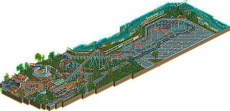

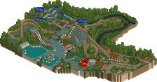
I hate the flume.
#2 and I haven't done shit since May 2011.
I'M THE LAZIEST MUTHA FUCKKKAAA
I really did enjoy this design. The details were executed extremely well, and I loved the touches like the faded parking spots and the broken-down monorail. That being said, the layout held it back a bit for me, due to it being so damn short, but I'd blame the source material more that moreso than you.
Fantastic job!
You should have just harassed me on facebook or something haha.
Regardless, fantastic work buddy. I would have rated much higher than RMM given the chance;]
RMM Offline
no need to fear.
there just wasn't much to the actual design and there just wasn't much going on. it felt very sterile. go play LL Louis!, be useful.
Liam - You're boring! In all seriousness though, I don't think you're ever gonna really like my aesthetics.
Arjan and nin - Looking forward to hearing your thoughts.
Wanted - Glad you picked up on the support work. I busted a gut on that.
trav - I know you like themes lol but I appreciate that you could appreciate the design regardless. I think that some people get stuck in what they really like and can't appreciate anything other than that. Too many people seem to be picky in RCT and don't appreciate a good piece of work because they are too short-sighted with what they want to see.
disneylandian - A shame you couldn't enjoy the parking lot for what it is, I put a lot of time into making the parking lot as detailed as possible and I've always wanted to do a parking lot coaster, which is why there was so much focus on it. I believe robbie once said 'making something ugly, beautiful' or was it phatage on robbies park? I don't know lol
zburns - I'm glad someone picked up on Turtle
RMM and gir - Shame you didn't enjoy it as much as the others.
Keep those comments coming!
It's stuff like that that makes me sad, I just don't get the hang of CSO.
I would really like to see you tackle a design/park with a stronger theme next time. Six Flags themes just seem cheap to me, like an excuse to get away with the bare minimum. Still, for what it was, this was great
The architecture was pretty standard realistic, nothing to exciting. The layout was good but i wish it was larger in terms of height, its pacing also seemed a little slow to me. One thing that i was really missing was A working flat though, it seemed so lifeless with peeps but no moving flats. The parking lot is, well good but it is just a car park, nothing to exciting to look out. Foliage was nice though, a bit sparse under neath trees etc but what was along the waters edge was very nice.
So yeah, hardly a ground breaking design to me, but was still enjoyable none the less.
70%.
A few flat rides where definitely missing and the layout would've been more exiting if it was somewhat higher.
I like the use of colors and the overall setup is quite nice too.
I assume the monorail broke down over there, or is it maintenance?
Architecture is nice as well, overall an enjoyable design to me.
Congrats.
I loved the detail of the parking lot, as i'm a big fan of rides that maneuver in or around a parking lot. Something that i especially found amazing was the supports, though. Wow, I didnt imagine RCT2 supports being used like that. I never thought they were that flexible, but you proved me wrong. Every part of it was breathtaking!
Congratulations!
I love the parking lot! But the friction brakes on this made me wonder.. how do you do that.? Either way, it's really cool!
you really got flanged by rmm
sure did.
#1 rct creation right here.