Park / Goliath

40 Comments

  • Comment System%s's Photo
  • Louis!%s's Photo
    There's only one thing I have to say on the matter:

    Posted Image

    :lol:
  • Ling%s's Photo
    Broken monorail, broken flat ride, car crash... wtf is wrong with the park?

    EDIT: Did ALL of the points just disappear from everything?
  • pierrot%s's Photo
    Almost perfect. Another superior realistic design since Kumba.
  • Louis!%s's Photo

    Broken monorail, broken flat ride, car crash... wtf is wrong with the park?

    EDIT: Did ALL of the points just disappear from everything?


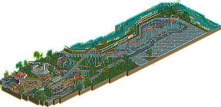
    It's operated by Six Flags, no seriously though, La Ronde has a serious problem with maintenance and reliability. I guess I went a bit overboard, but it's better than plain monorail track and a blank flat ride.

    And the points are updating that's why they've disappeared.
  • Liampie%s's Photo
    Barely 80% from me. It was well executed and all, but ironically the parking lot was the only area that looked pretty. Despite all the details, this was a little boring... You need way better aesthetics and more fun to make me vote any higher. 80% is still a lot though. Deserved design win, and an amazing attempt to break the 70% barrier. Congratulations.
  • Arjan v l%s's Photo
    Oh wow Louis!

    I didn't get the job to vote... but this is the shit!
    I'm going to check this one within an hour with some coffee to fully enjoy and inspect your design.
  • Wanted%s's Photo
    B&M hypers suck in RCT if you stick to a realistic scale. This style just isn't my cup of tea. 70 from me because it's clean and the support work is great. Congrats on the design.
  • trav%s's Photo
    Looks shit, start over.


    Nah this is definitely your best work, the detailing you have put into this is just so much better than all your previous work. Whilst I don't really think hypers are all that interesting layout wise, the supports and little details like the trim brakes that you put around the layout added a hell of a lot.

    The architecture in this was also better than anything you've done before I thought. I'm still not a big fan of the style because, well, I like themes, but for the generic sorta theme it was definitely from the top drawer. It was clean and well executed, seemed around the right size which I tend to feel that people who aim for this style make their architecture far too small.

    That flat ride is also incredible, I really do enjoy that. I'm not a big fan of the log flume being cut off though, should have just made the whole thing.

    Overally I'd probably rate this somewhere around the 85% mark.
  • disneylandian192%s's Photo
    I really enjoyed this Louis. Everything was so wonderfully done. However, the big thing with me about this design was that it seemed to be mostly parking lot. Granted, you did it very very well, I had hoped to see a little more park content. Again I'll say it, the small amount that was on the map that wasn't parking lot was fantastic. I agree with Trav too, more log flume would've been great. Lovely station, great flat ride, solid layout that is done as good as it can be within RCT's limits, lotsa parking lot (which still looked sweet).
  • Louis!%s's Photo
    #1 with 1031 points

    I'M THE GREATEST MUTHA FUCKKKAAA
  • Liampie%s's Photo
    Not for long. ;)
  • FK+Coastermind%s's Photo
    Lol, u guys are being such Kumba's!
  • nin%s's Photo
    Sorry for the logo mishap :p.

    I loved this, and I'll give my thoughts later.
  • Louis!%s's Photo
    ^Yeah well I was getting pissed. I've been waiting for ages for a damn logo, everything else was done in day 1 lol
  • zburns999%s's Photo
    Fantastic! You really can't build a "parking lot" coaster any better than this. Loved the queue line as well as the small bit of park you represented on the map. The high diving stadium was an excellent touch, especially with Turtle in mid-air haha.

    I guess the only real problem I had with this was just that, by no fault of your own, the coaster was boring to watch. You really did make it come to life, though, and that by itself is a difficult task.Little touches like the realistic MCBR, the nets under the airtime hills, and the support work made this more than worthy of the score it received. Excellent design.
  • RamSam12%s's Photo
    What I like best about this is how you made something from real life that looks below average, appear so well in RCT. Details such as ads along the parking lot wall, faded parking lines under the coaster made it just that more believable for a Six Flags parking lot coaster. I would have liked to see the log flume completed since another operating ride would add more life to the area.
  • SSSammy%s's Photo
    slut
  • Midnight Aurora%s's Photo
    You know how much I love a good parking lot...

    I think this is a good example of what the "Design" category should be.
  • Louis!%s's Photo
    ^Parking Lot Tycoon FTW!