Park / Finn Folcwalding
-
 18-January 13
- Views 3,271
- Downloads 633
- Fans 0
- Comments 6

-
 61.15%(required: 65%)
 Design Submission

Dimi 80% Liampie 70% Arjan v l 65% chorkiel 65% Jonny93 65% Maverix 65% Pacificoaster 65% 5dave 60% In:Cities 60% zburns999 60% BelgianGuy 55% CedarPoint6 55% prodigy 55% Wanted 55% turbin3 50% 61.15% -
 No fans of this park
-
 Download Park
633
-
 Objects
186
-
 Tags
Tags
![park_2815 [PT4 R1] Unnamed Entry](https://www.nedesigns.com/uploads/parks/2815/aerialt2478.png)
![park_2830 [PT4 R3] Transport Tycoon](https://www.nedesigns.com/uploads/parks/2830/aerialt2488.png)
![park_2859 [PT4 R7] Medieval Climate Optimum](https://www.nedesigns.com/uploads/parks/2859/aerialt2509.png)

![park_2855 [PT4 R7] Unnamed Entry](https://www.nedesigns.com/uploads/parks/2855/aerialt2505.png)
![park_2840 [PT4 R4] The Catherine Palace St. Petersburg](https://www.nedesigns.com/uploads/parks/2840/aerialt2497.png)
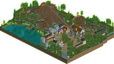
I liked this one, the harmony, it's neat and clean cut.
The graveyard que is a nice touch.
Only one part of the rollercoaster hurt my eyes a little, the part after the thirth corner from de drop, the track goes up steep and then turns into a right upwards corner.
The flow looked bad there.
It could have used some flatrides, to enhance atmosphere.
Maybe improve a little here and there and next time you'll reach the design score Geert, i'm sure.
+the color harmony between the landscaping, coaster, and architecture.
+landscaping and pathing makes this very pretty
-architecture itself is fairly bleh
-the coaster is really weak, especially for a GCI
Overall, a 55 from me because it has the beauty a park like this needs, but the architecture and coaster aren't up to par with NE accolade level
+ Foliage
+ Queue
- Boring layout
- Standard architecture
- Nothing to see besides the coaster
The skills are there but I think you should be more original, I felt like I've seen it all before.
Good luck bro.
Also thanks to all the reactions with + and -'s. I feel now like I've to explain why I build this. Because I didn't spend much time into the layout, and original theme because it was my goal to improve my path working (more atmosphere) and foliage work. You guys call the atmosphere and foliage as +'s and I think that's a great compliment from you guys!
Thanks!